You have to keep in mind that, when you design your cover, what you want people to notice isn't the same as what sticks out. Also, people don't spend nearly as much time watching your cover as you do.
Designing a cover is similar to writing a book. You can perfect every little detail, but if the overall view doesn't support it, it won't work.
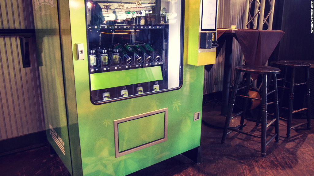
There's no problem with what you chose to represent on your photo. It's everything else that needs work.
One trick designers use to improve their covers is to squint to make the design blurry, so instead of focusing on the little things that you love (the idea of a vending machine, the sticker...) you see the cover the same way your readers do. With yours it looks like this:
As you can see, at first glance, it's very square and rigid. Because of the low contrast and the small size, the product, sticker and everything else are
not eye-catching. They fade into the background. That doesn't mean they're not interesting, it means they're not what potential readers notice. Readers notice: faded photo pasted over a dark green background, blocky title.
Which is why it's so important to start with your comps and subgenre. You need to identify the general shape and colors readers expect for your kind of books.
But that doesn't mean you need to let the gumball/leaf vending machine idea go. You can even keep this photograph (provided you own the rights) and fix it to make it look professional. It's like with writing: if people say your opening doesn't work, it doesn't mean your story is bad. It only means you need to work on the opening.