
Favorite Fantasy Series and Covers

Status
Not open for further replies.

KodyBoye

New kid, be gentle!
Super Member
Registered
Joined
Mar 12, 2010
Messages
97
Reaction score
18
Location
Austin
Website
kodyboye.com
I figured I'd start this thread so we could share some of our favorite cover art and series at the same time.

To start, I really like to say that though I haven't read Robert Jordan's work (something I'm dying to do once I finish my own saga,) I absolutely love the artwork that adorns the man's work.

Wheel-of-Time-Books.jpg


Another favorite of mine is Tamora Pierce's Tortal trilogy, of which I've read almost the entirety of (sans her Tricksters, Beka Coop series and the new short story collection of hers.)

terrier_4site.jpg


I'll post some more when it's not so early in the morning.
 

MJNL

A Little Lost
Super Member
Registered
Joined
Sep 18, 2010
Messages
1,033
Reaction score
118
Website
lostetter.wordpress.com
Ooh, good topic. As both a writer and an illustrator I think this is a very worthwhile area to delve into: what covers we like and why.

I'll have to pop back in with some of my favs later.
 

Ardent Kat

Kill your television
Super Member
Registered
Joined
Aug 27, 2009
Messages
793
Reaction score
152
Location
Austin, TX
Website
www.katherineokelly.com
I like a cover that's not only attractive, but showcases some of the things you'll expect to find in the book.

Joan D. Vinge's Catspaw immediately came to mind when I saw this thread.

523989-L.jpg


Things I like about this cover:

The background and clothing gives an indication of what sort of world/technology the reader can expect--planetside (city background), futuristic (digital console, data band on wrist) but still identifiable and familiar (leather jacket, concrete stairs with handrail)

2) The zoom-in on the character lets the reader know this is a character-focused story. Catspaw is told in first person and the unique perspective of the protagonist is one of the book's main appeals.

3) His cat-like pupils shows that the protagonist is not quite human, also suggesting what sort of story this is (A different stylistic choice could have shown the protagonist so zoomed the pupils aren't noticible) The arched eyebrow, punk hair, and young face also accurately tell what sort of protagonist he is.


The image on the cover draws in a reader with its intriguing details and by being aesthetically pleasing. More importantly, it tells a lot about what sort of story this is. I picked this book up and greatly enjoyed it, because it was character-focused with a not-quite-human POV just like I'd hoped.

By contrast, I would never pick up a book with a picture of a planet, a ship, or a space station on it because it's so "zoomed out", I assume the story has a larger scale and a more omniscient POV. Since I prefer character-driven stories, I expect to see the characters showcased, especially in their natural environment and in a way that gives an inkling of their personality.
 

lastlittlebird

avem narrans
Super Member
Registered
Joined
Aug 7, 2009
Messages
1,316
Reaction score
161
Location
Australia
Website
lastlittlebird.blogspot.com
I absolutely loved the original UK paperback covers for Tamora Pierce's Wild Magic series. This is the first one:
wildmagicoriguk.jpg


I wish I had kept mine in better condition, but I was very hard on books back then.
You can see the others here: http://tamorapierce.com/galleries.html

ETA: I'm not sure why I like it besides... it's pretty! I loved how classy and "grown-up" it looked, and that they included all her study paraphernalia in the border. And I guess they managed to capture a very active feel to the main picture as well.
And it's pretty.
 
Last edited:

jjdebenedictis

is watching you via her avatar
Super Member
Registered
Joined
Jun 25, 2010
Messages
7,063
Reaction score
1,643
Tad Williams always seems to have the most gorgeous covers. For example, this one (which looks better in the flesh because the blues are more intense and mysterious-seeming):
Shadowmarch%2BUSA.jpg


Unfortunately, I really didn't like this book. :(
 

Marumae

Queen of Quixotica
Super Member
Registered
Joined
Oct 12, 2010
Messages
255
Reaction score
19
Location
Fantasia
Website
www.instagram.com
Great topic! I have a huge collection of pictures on my hard drive saved from cover artists and things I use as inspiration for my stories, that and I just like purty pictures. My favorite series is the Fern Capel Trilogy by Jan Siegel, and the covers for the American Editions are love, introduced me to my favorite artist EVAR. Thomas Kidd.


-WHAT I LIKED...about the covers... besides the colors? (With Regards to Prospero's Children, the first book)The details are the thing that drew me to the book in the library and pick up the inside cover. This is a glimpse from a scene described in the book and it perfectly reflects the tone of the novel, simple barn with a doorway into somewhere, the bright light casts shadows brilliantly in the barn and the small glowing key on the floor (a major plot point in the novel, that key is) and the golden dome through the door and what looks like a school of fish swimming by? Oh do I love Thom Kidd's eye for detail. that "doorway" is one of those novels that has a hole cut into it where you can look directly onto a picture done on the cover. I love those <3 What you don't see from this picture is on the side we get a glimpse of the mermaid who is the viewpoint character of the prologue, done in complete elegance and it actually resembles the mermaid as described in the novel. On the hardcover section of the book is the mermaid herself, the fallen city and a skeleton rotting on the sea floor. Absolutely brilliant cover for a brilliant book. I feel the same way about the rest of the covers in this trilogy, though I (I reviewed under this online handle on amazon.com) wasn't as fond of the other two novels in the trilogy I can appreciate her writing style which was elegant enough to make me reread the series frequently.
 

seeker_nomad

total newbie
Super Member
Registered
Joined
Oct 17, 2011
Messages
121
Reaction score
21
Location
Upstate New York
Funny, I read Jordan (although I accept and agree that he went downhill quickly and stayed there) I absolutely cannot stand his cover art. :) I am glad that someone likes it, though!
 

peele

Stealth!
Registered
Joined
Nov 11, 2011
Messages
3
Reaction score
0
Location
Florida
a-game-of-thrones-book-cover.jpg


heir%20apparent.jpg


If I had to choose between the two I'd choose Heir Apparent even though I love GOT. I just love the colours and the dichotomy present in Heir Apparent's cover.
 

Martin Persson

Super Member
Registered
Joined
Aug 16, 2011
Messages
69
Reaction score
0
I cracked up just from seeing this cover. Ugly hat, ugly pants, he is holding a letter and is posing like he is Luke Skywalker.

goingpostal_87805509.jpg
 

Filigree

Mildly Disturbing
Super Member
Registered
Joined
Jul 16, 2010
Messages
16,450
Reaction score
1,554
Location
between rising apes and falling angels
Website
www.cranehanabooks.com
This 'parody' style of Pratchett cover always saddens me a little -- it riffs so much on the ground-floor comedy (ugly shoes, stupid expression), that readers unfamiliar with Pratchett never have the chance to learn what else is important about Pratchett's Discworld books. Like, their humanism, complex satire, worldbuilding, and deep ethical discussions. Do I make them seem pretentious? They're not, since the humor ties everything together beautifully.

I actually like the covers that Harper Collins is putting on the US hardback Pratchett editions. They're more artistic and literary, while still conveying the feel of the books.
 

Elvirnith

Dark Lord
Super Member
Registered
Joined
Jul 2, 2010
Messages
111
Reaction score
2
Location
New York
Website
ronaldcraft.com
I'm a big fan of James Clemens (aka James Rollins) new fantasy series (which is currently on hiatus in favor of his non-fantasy series *sadface*)

shadowfall-james-clemens-hardcover-cover-art.jpg
 
Last edited:

Martin Persson

Super Member
Registered
Joined
Aug 16, 2011
Messages
69
Reaction score
0
I think the twisted covers of the Discworld books are a good thing because the books themselves are full of twisted humour. I am annoyed by the fact that Twoflower literary have four eyes when he was only meant to have glasses.

A more serious cover I like is this
stephen-king-the-gunslinger.jpg


It is so good you kind of get a sense of the plot from just looking at the picture.
 

small axe

memento mori
Super Member
Registered
Joined
Apr 6, 2007
Messages
1,940
Reaction score
261
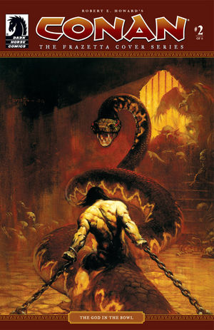
FrazettaConan1-thumb-300x493-28750.jpg
15486.jpg


Frank Frazetta's covers for the CONAN series pretty much captured me in my teens and never let go ...

Luv'd those all, too many to put here, but well worth a study! His use of atmospheric effects and colours, of capturing a peak dramatic moment ... great art!
 
Status
Not open for further replies.