This may take some time. Many thanks in advance to anyone who reads this.
I thought I'd start with the image I currently have. I'd also like you to take a peek at my signature if you'd be so kind. Hopefully, that will give you some kind of idea of the branding I'm attempting to accomplish. I write noblebright fantasy, usually with a fairy tale or folklore base. Generally set at least partially in our world, although I do write a little secondary world stuff. Sometimes there's a historical component, although I was planning to set this one in our contemporary world or close.
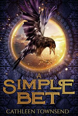
So, this is the cover. And I like it, but I'm discovering that the more books I publish, the harder it can be to dial in the aesthetic. I want my books to look like they all belong to the same genre, but I don't want them so similar that it looks like I've settled on only one visual idea. Currently, that seems like no problem, right?
But now I need you to follow a link, since these books aren't published yet: https://absolutewrite.com/forums/sh...-Civil-War-cover-feedback-on-complete-duology.
To my eye, this Simple Bet cover is too similar to the Snow White covers. I kinda feel bad about sending this one back to the drawing board, but I did tell them that the last attempt looked too much like Snow White, too. I would've thought they'd have tried something a little more different.
But it does, I think, nail the fairy tale aesthetic, which can be a surprisingly difficult thing to do for an adult audience. So how can I fix it without breaking it? I'd like to use the crow, and maybe the circular frame and background image, if I can. I might even keep the purple, since it seems like the most common way to differentiate between fantasy series books is to change colors somehow, and purple seems to be harder to do well than orange/brown, green, or blue.
Concerning my story, it's the unlikely friendship that develops between a corbie (crow shifter) and a selkie. Basically, they make a bet to see who can get the attractive barmaid at the local dive to go out to dinner with them first. There are complications of course, and at the end, the gal laughs, shifts into a coyote, and runs away while the guys' jaws drop. The underlying serious theme is defining yourself apart from your family, but with an eye to fitting back in again later. But my protag (the selkie) wants things to be different when he tries the family thing again. He's not sure in what way he wants to change things at this point, or how to do it, but this is his emotional quest which underlies all the other plot stuff.
I'm attempting to have this volume be an intro novelette/novella, and then to write a trilogy after this. So this cover has to be something I can use for a series, unlike the covers for Dragon Hoard or Bellerophon. The trilogy will be a more serious, do-or-die proposition than this book, but it'll build on the friendship and characters of my selkie and corbie protags in Simple Bet.
So, how to adapt this cover? Or does it need adapting at all? Am I being too sensitive about imagery? My gut says no, but hey, it's been wrong before.
Assuming that I can adapt this imagery, what should I adapt it to? DDD is going to want concrete suggestions for improvement. It's maddening to be handed something, and the only feedback is that the prior attempt isn't good enough.
I found some series covers on DDD's site that I like.
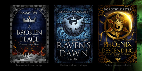
I chose to look through covers that DDD had already done because really, anything like that should be doable. This is a consideration because I can't get covers like Seanan McGuires' October Daye series, for instance. They hired painters for those things, and I don't work tight enough for cover art with humans. (Lesson learned from two failed covers for Bellerophon. My style of painting figures ends up looking MG.)
So, my preliminary thought is to use Ms. Wu's cover as a rough template. My author name always goes along the bottom, so that means there would be room at the top for something like the circled crow image posted above. Hopefully, if the arched framing element is strong enough, that would mitigate some of the resemblance to my Snow White covers, enough to make it look like a different series. And I'd ask them to use a similar frame as Ms. Wu's, but not too close. (This is one of those moments that I'm really glad some other person with greater Photoshop skills will be tackling this.)
Since DDD has unlimited access to Shutterstock and they take care of the commercial licensing and all that, I took a peek at what else was available, crow-wise, on the site. (The selkie and seal offerings are dismal cover fodder.) And it turns out there are enough different watercolor crows to have a distinct one on the cover of all four books. The cover colors would vary, probably in the background, but the frames would stay the same, and the crows would be similar, hopefully a unifying factor.
Or is this whole idea irreparably flawed because it's too Hunger Games? My avian is more realistic than the mockingjay--is that a big enough difference? Aargh, aargh, aargh... I can obsess over this stuff for hours, and in the end, it's like staring a word too long, and you realize you have no idea how to spell the silly thing anymore.
If anyone is feeling heroically helpful, DDD has some fantasy covers on display here, in case you want to check out more options: http://www.derangeddoctordesign.com/epic-and-high-fantasy-book-covers.html.
Any feedback on any part of this would be greatly appreciated. : )
I thought I'd start with the image I currently have. I'd also like you to take a peek at my signature if you'd be so kind. Hopefully, that will give you some kind of idea of the branding I'm attempting to accomplish. I write noblebright fantasy, usually with a fairy tale or folklore base. Generally set at least partially in our world, although I do write a little secondary world stuff. Sometimes there's a historical component, although I was planning to set this one in our contemporary world or close.
So, this is the cover. And I like it, but I'm discovering that the more books I publish, the harder it can be to dial in the aesthetic. I want my books to look like they all belong to the same genre, but I don't want them so similar that it looks like I've settled on only one visual idea. Currently, that seems like no problem, right?
But now I need you to follow a link, since these books aren't published yet: https://absolutewrite.com/forums/sh...-Civil-War-cover-feedback-on-complete-duology.
To my eye, this Simple Bet cover is too similar to the Snow White covers. I kinda feel bad about sending this one back to the drawing board, but I did tell them that the last attempt looked too much like Snow White, too. I would've thought they'd have tried something a little more different.
But it does, I think, nail the fairy tale aesthetic, which can be a surprisingly difficult thing to do for an adult audience. So how can I fix it without breaking it? I'd like to use the crow, and maybe the circular frame and background image, if I can. I might even keep the purple, since it seems like the most common way to differentiate between fantasy series books is to change colors somehow, and purple seems to be harder to do well than orange/brown, green, or blue.
Concerning my story, it's the unlikely friendship that develops between a corbie (crow shifter) and a selkie. Basically, they make a bet to see who can get the attractive barmaid at the local dive to go out to dinner with them first. There are complications of course, and at the end, the gal laughs, shifts into a coyote, and runs away while the guys' jaws drop. The underlying serious theme is defining yourself apart from your family, but with an eye to fitting back in again later. But my protag (the selkie) wants things to be different when he tries the family thing again. He's not sure in what way he wants to change things at this point, or how to do it, but this is his emotional quest which underlies all the other plot stuff.
I'm attempting to have this volume be an intro novelette/novella, and then to write a trilogy after this. So this cover has to be something I can use for a series, unlike the covers for Dragon Hoard or Bellerophon. The trilogy will be a more serious, do-or-die proposition than this book, but it'll build on the friendship and characters of my selkie and corbie protags in Simple Bet.
So, how to adapt this cover? Or does it need adapting at all? Am I being too sensitive about imagery? My gut says no, but hey, it's been wrong before.
Assuming that I can adapt this imagery, what should I adapt it to? DDD is going to want concrete suggestions for improvement. It's maddening to be handed something, and the only feedback is that the prior attempt isn't good enough.
I found some series covers on DDD's site that I like.
I chose to look through covers that DDD had already done because really, anything like that should be doable. This is a consideration because I can't get covers like Seanan McGuires' October Daye series, for instance. They hired painters for those things, and I don't work tight enough for cover art with humans. (Lesson learned from two failed covers for Bellerophon. My style of painting figures ends up looking MG.)
So, my preliminary thought is to use Ms. Wu's cover as a rough template. My author name always goes along the bottom, so that means there would be room at the top for something like the circled crow image posted above. Hopefully, if the arched framing element is strong enough, that would mitigate some of the resemblance to my Snow White covers, enough to make it look like a different series. And I'd ask them to use a similar frame as Ms. Wu's, but not too close. (This is one of those moments that I'm really glad some other person with greater Photoshop skills will be tackling this.)
Since DDD has unlimited access to Shutterstock and they take care of the commercial licensing and all that, I took a peek at what else was available, crow-wise, on the site. (The selkie and seal offerings are dismal cover fodder.) And it turns out there are enough different watercolor crows to have a distinct one on the cover of all four books. The cover colors would vary, probably in the background, but the frames would stay the same, and the crows would be similar, hopefully a unifying factor.
Or is this whole idea irreparably flawed because it's too Hunger Games? My avian is more realistic than the mockingjay--is that a big enough difference? Aargh, aargh, aargh... I can obsess over this stuff for hours, and in the end, it's like staring a word too long, and you realize you have no idea how to spell the silly thing anymore.
If anyone is feeling heroically helpful, DDD has some fantasy covers on display here, in case you want to check out more options: http://www.derangeddoctordesign.com/epic-and-high-fantasy-book-covers.html.
Any feedback on any part of this would be greatly appreciated. : )
Last edited: