Feedback for 4 covers for a child endangerment thriller please

Gregg Bell

Super Member
Registered
Joined
Oct 2, 2015
Messages
920
Reaction score
164
Location
Itasca, Illinois (U.S.)
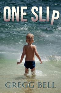
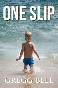
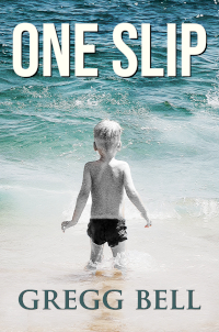
These are mock-ups for a child endangerment thriller. It's kind of a tear jerker in that the child dies. But it's also edifying in the end. Nicholas Sparks-ish but not much romance. That sort of thing. Thanks.

#1)
One-Slip1838-X2775-B.jpg


#2)
One-Slip1838-X2775-NEWtest.jpg


#3)
One-Slip1838-X2775-NEWtestdarker.jpg


#4)
One-Slip1838-X2775-NEWtestdarkerest.jpg
 

kevinwaynewilliams

Be blunt: I appreciate it
Super Member
Registered
Joined
Aug 18, 2013
Messages
555
Reaction score
53
Location
Phoenix
The dark sea does the best at conveying danger. I'd try a little bit of creative masking to get the beach of #2 combined with the water of #4 to heighten the contrast.

The title font is a complete meh for me. Doesn't convey anything thrilling or dangerous.
 

Earthling

I come in peace
Super Member
Registered
Joined
Feb 3, 2016
Messages
1,210
Reaction score
192
The dark sea does the best at conveying danger. I'd try a little bit of creative masking to get the beach of #2 combined with the water of #4 to heighten the contrast.

The title font is a complete meh for me. Doesn't convey anything thrilling or dangerous.

I agree with all this.
 

Chris P

Likes metaphors mixed, not stirred
Kind Benefactor
Super Member
Registered
Joined
Nov 4, 2009
Messages
22,663
Reaction score
7,354
Location
Wash., D.C. area
My initial gut says 1 or 4, and I agree that the font is not eye-catching. I see what you were trying to do in 3 by hqving the child in grayscale, but I initially completely missed it. Now I think 4 is the strongest.
 

dpaterso

Also in our Discord and IRC chat channels
Staff member
Super Moderator
Moderator
Super Member
Registered
Joined
Feb 12, 2005
Messages
18,806
Reaction score
4,598
Location
Caledonia
Website
derekpaterson.net
Man, what a spoiler!

I prefer #1's title because of its gradient, and #4's more menacing darker ocean. And maybe #3's author name especially if it matches the ocean color.

-Derek
 

Gregg Bell

Super Member
Registered
Joined
Oct 2, 2015
Messages
920
Reaction score
164
Location
Itasca, Illinois (U.S.)
The dark sea does the best at conveying danger. I'd try a little bit of creative masking to get the beach of #2 combined with the water of #4 to heighten the contrast.

The title font is a complete meh for me. Doesn't convey anything thrilling or dangerous.

Thanks Kevin. I agree this needs the darker water. Any suggestions on the font? Or texturing it?
 

Gregg Bell

Super Member
Registered
Joined
Oct 2, 2015
Messages
920
Reaction score
164
Location
Itasca, Illinois (U.S.)
My initial gut says 1 or 4, and I agree that the font is not eye-catching. I see what you were trying to do in 3 by hqving the child in grayscale, but I initially completely missed it. Now I think 4 is the strongest.

Thanks Chris. Not sure what you meant by you almost missed what I was trying to do in #3, though.
 

Crispin

Super Member
Registered
Joined
Feb 20, 2019
Messages
54
Reaction score
6
Consider putting the entire image in grayscale and dropping the brightness to better represent the feeling of the book. Right now it feels like it could be about a day at the beach. As for the font, I think a distressed look will be your best bet. Something like this to sell the mood: https://www.fontspace.com/k-type/mailart-rubberstamp
 

dpaterso

Also in our Discord and IRC chat channels
Staff member
Super Moderator
Moderator
Super Member
Registered
Joined
Feb 12, 2005
Messages
18,806
Reaction score
4,598
Location
Caledonia
Website
derekpaterson.net
Just a thought, you could also drop the P down a little and angle it as if it's "slipped" -- might make the title a little less ordinary, e.g.

one-slip-test.jpg


-Derek
 
Last edited:

Gregg Bell

Super Member
Registered
Joined
Oct 2, 2015
Messages
920
Reaction score
164
Location
Itasca, Illinois (U.S.)
Consider putting the entire image in grayscale and dropping the brightness to better represent the feeling of the book. Right now it feels like it could be about a day at the beach. As for the font, I think a distressed look will be your best bet. Something like this to sell the mood: https://www.fontspace.com/k-type/mailart-rubberstamp

Thanks Crispin. I'm posting new versions of the cover today (with a different image) and one of them has grayscale. Thanks for the link with the font. Very interesting. I'll try it out.
 

Gregg Bell

Super Member
Registered
Joined
Oct 2, 2015
Messages
920
Reaction score
164
Location
Itasca, Illinois (U.S.)
Just a thought, you could also drop the P down a little and angle it as if it's "slipped" -- might make the title a little less ordinary, e.g.

one-slip-test.jpg


-Derek

Thanks Derek. You did a really awesome job on that. And without the source file. Impressive. I think I'm going to go with a different image though. I'm going to post right after this.