Snow White and the Civil War--cover feedback on complete duology

CathleenT

I write
Super Member
Registered
Joined
Aug 6, 2014
Messages
5,097
Reaction score
1,981
Location
Northern California
I have here four covers that I'd like narrowed down to two:


book-1-version-01.jpg


book-2-version-01.jpg


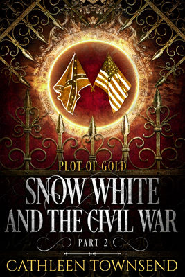
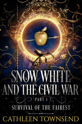
Or with subtitle below:


book-1-version-02.jpg


book-2-version-02a.jpg


I'm mostly interested in choosing between the two font arrangements, but if there's any other feedback, I'd love that as well. I need to give Deranged Doctor back the results within a week or so, though.


The only other important thing with these covers is that I'm really trying to give the impression that this is a single story told in two parts. (Part 1 ends in a serious cliffhanger.) I'm going to have something at the end of the blurb for book 1 as well--I suppose I might as well get your thoughts on that while we're here. :)


The story concludes in Snow White and the Civil War, Part II: Plot of Gold.


I don't want to baldly state that Part I ends in a cliffhanger--that just seems to lack finesse. Would the above line do, in concert with the covers?


And I'm going to release both books on the same day.


Thanks so much in advance to everyone who pops in.
 
Last edited:

muse

standing on head, typing one-handed...
Kind Benefactor
Super Member
Registered
Joined
Sep 25, 2010
Messages
9,143
Reaction score
3,021
Location
Ireland
I like the subtitle below, too.

Just wondering, though, if you should put the 'Part 1' and 'Part 2' in yellow - just to make it stand out more?
 

-Riv-

The much appreciated
Kind Benefactor
Super Member
Registered
Joined
Sep 3, 2014
Messages
4,442
Reaction score
2,229
Location
Pacific Northwest
book-1-version-02.jpg
book-2-version-02a.jpg


I'm mostly interested in choosing between the two font arrangements, but if there's any other feedback, I'd love that as well. I need to give Deranged Doctor back the results within a week or so, though.
I prefer the subtitle below. I'm wondering if the "Part 1" and "Part 2" could be a bit larger/more prominent. They seem to get lost, at least on images this size. Apart from that, the covers look great, to me, and give the impression that they belong together (but with the color distinctions to help show they are, indeed, two different books).

The only other important thing with these covers is that I'm really trying to give the impression that this is a single story told in two parts. (Part 1 ends in a serious cliffhanger.) I'm going to have something at the end of the blurb for book 1 as well--I suppose I might as well get your thoughts on that while we're here. :)


The story concludes in Snow White and the Civil War, Part II: Plot of Gold.
Works for me. :)

All the best,
Riv
 

Cobalt Jade

Kind Benefactor
Super Member
Registered
Joined
Oct 21, 2015
Messages
3,328
Reaction score
1,486
Location
Seattle
I prefer the subtitle below. I'm wondering if the "Part 1" and "Part 2" could be a bit larger/more prominent. They seem to get lost, at least on images this size.

I agree with Riv here.
 

starrystorm

Super Member
Registered
Joined
Jul 9, 2018
Messages
2,987
Reaction score
605
Age
24
I vote for the second version. Honestly, I didn't even see the subtitles on the first version until someone pointed it out.
 

Ari Meermans

MacAllister's Official Minion & Greeter
Super Member
Registered
Joined
Jan 24, 2011
Messages
12,861
Reaction score
3,071
Location
Not where you last saw me.
Yep, I still go for the subtitles below. I suppose I expected the font color balance to stay the same—with the subtitles to remain in gold and with the part numbers in gold as well—but this works well, too. They're beautiful covers, Cathleen, and I still love 'em.
 
Last edited:

MaeZe

Kind Benefactor
Super Member
Registered
Joined
Jun 6, 2016
Messages
12,832
Reaction score
6,590
Location
Ralph's side of the island.
Another vote for the subtitle below, and a vote for liking the covers.

Oh my word, I managed to delete half the paragraph and not notice.

The F blurs into the next letter the way half of it is faint. I wasn't sure it didn't say 'Fittest' or 'Forest'. Obviously fairest makes sense but the point is still that the font is an issue. (A tiny issue.)
 
Last edited:

CathleenT

I write
Super Member
Registered
Joined
Aug 6, 2014
Messages
5,097
Reaction score
1,981
Location
Northern California
Wow! Thanks, everyone. I love it when the choice is easy. We might play around with some gold font, and/or I'm thinking the swirls might look nice in gold. :)

ETA: We're probably all overthinking it, though. Supposedly, covers are often split-second decisions. They appeal to the "Ooo, shiny," reactions of your readers, and hitting genre is the most important thing. I don't know if the covers convey noblebright, but I think they at least evoke a classic fantasy vibe, and that should work, too.

DDD did such a good job with these that it has me wondering if I should just get out of their way in the future. I painted the flags on this one, but that was all.

Or maybe turn the whole thing over to them only for future novels? (Collections and novellas sell less.) I really wanted to paint my covers, but these are better than what I could do. Hmmmm...
 
Last edited:

CathleenT

I write
Super Member
Registered
Joined
Aug 6, 2014
Messages
5,097
Reaction score
1,981
Location
Northern California
Deranged Doctor Design did the covers, Marissa. :)

Just an FYI for anyone else using an American flag--apparently the American flag should only be shown on the left, or it's considered disrespectful: https://www.va.gov/opa/publications/celebrate/flagdisplay.pdf.

This'll be an easy fix (just reverse the flag image and make sure Union flag's staff is in front). But I thought I'd mention it because you never know if anyone else will have an issue like this, so it's good general knowledge to have. :)

I deliberately painted the US flag on the right, since I've always considered the Union position to be the correct one, but I guess I erred. Just passing it on.