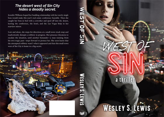
You have WAY too many fonts, Wesley. I count possibly six? You should use no more than 2 fonts outside of the "Sin" neon splash logo which I do like.
Make "West of" the same font as "a Thriller". Make "West of Sin" on the spine the same font as that. Use that font for the header on the back. Keep the serif text for the blurb, since it's pleasant to read. If you feel you need to alter the "impact" levels use bolding, italics, or all caps/small letters like you have on "a thriller" under "SIN". That looks fine.
Right now, it creates a bit of whiplash, clashing with the chaos of the background–which I love.
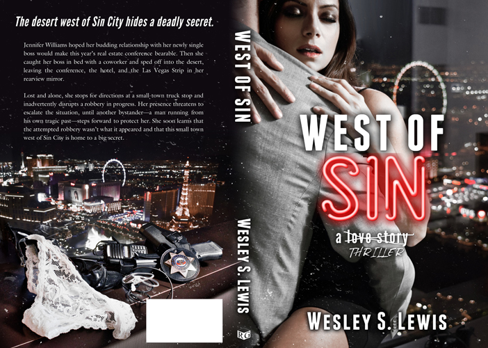
The cover does read as erotica to me, not thriller. If I wanted to make that read as thriller, I'd add an overlay over the interior, crank the lighting to be really dramatic rather than photographic, take the feature off of the sexuality but instead make it like the continuation of the city washing over them, tempting them into its neon sin.
It's not bad. It's close. The font thing is the one thing that'll really make a professional graphic designer like me notice it's a self-made cover... it's one of the encouraged laws of typography, though of course laws of design exist to be broken (and the SIN neon sign is one such thing I consider an acceptable reason to break it).
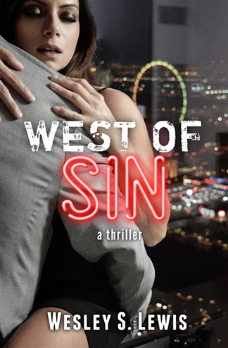
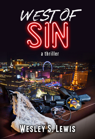
") The first one looks very self-published to me, which means there's something off with the font but I can't pinpoint it.
The first one looks very self-published to me, which means there's something off with the font but I can't pinpoint it.