feedback--Snow White and the Civil War cover

CathleenT

I write
Super Member
Registered
Joined
Aug 6, 2014
Messages
5,097
Reaction score
1,981
Location
Northern California
Cathleen-Townsend-Snow-White-and-the-Civil-War-1.jpg


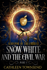
This one is all Deranged Doctor Design (except the subtitle, Survival of the Fairest, which was a gift from Tazlima), and provisionally, I quite like it, although I'm willing to entertain suggestions for improving it.

The big problem with this duology is that the first story ends in a cliffhanger. The way I wrote it, it has to. It's in two parts, first person, intitially from the POV of Snow White, and the second part from the POV of Prince Charming. Snow White loses consciousness at the end of her story. That's central enough that I'd consider it canon.

What always bugged me about SW is that here's this prince who shows up, and he could have a dozen mistresses or kill puppies in his spare time, but we're all so happy that he's taking SW away because he's rich. Blech. So part 2 is Jack's story.

They're too big to combine, at least as physical books. As it sits currently, SW part 1 is 115k and part 2 is 85k. So I'm doing the best I can with this cover (and the next, which isn't yet done) to make it clear that this is a single story in two parts.

Does this cover do this?

I'm also eager for marketing suggestions for it. Lots of people here don't self-publish, but we're all readers. How should I deal with a two-part, two-novel story where part 1 ends in a cliffhanger? Parts 1 and 2 in the same ebook, with only the physical books pubbed separately? Or publish the ebook for Part 1 cheap ($.99, which I dislike, but I could get over that), and part 2 full price? Or go ahead and sell both books for $2.99 each?

Which treatment wouldn't make you angry, as a reader?

I'm already planning on having a line at the end of the blurb for part 1 that states: The story concludes in Snow White and the Civil War part II, if I sell them as separate ebooks.

The main goal isn't to maximize profits. I just want to publish this story that I do believe in very much and not piss anyone off.

Anyway, feedback on my marketing quandary and /or cover very much appreciated.
 
Last edited:

starrystorm

Super Member
Registered
Joined
Jul 9, 2018
Messages
2,987
Reaction score
605
Age
24
I like how decorative it is, but my main concern is how much it reminds me of the cover for the "Hunger Games" with the orange circle and the arrow going through. At least that was my first thought.
 
Last edited:

Netz

Freshly caught writing bug lives!
Kind Benefactor
Super Member
Registered
Joined
Feb 3, 2011
Messages
2,669
Reaction score
588
Location
The view from my stained glass window suggests by
Just popping in quickly to say I think the cover looks fab (I wasn't reminded of THG at all, btw) and it was clear to me it was Part 1. Are you going to be releasing both parts at the same time? That's what would cheese me off as a reader, if Part 1 ended on a cliffhanger & I then had to wait months for Part 2. I'd probably have them as 2 e-books, so I'd have 2 pretty covers to look at, and (as an e-reader) I'd feel like I'm making progress in the % I've read when 200k words are split over 2 books rather than feeling I'm slogging through 200k in 1 book, if that makes sense? (I'm not saying your book would be a slog to read, btw - I'd find any 200k book quite daunting, lol.)
 

CathleenT

I write
Super Member
Registered
Joined
Aug 6, 2014
Messages
5,097
Reaction score
1,981
Location
Northern California
Thanks, starrystorm and Netz.

I should have mentioned this already--if I publish Snow White in two parts, ebook or physical book, I'd release both at the same time. :)
 

Ari Meermans

MacAllister's Official Minion & Greeter
Super Member
Registered
Joined
Jan 24, 2011
Messages
12,861
Reaction score
3,071
Location
Not where you last saw me.
I love the cover, Cathleen. I have a question, though: Does Part II have the same subtitle or a different one?*

*If the books have different subtitles you might consider rearranging the text to indicate that better and make the subtitle(s) stand out. Just a thought.
 

CathleenT

I write
Super Member
Registered
Joined
Aug 6, 2014
Messages
5,097
Reaction score
1,981
Location
Northern California
Thanks, Ari.

The subtitle for part II is Plot of Gold. My only reservation right now is that the subtitle comes before the title. I have no idea if that's important or not. Should I ask for a cover draft that has the subtitle that follows the title?

One thing's for certain--it's a whole lot of font. Honestly, when I turned the cover over to them, I was thinking, "Better you than me. I really hope you're up to making this many words work." But I asked Deranged Doctor Design to be sure to make the series title the most important thing, and to try to convey the impression that this is one tale in two books.
 
Last edited:

Ari Meermans

MacAllister's Official Minion & Greeter
Super Member
Registered
Joined
Jan 24, 2011
Messages
12,861
Reaction score
3,071
Location
Not where you last saw me.
It is a lot of font but it works. I was thinking along the lines of maybe having the main title bumped up a notch to where the subtitle currently is with Part I: Survival of the Fairest just below the main title. So, yes, I'd ask for a cover draft showing that. Keep in mind, aesthetically speaking and all, that's my taste and what I'm used to seeing for books in two or more parts.


Just want to add again that I love that cover and it definitely would make me want to explore the book.
 
Last edited:

CathleenT

I write
Super Member
Registered
Joined
Aug 6, 2014
Messages
5,097
Reaction score
1,981
Location
Northern California
Thanks! I'd like a draft with the subtitle below the main title as well. Only what do you mean by the main title raised? Just higher in the "picture plane" of the cover?
 
Last edited:

Ari Meermans

MacAllister's Official Minion & Greeter
Super Member
Registered
Joined
Jan 24, 2011
Messages
12,861
Reaction score
3,071
Location
Not where you last saw me.
Yes, higher in the picture plane, but no higher than where the subtitle now sits and keeping the main title at the current font size. I think by doing that you'll have plenty of room to do the subtitle justice and have it stand out as it should.
 
Last edited:

WilkinsonMJ

Super Member
Registered
Joined
Dec 3, 2018
Messages
85
Reaction score
7
I think the cover is already really excellent, but as said putting the subtitle beneath the actual one might suit better. Best of luck with it all, the book looks intriguing haha
 

GFXJames

Registered
Joined
Dec 26, 2018
Messages
22
Reaction score
2
I have to agree with the subtitle position change... the cover looks really good, till the detail I can see. The contrast is very powerful, you will see the main shapes yet in really small size (not that I care that much about that thing, but I guess is good to have).