- Joined
- Jun 11, 2017
- Messages
- 150
- Reaction score
- 17
Please ignore images below and go to post #12 for latest
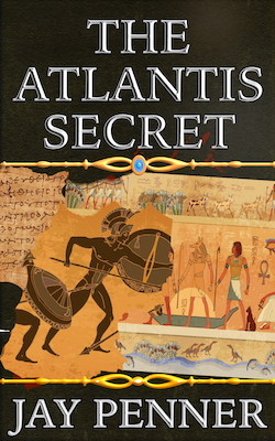
I've left out the genre deliberately.
Greatly appreciate feedback on two questions
1. Which do you prefer, (A) or (B)?
2. When you look at it overall what does it evoke in you?
[removed]
Thank you!!
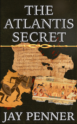
I've left out the genre deliberately.
Greatly appreciate feedback on two questions
1. Which do you prefer, (A) or (B)?
2. When you look at it overall what does it evoke in you?
[removed]
Thank you!!
Last edited:
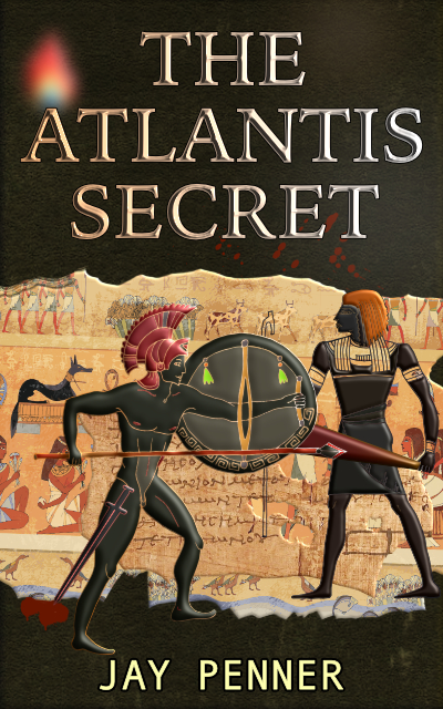
") . In the first cover the two golden lines frame the image so they look alright. And yes, the bigger soldier image is also more catchy. If you're putting this on Amazon etc it's going to be a thumbnail and you don't want images that look like undecipherable dots on it.
. In the first cover the two golden lines frame the image so they look alright. And yes, the bigger soldier image is also more catchy. If you're putting this on Amazon etc it's going to be a thumbnail and you don't want images that look like undecipherable dots on it.