Wow! Thanks, everyone.
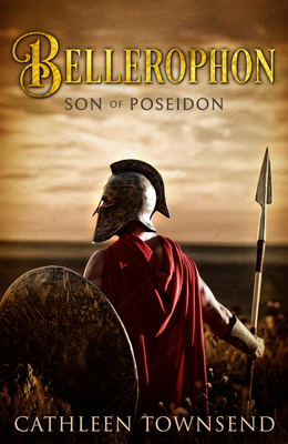
As far as my name goes, or at least the placement of it, part of the problem is that it's so long. Sixteen letters plus the space in the middle. And I don't honestly know how important a consideration this is, but when it comes to the author's name, DDD advises keeping the same font and the same placement for all my books. I figure they've done way more covers than I ever will, so I'm inclined to stick with their advice, at least for now. I do know that name recognition is hard to get, so if this makes it any easier, I'm all for it.
Concerning the spottiness, I suppose we'll see how the next version comes out. Right now it bugs me. But I'm trying to be flexible about this sort of thing, and I'm feeling mildly successful since I went with a photograph instead of one of my paintings because it's better branding.
As an aside, I painted not one, but two covers for this thing. And both of them made my book appear to be MG. Grrr. This cover has turned into such a quest, but I did learn some stuff from it, and I suppose that sort of thing should be expected. Everything seems to have its very own learning curve.
Concerning whether or not the title font is on top of or under the gradient, we can see how the next version looks. Maybe the title is already in front, like Riv suggested. I can probably get away with another round of revisions. I've already told Kim that I'll pay them whatever's fair, even if it goes over their quote.
As another aside, one thing I really like about them is that they've knocked the price down when it goes quickly, so this principle seems to be working both ways. I really like DDD, in case anyone's looking for a cover designer. You can certainly find cheaper covers, and they're scheduling for June right now, so you have to think ahead, but I can have extended conversations about branding and other stuff, which helps a lot.

")
 Also, the layering of the gradient over the title was one of the most eye-catching aspects for me (right behind the color). It was interesting and made me look closer (in a good way).