*scatters acorns, chocolate, and bottles of liquor, orange juice, and iced tea*
There--I think I've got all the bases covered.
This is the second round of cover discussions with Deranged Doctor Design. Let me show you what I've got so far.
1. The original revision they sent me this morning.
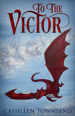
It doesn't seem quite right to me, so I played around with it a little. Please understand: these are rough mock-ups. I don't have access to the font in layers. Note that the clouds go nearly to the top of the wing. Moving the font around will destroy that, and you'll have to add it back in visually.
2. The all-red font was bugging me, as was the placement. So I tried making the font less red and moving things around a bit.
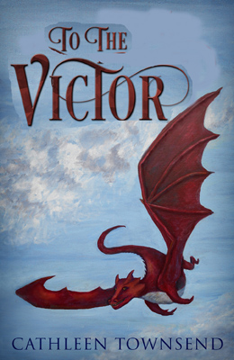
The sky is messed up on this fix (and on all the others). Please try to visualize it with a proper sky. Feathering everything back in is a whole lot of work. This is just to decide which option to pursue.
3. I tried a gold font (actually more of an orange).
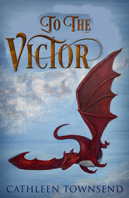
I thought I would like this one more, but the primary red-yellow-blue triad is really getting on my nerves. Still, I include it here because you never know, and all of them have slightly different font placements.
4. I tried a blue font.
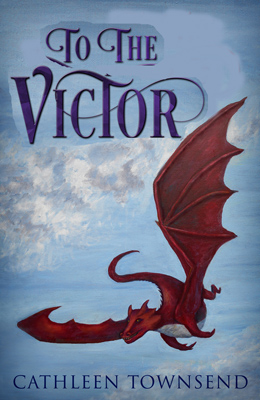
This one bugged me for one of the strangest reasons. Even though I used a blue that borders on purple, the whole thing ended up looking like it was patriotic to me. I'm actually concerned that someone will think that I'm a yee-haw Trump supporter with this thing. Please tell me I'm overthinking this. I wouldn't want it to be the case that Trump could screw up even my dragon book cover.
5. I tried combining red and blue.

I actually like this one the best so far. The blue font on the top and bottom seems to frame the whole thing to me.
On all of these, the title font ends up looking like it's sitting on a straight line of clouds. That will be fixed in the final version. I'm just trying to decide which one that will be.")
So, which font placement and colors do you like best? Is there a clear winner, or should I make another mock-up?
Thanks so much in advance, everyone who responds.
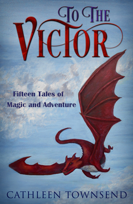
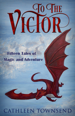
ETA: This book has a subtitle: Fifteen Tales of Magic and Adventure. Does that have to go on the cover, or is it enough that it's on the title page?
ETA2:
6. Now, with added subtitle:

ETA3:
7. Original placement with subtitle--subtitle font is a placeholder until DDD makes me a better one.
ETA again
8. all-red title font with placeholder subtitle
There--I think I've got all the bases covered.
This is the second round of cover discussions with Deranged Doctor Design. Let me show you what I've got so far.
1. The original revision they sent me this morning.
It doesn't seem quite right to me, so I played around with it a little. Please understand: these are rough mock-ups. I don't have access to the font in layers. Note that the clouds go nearly to the top of the wing. Moving the font around will destroy that, and you'll have to add it back in visually.
2. The all-red font was bugging me, as was the placement. So I tried making the font less red and moving things around a bit.
The sky is messed up on this fix (and on all the others). Please try to visualize it with a proper sky. Feathering everything back in is a whole lot of work. This is just to decide which option to pursue.
3. I tried a gold font (actually more of an orange).
I thought I would like this one more, but the primary red-yellow-blue triad is really getting on my nerves. Still, I include it here because you never know, and all of them have slightly different font placements.
4. I tried a blue font.
This one bugged me for one of the strangest reasons. Even though I used a blue that borders on purple, the whole thing ended up looking like it was patriotic to me. I'm actually concerned that someone will think that I'm a yee-haw Trump supporter with this thing. Please tell me I'm overthinking this. I wouldn't want it to be the case that Trump could screw up even my dragon book cover.
5. I tried combining red and blue.
I actually like this one the best so far. The blue font on the top and bottom seems to frame the whole thing to me.
On all of these, the title font ends up looking like it's sitting on a straight line of clouds. That will be fixed in the final version. I'm just trying to decide which one that will be.
So, which font placement and colors do you like best? Is there a clear winner, or should I make another mock-up?
Thanks so much in advance, everyone who responds.
ETA: This book has a subtitle: Fifteen Tales of Magic and Adventure. Does that have to go on the cover, or is it enough that it's on the title page?
ETA2:
6. Now, with added subtitle:
ETA3:
7. Original placement with subtitle--subtitle font is a placeholder until DDD makes me a better one.
ETA again
8. all-red title font with placeholder subtitle
Last edited:
