Humorous thriller cover feedback please
- Thread starter Gregg Bell
- Start date
You are using an out of date browser. It may not display this or other websites correctly.
You should upgrade or use an alternative browser.
You should upgrade or use an alternative browser.

I always argue that a simple cover done well is better than a complicated one done poorly. Here, you've reached a bit beyond your skill set, and the result is an obviously self-published book. Either hire a more talented artist to execute the concept well, or back off to something you can accomplish with stock photos and fonts.
I always argue that a simple cover done well is better than a complicated one done poorly. Here, you've reached a bit beyond your skill set, and the result is an obviously self-published book. Either hire a more talented artist to execute the concept well, or back off to something you can accomplish with stock photos and fonts.
Thanks Kevin. Appreciate the feedback.


The first one in your new post (simple orange/blue graphic) is the best of the bunch. Emphasise "misdaventure" a bit to convey that it's a comedy, and I think you are on your way. You could probably work your "One nuclear crisis" tagline into the simpler cover and make it work as well.
Last edited:
The first one in your new post (simple orange/blue graphic) is the best of the bunch. Emphasise "misdaventure" a bit to convey that it's a comedy, and I think you are on your way. You could probably work your "One nuclear crisis" tagline into the simpler cover and make it work as well.
Thanks a lot, Kevin. I like that first one in the new post too, but, like you were saying, I'm wondering if it's going to convey that it's a comedy. I could underline "Mis" in "Misadventure" at the top but that won't do much. And adding the tagline without the missile won't really work.
Thanks a lot, Kevin. I like that first one in the new post too, but, like you were saying, I'm wondering if it's going to convey that it's a comedy. I could underline "Mis" in "Misadventure" at the top but that won't do much. And adding the tagline without the missile won't really work.
For the 'Misadventure problem' couldn't you have the Mis part maybe broken, or skewed somehow? Go comedy and have smoke spewing out of it, or something like that?
I do like the first cover in your second post, too, but I did find the 'Navy Seal Misadventure #1' kinda hard to read.
(Also liked the open humour in cover #2.
 )
)adding the tagline without the missile won't really work.
I think you are wrong on that: pretty sure that the tagline would work without an explicitly supporting image.
I like the first one in the first post. I don’t actually think you need to highlightthe “Mis” because I would assume a carton cover on a thiller would be humorous…
I have a couple of thoughts for you to consider:
For the orange/blue one, it has kind of an old school feeltoo it, and I like that. Things toconsider with that one.
Good job so far!
I have a couple of thoughts for you to consider:
- Move the Title up closer to the tagline. Just a tad to much room between the two.
- Decrease the landscape background by about 30% and move the parachutes up higher into the sky. For me, my eye is having a hard time separating the two elements. Where the palm tree and the Navy hit is really hard for me to read.
For the orange/blue one, it has kind of an old school feeltoo it, and I like that. Things toconsider with that one.
- All the elements are a bit crowded and could possibly use some white space. Perhaps shrink your name a bit and move it further down. Then shrink the main parachute down by 15% and center it between the title and your name.
- Is everything centered together? It seems like everything is a bit off…
Good job so far!
- Joined
- Dec 16, 2015
- Messages
- 10,310
- Reaction score
- 5,282
- Location
- Melbourne
- Website
- www.lanifrank.com
I think you are wrong on that: pretty sure that the tagline would work without an explicitly supporting image.
+1. Tagline definitely doesn't need the image.
Also +1 to the first cover in your second post being the best. The left hand parachute and the book title look a bit crowded to my eye, though (just a layperson here, no expertise). How does it look if you de-centre the title?
- Joined
- Mar 27, 2011
- Messages
- 16,939
- Reaction score
- 5,320
- Location
- Near the gargoyles
- Website
- www.alessandrakelley.com
Thanks a lot, Kevin. I like that first one in the new post too, but, like you were saying, I'm wondering if it's going to convey that it's a comedy. I could underline "Mis" in "Misadventure" at the top but that won't do much. And adding the tagline without the missile won't really work.
It seems to me that the comedy is neatly conveyed by the stick figures, the colors, and the typeface.
For the 'Misadventure problem' couldn't you have the Mis part maybe broken, or skewed somehow? Go comedy and have smoke spewing out of it, or something like that?
I do like the first cover in your second post, too, but I did find the 'Navy Seal Misadventure #1' kinda hard to read.
(Also liked the open humour in cover #2.
Thanks Muse. I prefer the first cover in the second post, but this book is so zany I'm wondering if I shouldn't be going with the humour in cover #2. Anyway I'm going to post a couple more.
I think you are wrong on that: pretty sure that the tagline would work without an explicitly supporting image.
I'm never wrong, Kevin. Yeah--LOL--just kidding. (Look at my signature line.) I took your suggestion and will post the cover with the tagline. (And a different font and different parachuters but the same concept.) Thanks.
I like the first one in the first post. I don’t actually think you need to highlightthe “Mis” because I would assume a carton cover on a thiller would be humorous…
I have a couple of thoughts for you to consider:
- Move the Title up closer to the tagline. Just a tad to much room between the two.
- Decrease the landscape background by about 30% and move the parachutes up higher into the sky. For me, my eye is having a hard time separating the two elements. Where the palm tree and the Navy hit is really hard for me to read.
For the orange/blue one, it has kind of an old school feeltoo it, and I like that. Things toconsider with that one.
- All the elements are a bit crowded and could possibly use some white space. Perhaps shrink your name a bit and move it further down. Then shrink the main parachute down by 15% and center it between the title and your name.
- Is everything centered together? It seems like everything is a bit off…
Good job so far!
Thanks very much, Tara, and I think your suggestions are great, but I've bailed on that cover. A lot of people who saw it thought it was a children's book. And I finally came to believe they were right.
+1. Tagline definitely doesn't need the image.
Also +1 to the first cover in your second post being the best. The left hand parachute and the book title look a bit crowded to my eye, though (just a layperson here, no expertise). How does it look if you de-centre the title?
Thanks Frank. I tried the tagline with that cover. Will try the de-centring too. (I'm posting again.)
It seems to me that the comedy is neatly conveyed by the stick figures, the colors, and the typeface.
Thanks Alessandra. I'm giving it a try. I'm posting right after this.
Okay, I took the garish blue out of the cover with the missile, and took a lot of your suggestions for adding a tagline to the cover with the orange parachuters. And I added a ? mark to the title. (I thought "Navy Seal Rescue" just sounded too much like a non-fiction book.) And I changed the parachuters a bit.
Since this is going to be a series I'm thinking it will be easier to do the cover with the dark blue background and orange parachuters. It will be easier because I can use icons for future covers. And it will be less cartoonish. But maybe cartoonish is better because believe me this book is very over the top. Thanks.


Since this is going to be a series I'm thinking it will be easier to do the cover with the dark blue background and orange parachuters. It will be easier because I can use icons for future covers. And it will be less cartoonish. But maybe cartoonish is better because believe me this book is very over the top. Thanks.
Still prefer the simpler graphic in the second example. Not a big fan of the brushy font, but I don't hate it, either.
Still prefer the simpler graphic in the second example. Not a big fan of the brushy font, but I don't hate it, either.
Thanks Kevin. Somebody told me the font I had in #4 was too juvenile. Anyway, this is my latest.

- Joined
- Mar 27, 2011
- Messages
- 16,939
- Reaction score
- 5,320
- Location
- Near the gargoyles
- Website
- www.alessandrakelley.com
I think it's better without the question mark.
Thanks Alessandra. I think so too.
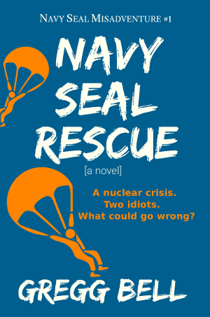
I added "[a novel]" because the title sounds so much like non-fiction. Is it looking pretty done? Thanks.
- Joined
- Dec 16, 2015
- Messages
- 10,310
- Reaction score
- 5,282
- Location
- Melbourne
- Website
- www.lanifrank.com
I added "[a novel]" because the title sounds so much like non-fiction.
Yeah ... I'm pretty sure what with the "Navy Seal Misadventure #1", the cartoony cover, the comedic tag line, and the fact you'll presumably be putting this in the fiction section ... it's safe to assume readers won't think they're buying a serious treatise on the armed services.
Yeah ... I'm pretty sure what with the "Navy Seal Misadventure #1", the cartoony cover, the comedic tag line, and the fact you'll presumably be putting this in the fiction section ... it's safe to assume readers won't think they're buying a serious treatise on the armed services.
Thanks Frank. LOL I guess that was pretty substantial overkill.