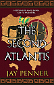
Book cover feedback - Callisthenes' Secret / Historical Fiction/thriller
- Thread starter ecerberus
- Start date
You are using an out of date browser. It may not display this or other websites correctly.
You should upgrade or use an alternative browser.
You should upgrade or use an alternative browser.
- Joined
- Jun 11, 2017
- Messages
- 150
- Reaction score
- 17
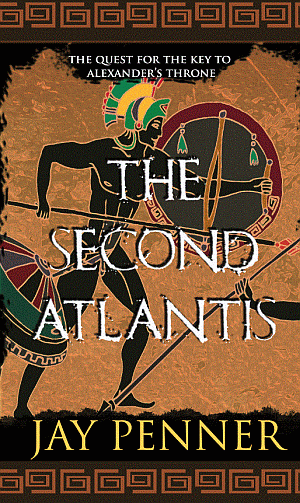
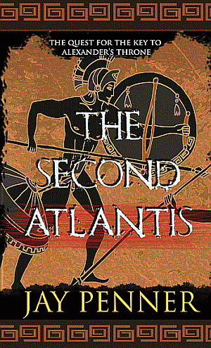
Back with a refreshed direction. A few things
1. A fuller image, bigger fonts.
2. Color harmony - not too many distracting ones
3. New tagline
My preference:
OR
OR
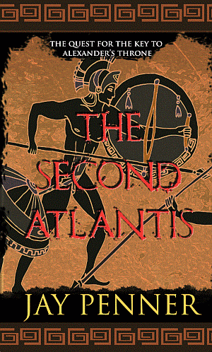
I don't quite like the third one due to red looking garish and not working well on the background.
Still very tempted to add an...ahem... blood splatter to the first one. But first let me hear if this direction works generally...
(PS don't worry about centering, cropping - I'm new to Photoshop and I just screenshot/copied a selected area, the image and its elements are centered to the guideline and if they're not, I will take care)
thank you
1. A fuller image, bigger fonts.
2. Color harmony - not too many distracting ones
3. New tagline
My preference:
OR
OR
I don't quite like the third one due to red looking garish and not working well on the background.
Still very tempted to add an...ahem... blood splatter to the first one. But first let me hear if this direction works generally...
(PS don't worry about centering, cropping - I'm new to Photoshop and I just screenshot/copied a selected area, the image and its elements are centered to the guideline and if they're not, I will take care)
thank you
Last edited:
I really like the new background and the design overall. I agree with you - the text color works better on image 1, but I don't understand the red streak behind the word Atlantis. Overall, the color scheme may now be too monochromatic. There's nothing there to really catch your eye on a bookshelf of other colorful covers.
- Joined
- Jun 11, 2017
- Messages
- 150
- Reaction score
- 17
@avekevin - I wanted to get to this base. I'll try a little bit of coloring. The red streak is well... a streak of red to break the monotony of orange ") Kind of like a bloody imprint or something, at least in my mind!
Kind of like a bloody imprint or something, at least in my mind!
Edit: added coloring and included in same message
Kind of like a bloody imprint or something, at least in my mind!Edit: added coloring and included in same message
Last edited:
Hi ecerberus,
I love that you are trying many things! I love and respect that fighting spirit, and congrats if you're new to photoshop and doing all this! Good work!
I do know photoshop well. I'll try and point out a few tricks, but it gets rather wordy, so go ahead and PM me if you don't get what I mean.
To my eye, all three are too busy. If you shrink it down, I don't think it would read. There's so much going on the eye dances all over, you want the title and your name to pop, everything else is secondary to that.
On the title. If you don't want to use a bolder font, or if bold isn't a variant available, dupe the layer with the text. (on mac, command+J with layer highlighted. Might be control+J on PC, but I'm not sure.) Make a selection on the type, then expand the selections a few points. Then fill over the type or in a new layer. This may mess up your kerning, so it may take a few times to get it right. You may want to do each word in separate layer. (or each letter) I think a bolder font and closer line spacing will improve the visibility. I do like the tighter drop, but maybe use in combination with a black outline too.
On the border. Make them uniform top and bottom, same size, and re-size the shape so it's not cut off on either end. May need to respace a bit. If it's going to be printed, you need some bleed, which is extra extension of color all around to compensate for printing and trimming. (Only along the outside of the whole thing, not the individual pieces.) You can make a guess and just open the canvas a little and then have a white border on a top layer to cover the trim area.
On the figure. The main thing is the weapon, shield, and figure. All the details and outlines are competing with the title. i would at the minimum, lower the contrast of the outlines. (Consider that the S is the same thickness as the outlines, it should be more dominant.) I still don't know what the thing hanging off his waist is. It looks like an umbrella to me (LOL!), and doesn't seem like something a fighter would have hanging off in a battle. I hope that helps. In the same way as the title above, try making a selection and just make the figure and the shield one black solid shadow. Just something to play with.
I'm not sure it can be done, but having the title alone on the parchment, and the figure beneath it may help.
Play with the sizing too. A bigger black behind the title will help, and in previous versions, you had the figure cut to show only the top parts, so maybe play with making the figure bigger, and then shorten the weapon so it can still show the point.
The cut off arm looks awkward to me. If you've got a full image of two warriors competing, maybe you could shrink considerably and show them below the tighter title.
Another general to consider. If the parchment is of the image, cutting off the figure where the rips are around the edges should be clear to observers, as in, they would get that. The borders take away from that simple notion of just a black surrounding the central image.
For any colors, google: egyptian parchment prints, and check the images. I would sample from those pallets in a similar fashion.
The tag, for example, is crowded in there over lapping the helmet. I know this is something you may intend to fix on your own.
Sorry for so many words. I did warn you, LOL! Mainly, less is more. Simpler is better. People are going to be seeing a very small version of whatever your final result is, and as stated, I love everything and anything Atlantis, so I think that's your strongest point! i really hope this helps, and feel free to PM. I can obviously go on and on, LOL! I tried to make suggestions for whatever direction you decide to go, so some may not agree, just giving you things to play with.
Again, congrats with your progress!
I love that you are trying many things! I love and respect that fighting spirit, and congrats if you're new to photoshop and doing all this! Good work!
I do know photoshop well. I'll try and point out a few tricks, but it gets rather wordy, so go ahead and PM me if you don't get what I mean.
To my eye, all three are too busy. If you shrink it down, I don't think it would read. There's so much going on the eye dances all over, you want the title and your name to pop, everything else is secondary to that.
On the title. If you don't want to use a bolder font, or if bold isn't a variant available, dupe the layer with the text. (on mac, command+J with layer highlighted. Might be control+J on PC, but I'm not sure.) Make a selection on the type, then expand the selections a few points. Then fill over the type or in a new layer. This may mess up your kerning, so it may take a few times to get it right. You may want to do each word in separate layer. (or each letter) I think a bolder font and closer line spacing will improve the visibility. I do like the tighter drop, but maybe use in combination with a black outline too.
On the border. Make them uniform top and bottom, same size, and re-size the shape so it's not cut off on either end. May need to respace a bit. If it's going to be printed, you need some bleed, which is extra extension of color all around to compensate for printing and trimming. (Only along the outside of the whole thing, not the individual pieces.) You can make a guess and just open the canvas a little and then have a white border on a top layer to cover the trim area.
On the figure. The main thing is the weapon, shield, and figure. All the details and outlines are competing with the title. i would at the minimum, lower the contrast of the outlines. (Consider that the S is the same thickness as the outlines, it should be more dominant.) I still don't know what the thing hanging off his waist is. It looks like an umbrella to me (LOL!), and doesn't seem like something a fighter would have hanging off in a battle. I hope that helps. In the same way as the title above, try making a selection and just make the figure and the shield one black solid shadow. Just something to play with.
I'm not sure it can be done, but having the title alone on the parchment, and the figure beneath it may help.
Play with the sizing too. A bigger black behind the title will help, and in previous versions, you had the figure cut to show only the top parts, so maybe play with making the figure bigger, and then shorten the weapon so it can still show the point.
The cut off arm looks awkward to me. If you've got a full image of two warriors competing, maybe you could shrink considerably and show them below the tighter title.
Another general to consider. If the parchment is of the image, cutting off the figure where the rips are around the edges should be clear to observers, as in, they would get that.
The borders take away from that simple notion of just a black surrounding the central image.For any colors, google: egyptian parchment prints, and check the images. I would sample from those pallets in a similar fashion.
The tag, for example, is crowded in there over lapping the helmet. I know this is something you may intend to fix on your own.
Sorry for so many words. I did warn you, LOL! Mainly, less is more. Simpler is better. People are going to be seeing a very small version of whatever your final result is, and as stated, I love everything and anything Atlantis, so I think that's your strongest point! i really hope this helps, and feel free to PM. I can obviously go on and on, LOL! I tried to make suggestions for whatever direction you decide to go, so some may not agree, just giving you things to play with.
Again, congrats with your progress!
Last edited:
- Joined
- Jun 11, 2017
- Messages
- 150
- Reaction score
- 17
Weekend refinement continues.
DarrenW - I took many elements of your feedback, went back to learning Photoshop to do some of the text stuff, and revised this again. So far, I realized that it never dawned upon me that most readers would never see the full size image of the cover when attempting to buy - they will see thumbnails or small sizes and make their decisions. That's when it hit me -- duh-- why y'all were emphasizing so much on title and author size.
So, with that, here's the next iter. I realize at some point this will hit human subjectivity, so there will always be something to tinker with and play. I tried many combinations before arriving at this, and I feel more and more at peace with it. There is a certain symbolism to the little isolated piece of parchment on the page (some may even figure it out!) and it's intentionally left that way.
Again, please ignore centering etc.
Here are the thumbnail sizes as well

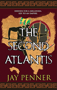
The Romanum Est font, which I really like (thanks Toothpaste), makes it slightly hard to make it stand out clearly in small thumbnails but I think where I landed works.
Thank you all so much. For a first time writer/photoshopper you have no idea how valuable all your input is.
DarrenW - I took many elements of your feedback, went back to learning Photoshop to do some of the text stuff, and revised this again. So far, I realized that it never dawned upon me that most readers would never see the full size image of the cover when attempting to buy - they will see thumbnails or small sizes and make their decisions. That's when it hit me -- duh-- why y'all were emphasizing so much on title and author size.
So, with that, here's the next iter. I realize at some point this will hit human subjectivity, so there will always be something to tinker with and play. I tried many combinations before arriving at this, and I feel more and more at peace with it. There is a certain symbolism to the little isolated piece of parchment on the page (some may even figure it out!) and it's intentionally left that way.
Again, please ignore centering etc.
Here are the thumbnail sizes as well
The Romanum Est font, which I really like (thanks Toothpaste), makes it slightly hard to make it stand out clearly in small thumbnails but I think where I landed works.
Thank you all so much. For a first time writer/photoshopper you have no idea how valuable all your input is.
Looks great ! I'm on phone, so only thing is tighten the line spacing on title and lower it. I think it will read better.
It really is looking great. I only have 2 suggestions. I would increase the font tracking to give a little more space between letters. They seem a little cramped. Another thought is, if you can find a way to fit it, add some graphic fragment to your new piece of parchment. It would help tie it into the main piece.
Kevin
Kevin
- Joined
- Jul 18, 2006
- Messages
- 8,745
- Reaction score
- 3,096
- Location
- Toronto, Canada
- Website
- www.adriennekress.com
This is so much better! I'm loving it! But . . . the title isn't quite working yet. I don't think white is the right colour and the font, which I know I know I suggested but that was back when you had a lot more clean lines in your image, is now too messy over the current image. You have so much going on in the background now, that the sort of splatter effect of the font makes it hard to read and one thing too many. I think maybe using a font like this instead would work better: https://www.dafont.com/roman-sd.font (if you don't like that have a scan through these pages of options: https://www.dafont.com/search.php?q=roman )
As to colour: white isn't awful, but it's not quite working for me. Maybe play again in the yellow range, maybe even a yellow that is almost white . . . or even a bright red . . . maybe. Hard to know without trying it.
(I know it's so much and so picky, but the thing is, title and image work together. The second you change one thing, you might then have to change something else. The worst thing a designer can do is slavishly stick to one thing because they like it even while the rest of the design has vastly changed. You are so close, and don't sacrifice legibility of the title (arguably one of the most important parts of the cover) because the font used to work but now doesn't quite)
(also again hope I'm not being too harsh, I think you're doing an amazing job, and we are so close. And the closer we get, the more nitpicky I get, lol. But seriously, you're doing an awesome job )
As to colour: white isn't awful, but it's not quite working for me. Maybe play again in the yellow range, maybe even a yellow that is almost white . . . or even a bright red . . . maybe. Hard to know without trying it.
(I know it's so much and so picky, but the thing is, title and image work together. The second you change one thing, you might then have to change something else. The worst thing a designer can do is slavishly stick to one thing because they like it even while the rest of the design has vastly changed. You are so close, and don't sacrifice legibility of the title (arguably one of the most important parts of the cover) because the font used to work but now doesn't quite)
(also again hope I'm not being too harsh, I think you're doing an amazing job, and we are so close. And the closer we get, the more nitpicky I get, lol. But seriously, you're doing an awesome job
)
Last edited:
- Joined
- Jun 11, 2017
- Messages
- 150
- Reaction score
- 17
@avekevin - I've done it, will be back next week.
@toothpaste - I hear you -- I will try font alternatives and some colors next week and see what I can come up with. Even I struggle with the title font now, so I guess I should try some options! So close... and now it's tweak, tighten, tinker, try time Thanks again.
(I never realized how much fun I'm having learning Photoshop. My day job is so far away from whatever I'm doing here - both writing and photoshopping, it's such a different feeling.)
@toothpaste - I hear you -- I will try font alternatives and some colors next week and see what I can come up with. Even I struggle with the title font now, so I guess I should try some options! So close... and now it's tweak, tighten, tinker, try time
Thanks again.(I never realized how much fun I'm having learning Photoshop. My day job is so far away from whatever I'm doing here - both writing and photoshopping, it's such a different feeling.)