- Joined
- Jun 11, 2017
- Messages
- 150
- Reaction score
- 17
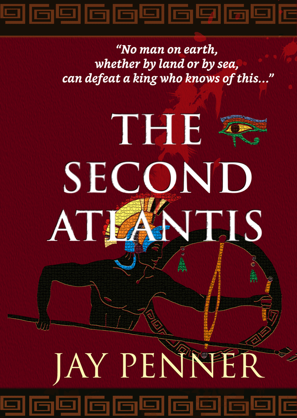
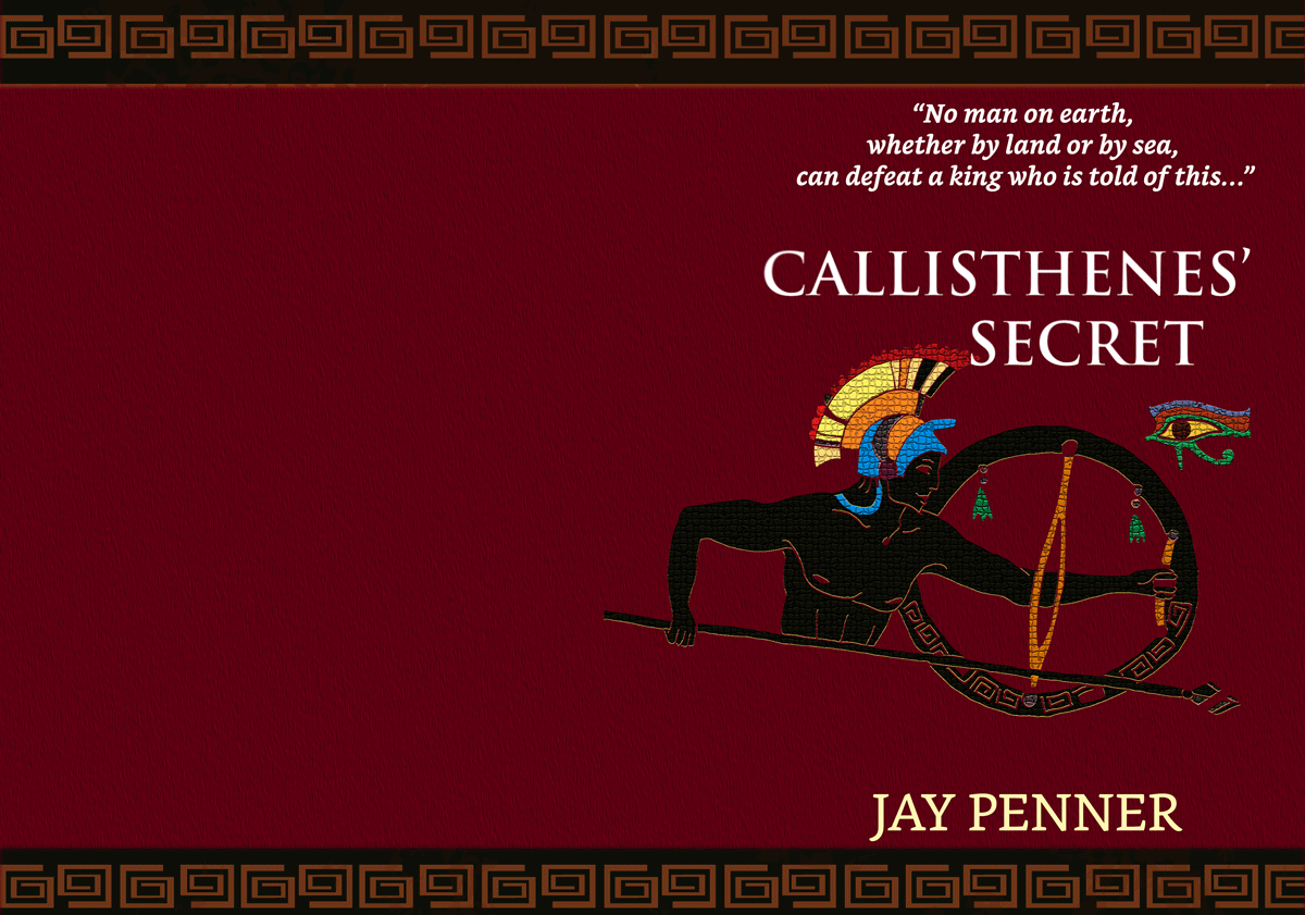
This is the intended front cover for a 5.5 x 8.5 format.
The "look" I'm going for is
- Simple/classy
- Symbolism that makes clear the era of the book (ancient Greece/Macedonia/Egypt)
- The back cover isn't done yet
Class or Trash? All feedback, thrashing welcome. First timer!
The "look" I'm going for is
- Simple/classy
- Symbolism that makes clear the era of the book (ancient Greece/Macedonia/Egypt)
- The back cover isn't done yet
Class or Trash? All feedback, thrashing welcome. First timer!
Last edited:
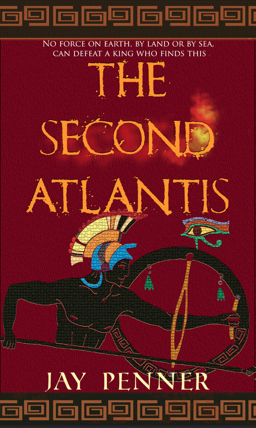
") ). Here's an example of merging the two ideas together to give it that thriller vibe but still ancient setting:
). Here's an example of merging the two ideas together to give it that thriller vibe but still ancient setting: