Folks have been asking that I give some kind of professional guide to putting covers together, specifically using typography.
As always, the usual advice: Hire a professional. Book design is so specialised that even trained graphic designers fail at it. It is not easy. It is why there are whole studios devoted to book and editorial design. Please hire someone who knows what they’re doing – in fact, make that person me because I’m very good at what I do – it will help you sell your book.
But people don’t, either they can’t or they won’t. As I said in my last post, at least go speak to designers about your budget, etc. But for those that aren’t going to do that, here’s a guide, of sorts, to typography in covers and covers in general. I’ll repeat myself a lot, things like “hire a designer”, “keep it simple”, “you don’t know what you’re doing”. I might even contradict myself in places: as a designer, I’m used to breaking the rules because I can, I know what I’m doing.
There are no real rules to type on covers and cover design apart from simple ones like make sure it’s readable and make content king. Otherwise, it’s so arbitrary, by necessity – else, all covers would be the same. Still, I’ll try and pop out some form of guide. It’ll be a long, there’s no real formula this time, just an illustration of principles to think about. As such, it could be useful or it could be utter garbage. Let’s go and see!
CONTENTS
1. Context and technical stuff
2. Types of cover
3. Constructing a cover
4. Spines
5. Back covers
A note on pre-made covers
1. CONTEXT AND TECHNICAL STUFF
In print, the cover of a book serves two roles: to protect the pages and to indicate the content. The adage of “don’t judge a book by its cover” is nonsense, as that’s all we do – in its literal sense and metaphorically. In digital, a cover is simply there to entice.
In many ways, designing for e-books is harder as, in the rapid space of the Internet, you need to pull the potential reader immediately. You don’t have the luxury of someone wandering around a bookshop, languid and calm, turning books over in their hands. Instead, you have people streaming through pages of similar thumbnailed covers. The best way to make your cover stand out is to make it look good. There is a difference between standing out and looking good, you can stand out for all the wrong reasons – which tends to be what covers here do. The problem is, when all self-published covers are falling short, even looking bad doesn’t make you distinct.
In digital, the front cover is all that matters. In print, we work to a clear hierarchy: front, back, spine. All of these need to work in tandem, along with prelim pages, to form the initial reading experience. It is something that book designers take great pains to craft carefully to form a coherent whole, in the same way as the title sequence of a film combines credits and imagery and sets the tone for the subsequent narrative.
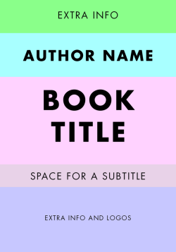
There are certain elements that need to be considered when developing a book cover, others that have to be included. Elements in the list below in italics are non-essential but still need to be considered.
cover
spine
back cover
As you can see, there is a lot that can go into a book and a lot to consider, but also very little that needs to be included. One thing I saw recently, which is a big no-no, is the designer’s name on a cover. This should be in the prelims, specifically in the imprint with the publishers’ and edition details. As always, keep things simple. If you don’t need to include something, don’t. You’ll just clutter your cover up.
What you should see from how many elements can and must be placed, is that it is hard to set defined rules for how to arrange a cover – especially typographically – there is no real formula to it, as there can be with laying out interiors.
2. TYPES OF COVER
Documentation
Covers designed to simply record what the book contains. This might take the form of a typographic title and/or a selection of representative images. Very “what you see is what you get”. This is the kind of cover that most people here put together, even though it’s best used in technical books or cookbooks – i.e. if I’m going to buy your cookbook, show me some food.
Conceptual
Covers that present the book’s content through visual allegory, pun, paradox, or cliché. Used to create a positive reaction to a cover through surprise and playing on a reader’s ego, along the lines of: “This book has a witty cover, I recognised its wit because I am intelligent.”
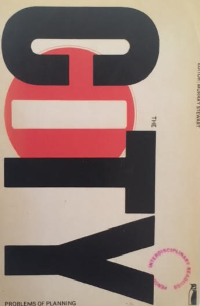
David Birdsall’s design for City is a perfect example of conceptual design.
Expressive
Most commonly used for novels and short stories. The aim – and this is the important bit – is not to make a summative visual but to evoke content – i.e. you don’t need to include everything that will be happening – it’s a hint to what is inside. Covers of this kind often use drawings, illustrations, or photography to allude to the story. The reader is drawn in by the ambiguity and the invitation to reflect on the meaning of the cover.
So, after all that context, how do we actually put a cover together? Like I said, there is no set formula that can be handed down. The cover design is, by necessity, arbitrary. Otherwise, all covers would be the same.
3. CONSTRUCTING A COVER
I’m going to show you a set of book covers with great use of typography and, where applicable, a great balance of text and image. Some of these are mine, just because, and others are pulled from publishers. In all cases, regardless of style, the typography is well thought-out, the hierarchy considered, and the cover generally beautiful. We’ll use these as examples later on too.
Imagery/content is king
The biggest mistake I see on the vast majority of covers on here is basically ignoring your content – and by extension, typography – in favour of imagery, specifically, imagery that tries to communicate every minute part of the book. Your protagonist living on a farm or drinking coffee does not mean the cover needs to have a barn in the background or have her holding a cup of coffee. If it’s not vitally important to the book, it doesn’t need to be on the cover.
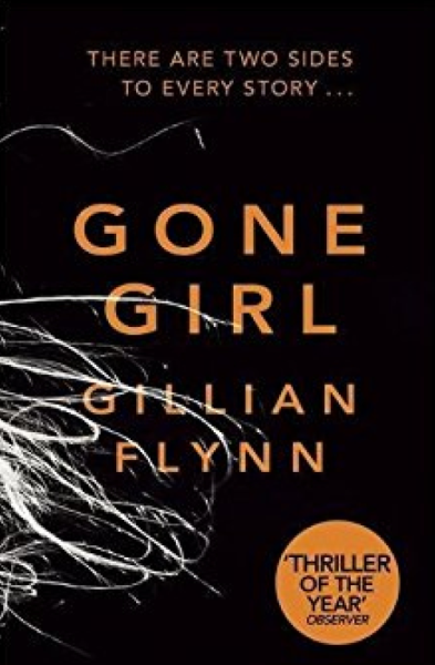
Subtle imagery works best for covers. Look at this cover for Gillian Flynn’s Gone Girl:
There’s one element of imagery: strands of hair. From that arrangement you can get the sense that there’s going to be a female element - in this case supporting the GIRL in the title – and the way the hair is splayed is reminiscent of scenes we’ve seen in crime films in which a murdered woman’s, somehow perfect, hair fans out on the floor. Take a look at that aside again: the image is supporting the content, not the other way around. That’s really important. Subtle imagery does this by default, as it sits in the background for the eye, no matter how prominent it is.
In most of the covers on here, typography and content take a backseat to awkward imagery. In the worst cases, these are images by the author or friends of the author, which isn't up to professional standards, or ill-chosen stock imagery. If you find an image you like, break it. Don’t just lay it on the page. Zoom right in, arrange it in chunks, mess around. You might think it’s the opposite of subtle to just zoom, but think about how a femme-fatale (hate that word) driven story with a woman on its cover compares with the woman’s leg draping over the cover from off-screen. The first is blunt and clumsy, the second, though a bit clichéd, reeks of mystery.
Your aim, at all times, should be to exalt the content of the cover, never to diminish it.
That doesn’t mean that you can’t use imagery and ornamentation, you just need to do it well. Look at this from William Morris/Kelmscott:

It’s typographic but also beautiful as all hell. Morris loved to emulate illuminated manuscripts. The thing is, unlike illuminated manuscripts, he still gave the content prominence over his decorations. Notice too how there is no imagery. Image-based covers are pretty new, and going back to 1900 all covers would have been typographic pieces. It's really since the 60s that we've been hit by so many image-based covers.
Bringing type out of an image
So, if you’re going to use images on your cover, how do you make sure your type is visible? Not every cover is going to have the kind of subtle imagery that Gone Girl has. I’m going to pick a random image from a free stock site and demonstrate alongside some professional examples.
Here are a few ways:
Use the free space in the image:
Go bold:
Use an overlay:
Use a plaque:
Make the image part of the text (only with bold type) or make the text interact with the image.
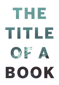
Image choice
Look at the image in the previous section. What could you say about it? I would say it represents a very good choice of image. If you’re not going to be able to edit your image effectively, you want to pick an image in which you can see how you can lay out type effectively over it.
As self-publishers, if you’re doing things right, you’re in a position to be in control of all elements of your cover as a kind of art director – this means you can brief for an image that doesn’t require any editing to give you room to use type, or you have a professional working with you that can brief an artist/illustrator.
While few of you are actually going to hire professional artists – from what I’ve seen, your friend the artist isn’t anywhere near professional – you’re probably going to raid the free stock image sites, places like Pexels and Pixabay, these give you access to some neat images but there’s a problem: they’re not unique. This isn’t necessarily a problem if you do something meaningful with them after all, publishers use stock photos all the time. But publishers have teams that make those images unique, most of you just slap the photo on the page, maybe with some weird effects to signify what you think represents a genre – no more faux green and purple mists on fantasy books, please.
Look at my website. That pencil image is a stock image from pixabay. It’s everywhere. I’ve seen it six or seven times since I started using it. It doesn’t weaken my brand because I’m using it as a background and for the colour, but imagine what happens if someone sees the same image on a bunch of book covers. It makes the first cover they saw look progressively cheaper and less original.
Images in which the subject is the whole photo means there’s going to be little room to add type AND keep the meaning of the image. It’s also, more importantly, going to complicate the image presented to the eye. In the previous section’s image, the sky is basically one colour, so text can sit happily on it. An image with lots of harsh changes in colour with text on top is going to be a bitch for the eye to decipher.
Typography
I’m going to be repeating a few of the things I said in my previous post, as they’re basic tenets of typography and just completely ignored by most people, that’s just a side-effect of dealing with typography a second time.
Heirarchy of information
This ties in with “content are king”. Making content the most important thing on your cover is one thing, but you have to arrange it in a way that gets the message across.
First, you need to decide what’s most important on your cover: the author or the title of the book. There’s no rule about this, it’s about preference. Some give the author’s name greater prominence, others the title of the book.
Generally, you’re going to want to make the title the most prominent thing on your cover.
Why?
Because making the name the most prominent thing on the cover means you think the name is the selling point. You might believe this is the case for you, in which case check your ego, because self-publishers need to rely on their content. Your friends and family might buy for your name, Joe Bloggs browsing Amazon won’t.
There are many ways to present hierarchy: through size differentiation, weight, alignment, style, to name a few. But the most important thing is how you control that. Pairing a script font title with a Futura author name can create a great dynamic, but if you don’t know how to construct a script, don’t know what you’re doing, and/or you’ve got some ugly free font, it’s going to look like crap no matter how much potential it had.
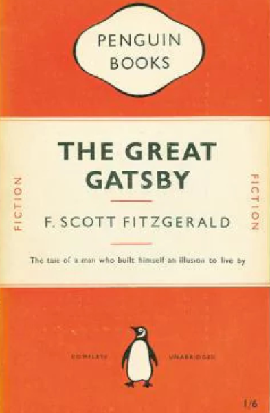
A great reference point for how the hierarchy works is Penguin’s classic layout:
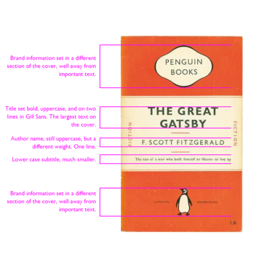
Look at that breakdown and see how easy it is to determine what the order of importance of information is on this cover. The really clever element is the choice to break up the cover into thirds, with the middle section being solely for text and a different colour. It makes the orange – a normally bold colour – less prominent, without detracting from how eye-catching it is. It also means information stored in the orange sections becomes secondary to the information in the white.
Making the information you want to be seen first bolder or larger is one way, using different weights and different fonts another. Look at this cover of The Worm Ouroboros:
The use of colour – black and white – to separate author and title, as well as the extra emphasis of the italics, means that, although the author name is bigger, the title and supplementary information is in the foreground of the cover – this is reinforced by the use of black in the illustrations.
The font for Eddison is also a custom font. You won’t find it on DaFont or anything because it was made just for this cover. How do I know that? I made it. I needed a tall, modular, resizable font and none existed that suited my needs. So I built one myself. Other designers might have just stretched an existing font, and done properly that might work. But in most cases, people just settle for a bad-looking font that half does the job.
But consider for a moment the effect of a custom font on that cover. Any number of things might draw people in, but don’t underestimate how “I’ve never seen that font” can influence people.
Font choice
I said it in the last guide and I’ll say it again here: there is no set font for any genre. Just because other books use a certain font, doesn’t mean that is the genre-trend or what you should do. Advanced or, as I call them, “fancy” fonts are unruly and take a lot of care to use. Using script on your romance novel, black letter on your fantasy novel, just stop it. You’ve ruined it.
Free fonts are valuable to people who can’t access professional typefaces. But free “fancy” fonts are universally terrible. You will not find a good, free-for-commercial-use script. It’s not going to happen. Even if you did get your hands on a good script, you’re not going to be able to use it.
Also, those scripts you see oin other books: custom. Very rarely will you see a book use Metroscript or even Zapfino. Generally, if a script is called for the designer will put it together themselves.
Look at the cover for All Our Lives:
That’s a custom script. Hand-drawn and reworked by a professional.
In the Name of the Rose:
Custom.
I’m singling out scripts because they get used most often by people who don’t know what they’re doing and always look awful. They look simple: here’s something pretty. But they’re actually some of the most complex type to work with.
If you want a script arrangement or any other kind of advanced type, black letter – no trained designer uses black letter, by the way, except ironically – or calligraphy, get a professional in. There’s no “but if you have to do it yourself” for this one, you get a professional in or don’t bother.
Unlike with interiors, there’s no “here’s what typefaces to use” formula. You’re not bound by a size restriction, so you can really use whatever type you want, so long as it is readable. Go into a bookshop, however, and you’ll see the vast majority of covers use fairly simple readable type. And if they do use something more advanced, it is normally given every chance of being instantly readable due to size, colour, or customisation.
Arrangement
Similar to, but not quite the same as, hierarchy. You may have the order of your information sorted, but you have to decide where to put it.
In the West, we generally work from left-to-right, top-to-bottom. But that doesn’t mean that the most important thing should be at the top or on the left. The overriding temptation is to centre everything, creating a symmetrical/balanced look. But that’s not always the best way.
In university, there was this weird kid called Adam who used to centre everything and it looked stupid. Not because centring is stupid but because he did it ALL THE TIME. Also, he smelled really bad and used to stalk one of my classmates, so there was that too.
Sometimes, ranging right can be far more effective than centring as it encourages a reader to actually open the book. In print, flow – from the top left of one page to the bottom right of the next – is really important in keeping the reader going. This happens naturally in flat text, but in things like cookbooks and technical books, it’s easy to block off flow with an errant image or caption.
Look again at the cover for All Our Lives:
It’s centred, sure. Everything sits tidily in the middle, except “A Novel”: this last bit of nonessential information breaks the alignment to then flow onto the next page. It’s very simple and very clever.
Mixing up different alignments is one of those things you need to know what you’re doing to pull off. In general, if you’re going to try it, you want to set up some kind of grid system.
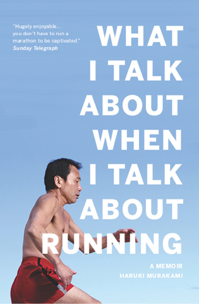
Let’s look at What I Talk About When I Talk About Running:
Two alignments, left and right. Pretty simple, so why the three column grid? It’s a slightly more advanced use of grid, but ranging right doesn’t mean just using the right margin. I’m using the entirety of the middle column to get the information that’s needed read first. All the words, but the last, start in the middle of this column and, more importantly, so does the face as the subject of the book. The review and the author name occupy the left and right columns respectively, meaning that the alignment is what is creating the hierarchy, not just the font size.
Negative space
Most common mistake #2: misunderstanding negative space. More space doesn’t equal negative space, so making everything tiny isn’t going to make your cover look good… unless you know what you’re doing
Negative space is about decreasing conflict and making your content as readable as possible.
This is a beautiful use of negative space:
But the text takes up the whole cover. The white space is what makes the cover effective because it serves to make the block text eminently more readable. It’s just as good an example of effective use of white space as anything from International Style.
The best example of negative space positively affecting a design – especially a book design – is the margin. It’s a set measure of negative space that gives the eye room to move around the page and latch on to what it needs to see. Whereas text running all the way to the edge will make it hard for the eye to keep up.
Making your type stand out
There’s a very easy way to make your type stand out. Just keep doing what you’re doing. Nothing is more noticeable than bad typography.
Making it stand out in a good way can be as simple as arranging fairly regular type in the proper way. You don’t have to do anything special to well-designed, well-arranged type to make it sparkle. Just look again at the Gone Girl cover:
It’s just type. Plenty of space on that upper case Gill Sans, but no distortions and, very importantly, no text effects – just sensible tracking.
If you’ve been using drop shadows or outerglows, or any kind of text effect on your covers, it’s time to stop. I mean it. They never look good. And never use gradients. I’ve not seen one example of these effects used properly – i.e. to enhance readability – instead, they’re thrown in as extraneous details or because you’ve used the worst colour combinations possible and can't get the text you've arranged incorrectly to work, but you're too stubborn to admit that.
We want to keep things as simple as possible.
Examples
First, let’s look at some example layouts. This isn’t really dealing with the what of type, but the how. I’m using Futura to demonstrate because it’s clear. These are really simple, frankly unimaginative, ways to lay your cover out. But it’s a general structure.
You have your vertical structure:
But you also have a horizontal structure, i.e. how you arrange your elements on a horizontal plane (margins in grey):
Another way to think of arranging your elements is creating relationships between them. Look at the very simple illustration below:
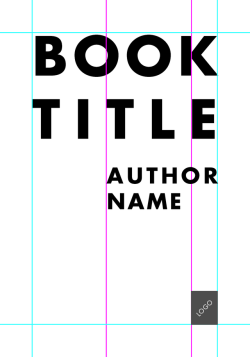
By aligning the author name with the middle T in TITLE we create an asymmetrical element without the use of a grid. We also create a stronger relationship between the title and author name by having the latter dependent on the position of the former. You can carry this on for other information, or create different relationships. The logo, being smaller, is aligned with the inside edge of the E in TITLE and, much like the “A NOVEL” on the All Our Lives cover, creates a sense of flow.
Colour
Choosing colours is just as arbitrary as type. No one can tell you exactly what colours to choose on your cover. However, try to keep to a limited palette. At most, you want to be using three colours yourself.
However, there are some rules you want to keep in mind when using colour – especially if your final intent is print:


Covers and prelims
A brief note on prelims: these are the pages that lead into the novel. They usually include contents, acknowledgements, dedications, and the imprint. Sometimes you’ll see forewords here too. But they also include title pages.
The way we normally deal with title pages is to have two: one as the next page after the cover and another before the book starts, i.e. after the contents and before chapter one begins. We take an exact copy of the front cover and place it on the first page. We take out all elements that aren’t type as well as, hopefully, reviews and taglines. Meaning we’re left with just the title, author, and publisher logo. For the second title we do the same, but just take over the title.
So, if this is my cover:
Then this might be my first title page, notice how I rearrange the layout to make it readable in black:
And my second title page will be so:

Let’s do it again with something we don’t need to rearrange, this is a cover for The Iliad:
So this is what the title page might look like:
It didn’t, the actual title page looked like this:
And the second might look like this:
Do you see?
3. SPINES
The primary purpose of spines is to serve as a kind of data point, a small identifier of a book on a shelf. This isn’t really where you sell a book, there’s not enough room. You should put a spine together with a mind that it needs to be found on a shelf at home not in a shop. Think how many times you’ve looked through bookshelves for a book based on the memory of the format and colour of the spine.
Unless you have a very thick spine, the text should be presented running from top-to-bottom. This is pretty much industry standard, though some presses in America run the text bottom-to-top instead. It’s all about making the text readable.
The best, and easiest way, to develop a spine is to start with a flat colour. If you have an image on your front cover, this can create an interesting dynamic. The use of imagery on spines is discouraged, as it takes really knowing what you’re doing to make it work. However, there are two ways to use imagery on a spine: spread and windowed.
Here is a photo of some books from my own bookshelves (with an unfortunate look at my skirting boards and carpet):
On the left are spines where the image of the cover spreads to the spine, on the right spines that window their images. The important thing to consider with spread images on the spine and back cover is that the text you place on top of them needs to be readable. Notice how the spines with images have parts of the image that aren’t particularly detailed. This means it is easy to set type on the spine despite the presence of a non-flat surface.
If you’ve presented the title and author name a certain way on the cover, you should keep these consistent on the spine. That doesn’t mean you have to fit your exact arrangement in, just that if you, say, put your title in orange Helvetica and your author in black Caslon the same should be true for how it’s shown on the spine. The exception to this is illustrations. If you’ve got an artist to illustrate some text, you can show it differently on the spine.
Whereas you can express yourself with covers, you should try and reign it in for spines. Here are some examples of great typographic book covers from David Pearson’s work for the Great Ideas series:
And here are the spines:
You see how all the covers are different (they actually use contextual cues for their design) but all the covers are consistent? This is really important when working on a series: consistent elements throughout the series to identify each book as part of a group. But the simplicity of the spines means that you’re not going to struggle to read them as you might if the illustrative typography had been carried over into spines.
So, if it’s simple type use it on the spine if it’s illustrative do something simpler for the spine.
Here’s a decent structure for spines, one that most adhere to. I’ve turned it horizontal for ease:

Elements can be shrunk and you don’t have to include the windowed image, but that is the general hierarchy of spines: title, author, logo. Sometimes the author might appear ahead of the title, for the reason we mentioned before.
Obviously, it’s important to consider the size of your spine. Thin spines will follow the above structure, but you might have space to set the text perpendicular to the spine:

4. BACK COVERS
Back covers are probably the hardest things to design for a book cover, just because you’ve spent most of your time on the front, put together a spine, and now you’ve got this whole other cover to link in. It’s the mistake even experienced book designers make, they forget to think of all three elements as a whole.
The back cover wants to link into the front cover in some way. The best way to do this is to carry over what you’ve used on the front to the back, i.e. if you have an image, make it large enough to stretch across the whole cover. Otherwise, linking through type is the most basic way of doing this.
Say you’ve used Gill Sans on the front cover, use it again on the back. This is one of the few times you’re allowed to set running text in sans-serif. Why? Because at most you’ve got two paragraphs to decipher and, providing you follow the guidelines set out in my previous post, the eye can manage to read two paragraphs of sans-serif without exhausting itself.
As always, the best advice for DIY: keep it simple. Back covers aren’t there to entice, the front does that, they’re there to inform. You’ve got the reader to pick the book up so now tell them why they’ll love it – this makes the readability of every element really important.
Let’s look at a few examples:
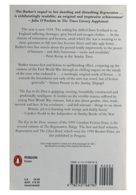

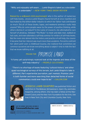
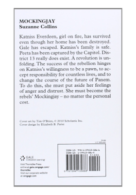
These are all good. All different, but they do what they need to. They show the blurb, give the details on pricing and whatever else is needed (bar codes, publisher logo and information). Even the last example, full as it is, is a perfectly acceptable back cover.
Let’s look at a couple of bad examples:

This is for Divergent by Veronica Roth. This is professionally made – yes, even we can slip up – and it is vile. Firstly, they’ve used a mixture of uppercase and small caps in a sans-serif typeface – looks like Gill Sans – which cannot look good because very few sans-serifs have well-designed small caps. Then they add onto that moments of italic Gill Sans in upper case and small caps! Aaaaaah, it’s like hell’s typographer got at this one.
There’s so many different kinds of type here – bold orange, white small caps, regular orange small, smaller white, logotype – all set on a variable background – grey to blue – and with a very obvious drop shadow. Seriously, that drop shadow is so far away from the letters it may as well be a new line of text.
Compare it to a similar book, The Hunger Games series, and you can see how simplicity and readability don't detract from the cover of a book. Just because it might look “boring” doesn’t mean it isn’t effective.
Then there’s this:
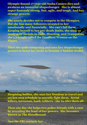
It’s visible. Okay, it is we have to give it that. But there’s no meaningful information, just a very long and poorly set blurb. The margins are uneven and there is a chasm between two halves of the blurb because the image gets in the way. Obviously, this is self-published. The creator probably had their hands-tied about using bright yellow because that’s the only colour that would show up on that image. This isn’t THAT far removed from most self-published covers, and it really shows what happens when you give too much attention to the image.
The lessons to take away: KEEP. IT. SIMPLE. You’re not a designer, you don’t know what looks good, so keep it simple so there are fewer ways to make mistakes. Focus on readability of the information and presenting it as clearly as possible. Keep type and imagery consistent across the entirety of the cover, this makes it easier to flow from front to back to front and is far more professional the disparate elements.
Let’s take a quick look at a full cover, from Penguin Modern Classics:
This is a great cover. It’s also part of a large and ongoing series and the designer has made sure there are going to be no issues with applying this style to each new book in the collection. It’s simple and attractive. The use of grey is problematic over the black & white image, but it’s also striking. The light grey elements on the front are given a gloss and metallic overlay to bring them out of the image and nullify printing issues, and this effect is repeated on the back for consistency. It’s not quite silver, but it’s close enough.
The most important thing is that the whole thing is consistent. There is one typeface used for this cover – ONE. Most covers I see on here go to town on picking all the fonts possible, this is hugely successful with one. The monochrome colour scheme also brings out the orange in the logo but doesn’t let it overpower the cover.
Most important is the clarity. This whole cover is clear. The image is there but it is held in the background, differentiation is handled with changes in size and colour, and the hierarchy is eminently clear. Look and learn.
A note on pre-made covers
A few of you don’t actually make covers yourself but instead look to pre-made services. This is pretty admirable, you acknowledge your lack of skill but also your lack of budget, so you look to a professional for slightly lower-quality, non-bespoke covers. There’s nothing wrong with that at all. What is wrong with it is that most of the pre-made covers I’ve seen used, most of the services I see advertised, are not professional. In short, they’re taking advantage of low-budget publishers by pretending to design book covers when they don’t: in many cases, they’re worse than what some self-publishers do themselves.
There are a couple of decent services I know of, myself and Books Covered spring to mind, but otherwise I’ve not seen a professional offering ready-to-publish (that’s what professionals call them, by the way) covers. If you’re going to go down the pre-made route, I’m going to offer one piece of advice – if you’re not going to use the two examples I highlighted – because I really am not comfortable with what these people do to self-published authors and that, at times, self-publishers have no choice but to resort to these misleading services.
If you find a pre-made designer or a specific cover and it isn’t from the two services I mentioned, then take a quick jpg of it and email it to a designer – a real, professional one. It might seem cheeky to do so, and some designers might not respond positively to it, but ask them whether it looks remotely professional. It only takes one word for a designer to tell you whether you’re on the right track (yes or no). Don’t keep the image, don’t try and get it edited by a designer; that’s stealing. But if you’re not sure of the quality of a cover designer – a sure sign they’re pretty pants – don’t be scared to ask people who actually know. If you’re going to shell out £150/$200 on a pre-made cover, you want to make sure it’s worth it.
Hopefully this is helpful to people.
As always, the usual advice: Hire a professional. Book design is so specialised that even trained graphic designers fail at it. It is not easy. It is why there are whole studios devoted to book and editorial design. Please hire someone who knows what they’re doing – in fact, make that person me because I’m very good at what I do – it will help you sell your book.
But people don’t, either they can’t or they won’t. As I said in my last post, at least go speak to designers about your budget, etc. But for those that aren’t going to do that, here’s a guide, of sorts, to typography in covers and covers in general. I’ll repeat myself a lot, things like “hire a designer”, “keep it simple”, “you don’t know what you’re doing”. I might even contradict myself in places: as a designer, I’m used to breaking the rules because I can, I know what I’m doing.
There are no real rules to type on covers and cover design apart from simple ones like make sure it’s readable and make content king. Otherwise, it’s so arbitrary, by necessity – else, all covers would be the same. Still, I’ll try and pop out some form of guide. It’ll be a long, there’s no real formula this time, just an illustration of principles to think about. As such, it could be useful or it could be utter garbage. Let’s go and see!
CONTENTS
1. Context and technical stuff
2. Types of cover
3. Constructing a cover
Imagery
Typography
- Bringing type out of an image
[*]Image choice
Typography
- Heirarchy of information
[*]Type choice
[*]Arrangement
[*]Making your type stand out
[*]Examples
[*]Colour
[*]Covers and prelims
4. Spines
5. Back covers
A note on pre-made covers
1. CONTEXT AND TECHNICAL STUFF
In print, the cover of a book serves two roles: to protect the pages and to indicate the content. The adage of “don’t judge a book by its cover” is nonsense, as that’s all we do – in its literal sense and metaphorically. In digital, a cover is simply there to entice.
In many ways, designing for e-books is harder as, in the rapid space of the Internet, you need to pull the potential reader immediately. You don’t have the luxury of someone wandering around a bookshop, languid and calm, turning books over in their hands. Instead, you have people streaming through pages of similar thumbnailed covers. The best way to make your cover stand out is to make it look good. There is a difference between standing out and looking good, you can stand out for all the wrong reasons – which tends to be what covers here do. The problem is, when all self-published covers are falling short, even looking bad doesn’t make you distinct.
In digital, the front cover is all that matters. In print, we work to a clear hierarchy: front, back, spine. All of these need to work in tandem, along with prelim pages, to form the initial reading experience. It is something that book designers take great pains to craft carefully to form a coherent whole, in the same way as the title sequence of a film combines credits and imagery and sets the tone for the subsequent narrative.
There are certain elements that need to be considered when developing a book cover, others that have to be included. Elements in the list below in italics are non-essential but still need to be considered.
cover
- image
- author name in full
- book title, plus subtitle where required
- additional cover text, e.g. “award winning”
- publisher’s logo
spine
- author name in full
- book title, plus subtitle where required
- publisher’s logo
back cover
- ISBN/barcode
- RRP
- blurb/book description
- breakdown of issues covered
- reviewers’ quotes
- author biography
- list of previous publications
As you can see, there is a lot that can go into a book and a lot to consider, but also very little that needs to be included. One thing I saw recently, which is a big no-no, is the designer’s name on a cover. This should be in the prelims, specifically in the imprint with the publishers’ and edition details. As always, keep things simple. If you don’t need to include something, don’t. You’ll just clutter your cover up.
What you should see from how many elements can and must be placed, is that it is hard to set defined rules for how to arrange a cover – especially typographically – there is no real formula to it, as there can be with laying out interiors.
2. TYPES OF COVER
Documentation
Covers designed to simply record what the book contains. This might take the form of a typographic title and/or a selection of representative images. Very “what you see is what you get”. This is the kind of cover that most people here put together, even though it’s best used in technical books or cookbooks – i.e. if I’m going to buy your cookbook, show me some food.
Conceptual
Covers that present the book’s content through visual allegory, pun, paradox, or cliché. Used to create a positive reaction to a cover through surprise and playing on a reader’s ego, along the lines of: “This book has a witty cover, I recognised its wit because I am intelligent.”
David Birdsall’s design for City is a perfect example of conceptual design.
Expressive
Most commonly used for novels and short stories. The aim – and this is the important bit – is not to make a summative visual but to evoke content – i.e. you don’t need to include everything that will be happening – it’s a hint to what is inside. Covers of this kind often use drawings, illustrations, or photography to allude to the story. The reader is drawn in by the ambiguity and the invitation to reflect on the meaning of the cover.
So, after all that context, how do we actually put a cover together? Like I said, there is no set formula that can be handed down. The cover design is, by necessity, arbitrary. Otherwise, all covers would be the same.
3. CONSTRUCTING A COVER
I’m going to show you a set of book covers with great use of typography and, where applicable, a great balance of text and image. Some of these are mine, just because, and others are pulled from publishers. In all cases, regardless of style, the typography is well thought-out, the hierarchy considered, and the cover generally beautiful. We’ll use these as examples later on too.
Imagery/content is king
The biggest mistake I see on the vast majority of covers on here is basically ignoring your content – and by extension, typography – in favour of imagery, specifically, imagery that tries to communicate every minute part of the book. Your protagonist living on a farm or drinking coffee does not mean the cover needs to have a barn in the background or have her holding a cup of coffee. If it’s not vitally important to the book, it doesn’t need to be on the cover.
Subtle imagery works best for covers. Look at this cover for Gillian Flynn’s Gone Girl:
There’s one element of imagery: strands of hair. From that arrangement you can get the sense that there’s going to be a female element - in this case supporting the GIRL in the title – and the way the hair is splayed is reminiscent of scenes we’ve seen in crime films in which a murdered woman’s, somehow perfect, hair fans out on the floor. Take a look at that aside again: the image is supporting the content, not the other way around. That’s really important. Subtle imagery does this by default, as it sits in the background for the eye, no matter how prominent it is.
In most of the covers on here, typography and content take a backseat to awkward imagery. In the worst cases, these are images by the author or friends of the author, which isn't up to professional standards, or ill-chosen stock imagery. If you find an image you like, break it. Don’t just lay it on the page. Zoom right in, arrange it in chunks, mess around. You might think it’s the opposite of subtle to just zoom, but think about how a femme-fatale (hate that word) driven story with a woman on its cover compares with the woman’s leg draping over the cover from off-screen. The first is blunt and clumsy, the second, though a bit clichéd, reeks of mystery.
Your aim, at all times, should be to exalt the content of the cover, never to diminish it.
That doesn’t mean that you can’t use imagery and ornamentation, you just need to do it well. Look at this from William Morris/Kelmscott:
It’s typographic but also beautiful as all hell. Morris loved to emulate illuminated manuscripts. The thing is, unlike illuminated manuscripts, he still gave the content prominence over his decorations. Notice too how there is no imagery. Image-based covers are pretty new, and going back to 1900 all covers would have been typographic pieces. It's really since the 60s that we've been hit by so many image-based covers.
Bringing type out of an image
So, if you’re going to use images on your cover, how do you make sure your type is visible? Not every cover is going to have the kind of subtle imagery that Gone Girl has. I’m going to pick a random image from a free stock site and demonstrate alongside some professional examples.
Here are a few ways:
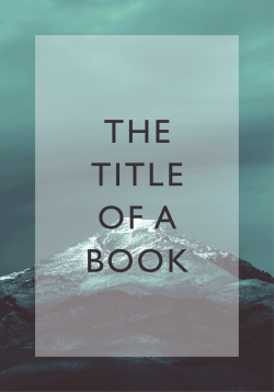
Use the free space in the image:
Go bold:
Use an overlay:
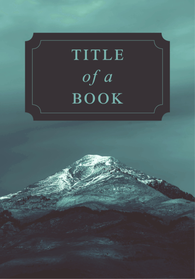
Use a plaque:
Make the image part of the text (only with bold type) or make the text interact with the image.
Image choice
Look at the image in the previous section. What could you say about it? I would say it represents a very good choice of image. If you’re not going to be able to edit your image effectively, you want to pick an image in which you can see how you can lay out type effectively over it.
As self-publishers, if you’re doing things right, you’re in a position to be in control of all elements of your cover as a kind of art director – this means you can brief for an image that doesn’t require any editing to give you room to use type, or you have a professional working with you that can brief an artist/illustrator.
While few of you are actually going to hire professional artists – from what I’ve seen, your friend the artist isn’t anywhere near professional – you’re probably going to raid the free stock image sites, places like Pexels and Pixabay, these give you access to some neat images but there’s a problem: they’re not unique. This isn’t necessarily a problem if you do something meaningful with them after all, publishers use stock photos all the time. But publishers have teams that make those images unique, most of you just slap the photo on the page, maybe with some weird effects to signify what you think represents a genre – no more faux green and purple mists on fantasy books, please.
Look at my website. That pencil image is a stock image from pixabay. It’s everywhere. I’ve seen it six or seven times since I started using it. It doesn’t weaken my brand because I’m using it as a background and for the colour, but imagine what happens if someone sees the same image on a bunch of book covers. It makes the first cover they saw look progressively cheaper and less original.
Images in which the subject is the whole photo means there’s going to be little room to add type AND keep the meaning of the image. It’s also, more importantly, going to complicate the image presented to the eye. In the previous section’s image, the sky is basically one colour, so text can sit happily on it. An image with lots of harsh changes in colour with text on top is going to be a bitch for the eye to decipher.
Typography
I’m going to be repeating a few of the things I said in my previous post, as they’re basic tenets of typography and just completely ignored by most people, that’s just a side-effect of dealing with typography a second time.
Heirarchy of information
This ties in with “content are king”. Making content the most important thing on your cover is one thing, but you have to arrange it in a way that gets the message across.
First, you need to decide what’s most important on your cover: the author or the title of the book. There’s no rule about this, it’s about preference. Some give the author’s name greater prominence, others the title of the book.
Generally, you’re going to want to make the title the most prominent thing on your cover.
Why?
Because making the name the most prominent thing on the cover means you think the name is the selling point. You might believe this is the case for you, in which case check your ego, because self-publishers need to rely on their content. Your friends and family might buy for your name, Joe Bloggs browsing Amazon won’t.
There are many ways to present hierarchy: through size differentiation, weight, alignment, style, to name a few. But the most important thing is how you control that. Pairing a script font title with a Futura author name can create a great dynamic, but if you don’t know how to construct a script, don’t know what you’re doing, and/or you’ve got some ugly free font, it’s going to look like crap no matter how much potential it had.
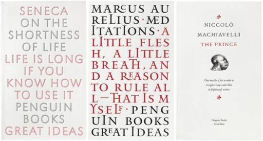
A great reference point for how the hierarchy works is Penguin’s classic layout:
Look at that breakdown and see how easy it is to determine what the order of importance of information is on this cover. The really clever element is the choice to break up the cover into thirds, with the middle section being solely for text and a different colour. It makes the orange – a normally bold colour – less prominent, without detracting from how eye-catching it is. It also means information stored in the orange sections becomes secondary to the information in the white.
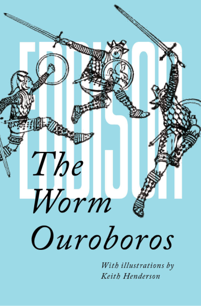
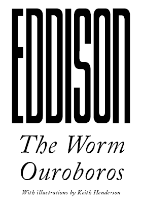
Making the information you want to be seen first bolder or larger is one way, using different weights and different fonts another. Look at this cover of The Worm Ouroboros:
The use of colour – black and white – to separate author and title, as well as the extra emphasis of the italics, means that, although the author name is bigger, the title and supplementary information is in the foreground of the cover – this is reinforced by the use of black in the illustrations.
The font for Eddison is also a custom font. You won’t find it on DaFont or anything because it was made just for this cover. How do I know that? I made it. I needed a tall, modular, resizable font and none existed that suited my needs. So I built one myself. Other designers might have just stretched an existing font, and done properly that might work. But in most cases, people just settle for a bad-looking font that half does the job.
But consider for a moment the effect of a custom font on that cover. Any number of things might draw people in, but don’t underestimate how “I’ve never seen that font” can influence people.
Font choice
I said it in the last guide and I’ll say it again here: there is no set font for any genre. Just because other books use a certain font, doesn’t mean that is the genre-trend or what you should do. Advanced or, as I call them, “fancy” fonts are unruly and take a lot of care to use. Using script on your romance novel, black letter on your fantasy novel, just stop it. You’ve ruined it.
Free fonts are valuable to people who can’t access professional typefaces. But free “fancy” fonts are universally terrible. You will not find a good, free-for-commercial-use script. It’s not going to happen. Even if you did get your hands on a good script, you’re not going to be able to use it.
Also, those scripts you see oin other books: custom. Very rarely will you see a book use Metroscript or even Zapfino. Generally, if a script is called for the designer will put it together themselves.
Look at the cover for All Our Lives:
That’s a custom script. Hand-drawn and reworked by a professional.
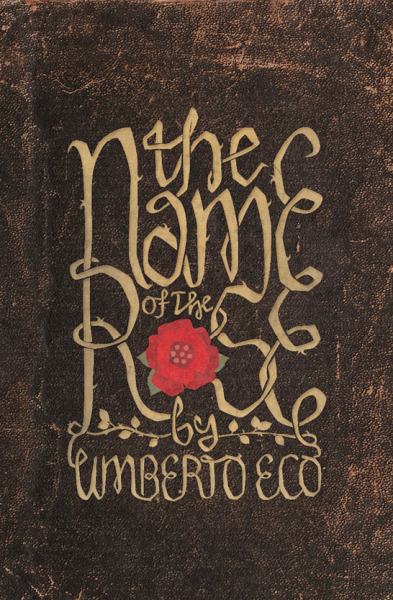
In the Name of the Rose:
Custom.
I’m singling out scripts because they get used most often by people who don’t know what they’re doing and always look awful. They look simple: here’s something pretty. But they’re actually some of the most complex type to work with.
If you want a script arrangement or any other kind of advanced type, black letter – no trained designer uses black letter, by the way, except ironically – or calligraphy, get a professional in. There’s no “but if you have to do it yourself” for this one, you get a professional in or don’t bother.
Unlike with interiors, there’s no “here’s what typefaces to use” formula. You’re not bound by a size restriction, so you can really use whatever type you want, so long as it is readable. Go into a bookshop, however, and you’ll see the vast majority of covers use fairly simple readable type. And if they do use something more advanced, it is normally given every chance of being instantly readable due to size, colour, or customisation.
Arrangement
Similar to, but not quite the same as, hierarchy. You may have the order of your information sorted, but you have to decide where to put it.
In the West, we generally work from left-to-right, top-to-bottom. But that doesn’t mean that the most important thing should be at the top or on the left. The overriding temptation is to centre everything, creating a symmetrical/balanced look. But that’s not always the best way.
In university, there was this weird kid called Adam who used to centre everything and it looked stupid. Not because centring is stupid but because he did it ALL THE TIME. Also, he smelled really bad and used to stalk one of my classmates, so there was that too.
Sometimes, ranging right can be far more effective than centring as it encourages a reader to actually open the book. In print, flow – from the top left of one page to the bottom right of the next – is really important in keeping the reader going. This happens naturally in flat text, but in things like cookbooks and technical books, it’s easy to block off flow with an errant image or caption.
Look again at the cover for All Our Lives:
It’s centred, sure. Everything sits tidily in the middle, except “A Novel”: this last bit of nonessential information breaks the alignment to then flow onto the next page. It’s very simple and very clever.
Mixing up different alignments is one of those things you need to know what you’re doing to pull off. In general, if you’re going to try it, you want to set up some kind of grid system.
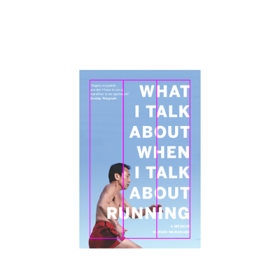
Let’s look at What I Talk About When I Talk About Running:
Two alignments, left and right. Pretty simple, so why the three column grid? It’s a slightly more advanced use of grid, but ranging right doesn’t mean just using the right margin. I’m using the entirety of the middle column to get the information that’s needed read first. All the words, but the last, start in the middle of this column and, more importantly, so does the face as the subject of the book. The review and the author name occupy the left and right columns respectively, meaning that the alignment is what is creating the hierarchy, not just the font size.
Negative space
Most common mistake #2: misunderstanding negative space. More space doesn’t equal negative space, so making everything tiny isn’t going to make your cover look good… unless you know what you’re doing
Negative space is about decreasing conflict and making your content as readable as possible.
This is a beautiful use of negative space:
But the text takes up the whole cover. The white space is what makes the cover effective because it serves to make the block text eminently more readable. It’s just as good an example of effective use of white space as anything from International Style.
The best example of negative space positively affecting a design – especially a book design – is the margin. It’s a set measure of negative space that gives the eye room to move around the page and latch on to what it needs to see. Whereas text running all the way to the edge will make it hard for the eye to keep up.
Making your type stand out
There’s a very easy way to make your type stand out. Just keep doing what you’re doing. Nothing is more noticeable than bad typography.
Making it stand out in a good way can be as simple as arranging fairly regular type in the proper way. You don’t have to do anything special to well-designed, well-arranged type to make it sparkle. Just look again at the Gone Girl cover:
It’s just type. Plenty of space on that upper case Gill Sans, but no distortions and, very importantly, no text effects – just sensible tracking.
If you’ve been using drop shadows or outerglows, or any kind of text effect on your covers, it’s time to stop. I mean it. They never look good. And never use gradients. I’ve not seen one example of these effects used properly – i.e. to enhance readability – instead, they’re thrown in as extraneous details or because you’ve used the worst colour combinations possible and can't get the text you've arranged incorrectly to work, but you're too stubborn to admit that.
We want to keep things as simple as possible.
Examples
First, let’s look at some example layouts. This isn’t really dealing with the what of type, but the how. I’m using Futura to demonstrate because it’s clear. These are really simple, frankly unimaginative, ways to lay your cover out. But it’s a general structure.
You have your vertical structure:
But you also have a horizontal structure, i.e. how you arrange your elements on a horizontal plane (margins in grey):
Another way to think of arranging your elements is creating relationships between them. Look at the very simple illustration below:
By aligning the author name with the middle T in TITLE we create an asymmetrical element without the use of a grid. We also create a stronger relationship between the title and author name by having the latter dependent on the position of the former. You can carry this on for other information, or create different relationships. The logo, being smaller, is aligned with the inside edge of the E in TITLE and, much like the “A NOVEL” on the All Our Lives cover, creates a sense of flow.
Colour
Choosing colours is just as arbitrary as type. No one can tell you exactly what colours to choose on your cover. However, try to keep to a limited palette. At most, you want to be using three colours yourself.
However, there are some rules you want to keep in mind when using colour – especially if your final intent is print:
Covers and prelims
A brief note on prelims: these are the pages that lead into the novel. They usually include contents, acknowledgements, dedications, and the imprint. Sometimes you’ll see forewords here too. But they also include title pages.
The way we normally deal with title pages is to have two: one as the next page after the cover and another before the book starts, i.e. after the contents and before chapter one begins. We take an exact copy of the front cover and place it on the first page. We take out all elements that aren’t type as well as, hopefully, reviews and taglines. Meaning we’re left with just the title, author, and publisher logo. For the second title we do the same, but just take over the title.
So, if this is my cover:
Then this might be my first title page, notice how I rearrange the layout to make it readable in black:
And my second title page will be so:
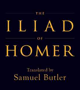
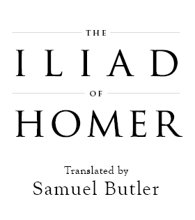
Let’s do it again with something we don’t need to rearrange, this is a cover for The Iliad:
So this is what the title page might look like:
It didn’t, the actual title page looked like this:
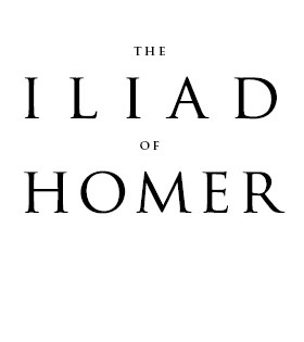
And the second might look like this:
Do you see?
3. SPINES
The primary purpose of spines is to serve as a kind of data point, a small identifier of a book on a shelf. This isn’t really where you sell a book, there’s not enough room. You should put a spine together with a mind that it needs to be found on a shelf at home not in a shop. Think how many times you’ve looked through bookshelves for a book based on the memory of the format and colour of the spine.
Unless you have a very thick spine, the text should be presented running from top-to-bottom. This is pretty much industry standard, though some presses in America run the text bottom-to-top instead. It’s all about making the text readable.
The best, and easiest way, to develop a spine is to start with a flat colour. If you have an image on your front cover, this can create an interesting dynamic. The use of imagery on spines is discouraged, as it takes really knowing what you’re doing to make it work. However, there are two ways to use imagery on a spine: spread and windowed.
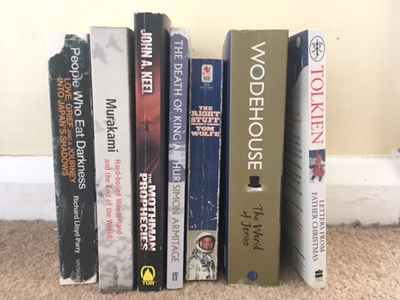
Here is a photo of some books from my own bookshelves (with an unfortunate look at my skirting boards and carpet):
On the left are spines where the image of the cover spreads to the spine, on the right spines that window their images. The important thing to consider with spread images on the spine and back cover is that the text you place on top of them needs to be readable. Notice how the spines with images have parts of the image that aren’t particularly detailed. This means it is easy to set type on the spine despite the presence of a non-flat surface.
If you’ve presented the title and author name a certain way on the cover, you should keep these consistent on the spine. That doesn’t mean you have to fit your exact arrangement in, just that if you, say, put your title in orange Helvetica and your author in black Caslon the same should be true for how it’s shown on the spine. The exception to this is illustrations. If you’ve got an artist to illustrate some text, you can show it differently on the spine.
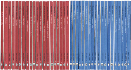
Whereas you can express yourself with covers, you should try and reign it in for spines. Here are some examples of great typographic book covers from David Pearson’s work for the Great Ideas series:
And here are the spines:
You see how all the covers are different (they actually use contextual cues for their design) but all the covers are consistent? This is really important when working on a series: consistent elements throughout the series to identify each book as part of a group. But the simplicity of the spines means that you’re not going to struggle to read them as you might if the illustrative typography had been carried over into spines.
So, if it’s simple type use it on the spine if it’s illustrative do something simpler for the spine.
Here’s a decent structure for spines, one that most adhere to. I’ve turned it horizontal for ease:
Elements can be shrunk and you don’t have to include the windowed image, but that is the general hierarchy of spines: title, author, logo. Sometimes the author might appear ahead of the title, for the reason we mentioned before.
Obviously, it’s important to consider the size of your spine. Thin spines will follow the above structure, but you might have space to set the text perpendicular to the spine:
4. BACK COVERS
Back covers are probably the hardest things to design for a book cover, just because you’ve spent most of your time on the front, put together a spine, and now you’ve got this whole other cover to link in. It’s the mistake even experienced book designers make, they forget to think of all three elements as a whole.
The back cover wants to link into the front cover in some way. The best way to do this is to carry over what you’ve used on the front to the back, i.e. if you have an image, make it large enough to stretch across the whole cover. Otherwise, linking through type is the most basic way of doing this.
Say you’ve used Gill Sans on the front cover, use it again on the back. This is one of the few times you’re allowed to set running text in sans-serif. Why? Because at most you’ve got two paragraphs to decipher and, providing you follow the guidelines set out in my previous post, the eye can manage to read two paragraphs of sans-serif without exhausting itself.
As always, the best advice for DIY: keep it simple. Back covers aren’t there to entice, the front does that, they’re there to inform. You’ve got the reader to pick the book up so now tell them why they’ll love it – this makes the readability of every element really important.
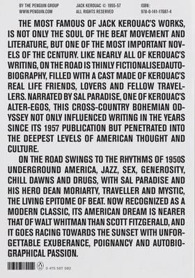
Let’s look at a few examples:
These are all good. All different, but they do what they need to. They show the blurb, give the details on pricing and whatever else is needed (bar codes, publisher logo and information). Even the last example, full as it is, is a perfectly acceptable back cover.
Let’s look at a couple of bad examples:
This is for Divergent by Veronica Roth. This is professionally made – yes, even we can slip up – and it is vile. Firstly, they’ve used a mixture of uppercase and small caps in a sans-serif typeface – looks like Gill Sans – which cannot look good because very few sans-serifs have well-designed small caps. Then they add onto that moments of italic Gill Sans in upper case and small caps! Aaaaaah, it’s like hell’s typographer got at this one.
There’s so many different kinds of type here – bold orange, white small caps, regular orange small, smaller white, logotype – all set on a variable background – grey to blue – and with a very obvious drop shadow. Seriously, that drop shadow is so far away from the letters it may as well be a new line of text.
Compare it to a similar book, The Hunger Games series, and you can see how simplicity and readability don't detract from the cover of a book. Just because it might look “boring” doesn’t mean it isn’t effective.
Then there’s this:
It’s visible. Okay, it is we have to give it that. But there’s no meaningful information, just a very long and poorly set blurb. The margins are uneven and there is a chasm between two halves of the blurb because the image gets in the way. Obviously, this is self-published. The creator probably had their hands-tied about using bright yellow because that’s the only colour that would show up on that image. This isn’t THAT far removed from most self-published covers, and it really shows what happens when you give too much attention to the image.
The lessons to take away: KEEP. IT. SIMPLE. You’re not a designer, you don’t know what looks good, so keep it simple so there are fewer ways to make mistakes. Focus on readability of the information and presenting it as clearly as possible. Keep type and imagery consistent across the entirety of the cover, this makes it easier to flow from front to back to front and is far more professional the disparate elements.
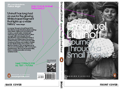
Let’s take a quick look at a full cover, from Penguin Modern Classics:
This is a great cover. It’s also part of a large and ongoing series and the designer has made sure there are going to be no issues with applying this style to each new book in the collection. It’s simple and attractive. The use of grey is problematic over the black & white image, but it’s also striking. The light grey elements on the front are given a gloss and metallic overlay to bring them out of the image and nullify printing issues, and this effect is repeated on the back for consistency. It’s not quite silver, but it’s close enough.
The most important thing is that the whole thing is consistent. There is one typeface used for this cover – ONE. Most covers I see on here go to town on picking all the fonts possible, this is hugely successful with one. The monochrome colour scheme also brings out the orange in the logo but doesn’t let it overpower the cover.
Most important is the clarity. This whole cover is clear. The image is there but it is held in the background, differentiation is handled with changes in size and colour, and the hierarchy is eminently clear. Look and learn.
A note on pre-made covers
A few of you don’t actually make covers yourself but instead look to pre-made services. This is pretty admirable, you acknowledge your lack of skill but also your lack of budget, so you look to a professional for slightly lower-quality, non-bespoke covers. There’s nothing wrong with that at all. What is wrong with it is that most of the pre-made covers I’ve seen used, most of the services I see advertised, are not professional. In short, they’re taking advantage of low-budget publishers by pretending to design book covers when they don’t: in many cases, they’re worse than what some self-publishers do themselves.
There are a couple of decent services I know of, myself and Books Covered spring to mind, but otherwise I’ve not seen a professional offering ready-to-publish (that’s what professionals call them, by the way) covers. If you’re going to go down the pre-made route, I’m going to offer one piece of advice – if you’re not going to use the two examples I highlighted – because I really am not comfortable with what these people do to self-published authors and that, at times, self-publishers have no choice but to resort to these misleading services.
If you find a pre-made designer or a specific cover and it isn’t from the two services I mentioned, then take a quick jpg of it and email it to a designer – a real, professional one. It might seem cheeky to do so, and some designers might not respond positively to it, but ask them whether it looks remotely professional. It only takes one word for a designer to tell you whether you’re on the right track (yes or no). Don’t keep the image, don’t try and get it edited by a designer; that’s stealing. But if you’re not sure of the quality of a cover designer – a sure sign they’re pretty pants – don’t be scared to ask people who actually know. If you’re going to shell out £150/$200 on a pre-made cover, you want to make sure it’s worth it.
Hopefully this is helpful to people.