Hi, everyone. Thanks in advance for taking a look at this.
I've got five possibilities for covers. Some of them are going to need a lot of work, so I made some mock-ups to see which ones people like best.
Note: All font is a merely a placeholder. I've learned that not everybody can see something that's not already there like I can, so I put some font in as a general idea of how it could be used with this image. The final result will be a heavy serif font, all caps for title and author name. Deranged Doctor will actually do the font for me, better than I can do it for myself. (Learned that lesson with Dragon Hoard.)
ETA: Given the amount of Photoshop work for every option but #2 and #5, if one of the other options is chosen, it'll just be used as a visual reference for a painting. It will probably take less time and be better branding, since I've painted all my other covers.
1. Swan boat
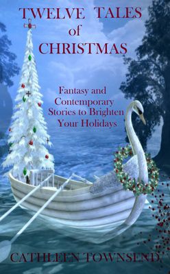
This one will need some work done to the image. The cross will go from the top of the Christmas tree, the back oars will go from both sides, and there's an oval shadow on the left margin that I'll need to get rid of. The boat needs a cast shadow.
Advantage: It clearly promises both fantasy and Christmas.
Disadvantages: I don't have a story with a swan boat in it for this collection, but I don't think that's a big deal. The main drawback is that the contrast on this one isn't as bold as some of the others.
2. Gold star tree
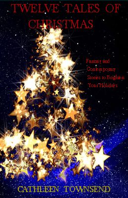
This was the first image I picked, which I mention because sometimes I can overthink things when I should've gone with my first impulse.
Advantages: It has the wonderful quality that the image needs no work whatsoever that I can see to use it. Also, the contrast is very strong, making it compelling in thumbnail.
Disadvantage: It hints of magic to me, but it doesn't overtly promise fantasy in the way the swan boat does.
3. Christmas gnome
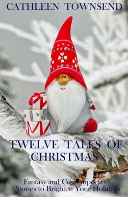
This one will also need some image work. I'll have to add snow and ice to the branch to eliminate any dark spots, making a decent canvas for the font. Also the red foot peeking out at lower right will need to be embedded in snow and given a cast shadow.
Advantages: It has red, which helps draw the eye, and it clearly promises fantasy.
Disadvantages: The contrast isn't awesome, although I suppose that could be partially remediated with font. My biggest reservation is that it's a photo of an ornament, and I don't know if that's classy enough for a cover.
4. Wizard/Santa (kind of a viewer's choice on this one)
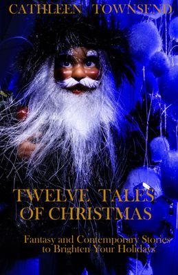
This one is going to need a lot of work. The rubber stamp tool will be my very best friend for a while, since I'll have to take out many white strands--mostly beard hairs, but there's some visual clutter in the blue puffballs on the right that needs to go, too. I'll have to blend in transitions--where the beard, mustache, eyebrows, etc. meet the face to make it look less like a doll.
ETA: Never mind, Photoshop is a lost cause with this image. But I could use it as a model to paint a very similar cover.
Advantages: This cover clearly promises fantasy, and the contrast is awesome. It pulls at the eye in thumbnail.
Disadvantage: Maybe even if I paint this image, it might not promise light-hearted fantasy.
5. Snowflake background

I didn't bother to put font on this because it'll basically be all font, and mine is pretty tame.
Advantages: It requires no image work, and the contrast should be good. Also, I have a snowflake story in the collection.
Disadvantages: I have a cordial dislike of all-font covers, especially for fantasy. They lack a compelling image to make a promise. I'd be completely relying on title to draw readers, and I'm not sure that's wise.
So, which cover(s) do you like best?")
I've got five possibilities for covers. Some of them are going to need a lot of work, so I made some mock-ups to see which ones people like best.
Note: All font is a merely a placeholder. I've learned that not everybody can see something that's not already there like I can, so I put some font in as a general idea of how it could be used with this image. The final result will be a heavy serif font, all caps for title and author name. Deranged Doctor will actually do the font for me, better than I can do it for myself. (Learned that lesson with Dragon Hoard.)
ETA: Given the amount of Photoshop work for every option but #2 and #5, if one of the other options is chosen, it'll just be used as a visual reference for a painting. It will probably take less time and be better branding, since I've painted all my other covers.
1. Swan boat
This one will need some work done to the image. The cross will go from the top of the Christmas tree, the back oars will go from both sides, and there's an oval shadow on the left margin that I'll need to get rid of. The boat needs a cast shadow.
Advantage: It clearly promises both fantasy and Christmas.
Disadvantages: I don't have a story with a swan boat in it for this collection, but I don't think that's a big deal. The main drawback is that the contrast on this one isn't as bold as some of the others.
2. Gold star tree
This was the first image I picked, which I mention because sometimes I can overthink things when I should've gone with my first impulse.
Advantages: It has the wonderful quality that the image needs no work whatsoever that I can see to use it. Also, the contrast is very strong, making it compelling in thumbnail.
Disadvantage: It hints of magic to me, but it doesn't overtly promise fantasy in the way the swan boat does.
3. Christmas gnome
This one will also need some image work. I'll have to add snow and ice to the branch to eliminate any dark spots, making a decent canvas for the font. Also the red foot peeking out at lower right will need to be embedded in snow and given a cast shadow.
Advantages: It has red, which helps draw the eye, and it clearly promises fantasy.
Disadvantages: The contrast isn't awesome, although I suppose that could be partially remediated with font. My biggest reservation is that it's a photo of an ornament, and I don't know if that's classy enough for a cover.
4. Wizard/Santa (kind of a viewer's choice on this one)
This one is going to need a lot of work. The rubber stamp tool will be my very best friend for a while, since I'll have to take out many white strands--mostly beard hairs, but there's some visual clutter in the blue puffballs on the right that needs to go, too. I'll have to blend in transitions--where the beard, mustache, eyebrows, etc. meet the face to make it look less like a doll.
ETA: Never mind, Photoshop is a lost cause with this image. But I could use it as a model to paint a very similar cover.
Advantages: This cover clearly promises fantasy, and the contrast is awesome. It pulls at the eye in thumbnail.
Disadvantage: Maybe even if I paint this image, it might not promise light-hearted fantasy.
5. Snowflake background
I didn't bother to put font on this because it'll basically be all font, and mine is pretty tame.
Advantages: It requires no image work, and the contrast should be good. Also, I have a snowflake story in the collection.
Disadvantages: I have a cordial dislike of all-font covers, especially for fantasy. They lack a compelling image to make a promise. I'd be completely relying on title to draw readers, and I'm not sure that's wise.
So, which cover(s) do you like best?
Last edited: