Feedback on Hawaii Recipe book

Sabrina Hartford

Registered
Joined
Jan 19, 2017
Messages
49
Reaction score
3
Here is my current recipe book.

51_Unu_Qtl_Xh_L.jpg


I am now making a sequel which has Hawaii desserts!!

I am struggling with this a bit, because there aren't that many good stock images of Hawaiian desserts and the images that do exist have bad cropping.


Here is my current short list:

Cover A
bonus2hawaii-10_copy.jpg


Cover B
bonus2hawaii-11_copy.jpg


Cover C
bonus2hawaii-8_copy.jpg


Cover D
bonus2hawaii-9_copy.jpg


Cover E
bonus2hawaii-4_copy.jpg


I really liked the next two, but the desserts don't have anything to do with Hawaii, so I am thinking I should drop them.

Extra 1
bonus2hawaii-1_copy.jpg


Extra 2
bonus2hawaii-3_copy.jpg


Thanks for any help that can be given, as I am struggling!
 

gtbun

Professional Book Designer
Super Member
Registered
Joined
Aug 4, 2016
Messages
67
Reaction score
15
Location
England
Website
geoffreybunting.co.uk
Not to be rude, but this looks a bit like knock-off packaging of Dr Oetker cake mixes and stuff. But it is full of the typical mistakes non-designers make, so hopefully I'll be able to help.

You're over-complicating it and have far too many elements/typefaces. Think of the hierarchy of information, generally this goes: "title, author, publisher", so the title wants to be the main draw - it's going to be what says "HAWAII AAAAAH" - then the author, and your little cake fairy badge thing. That should really be the order down the page, with the badge likely being the smallest element. Have a Google at other cookbooks, what you'll invariably find is books with a great photographic cover and very simple typography, below are some nice examples. The red also is a bit garish in blocks. Red type might work, but with blocks and badges it's all a bit confused.

cookbooks-2.nocrop.w710.h2147483647.jpg


Also, the imagery. When we think of Hawaii, we think pretty tropical. Even if the recipes inside aren't ALL coconuts and pineapples, an image that screams tropics would be much more effective than something communicating chocolate. I would choose one image and build your proposals on top of that.
 

Sabrina Hartford

Registered
Joined
Jan 19, 2017
Messages
49
Reaction score
3
@gtbun Thanks for that useful advice. I will reconsider it. Although I did use the badge on my first book and would like to use some device like a badge to convey that they are part of a series.

Also, the imagery. When we think of Hawaii, we think pretty tropical. Even if the recipes inside aren't ALL coconuts and pineapples, an image that screams tropics would be much more effective than something communicating chocolate. I would choose one image and build your proposals on top of that.
Out of interest, out of the images I picked, would you use any of them or something else entirely.


@Myrealana All of them are, apart from the ones on Extra 1 & 2. But if I went for those covers I would include the dessert in the book
 
Last edited:

gtbun

Professional Book Designer
Super Member
Registered
Joined
Aug 4, 2016
Messages
67
Reaction score
15
Location
England
Website
geoffreybunting.co.uk
Image C has a pretty clean look and the kind of framing that one might see in actual cookery photography. So long as those exact recipes are in the book. Obviously, the best thing to do would be to photography the actual food as you make it, as this would be best practice in most cookbooks in the mainstream

Generally, series of books will use the same lock-ups to communicate that they're part of a sequence, so whatever arrangement you used in the first book you'll want to lay on the second - even if it doesn't really work with the image. Changes in colour aren't unusual from book to book in a series, so you might consider softer colours to reduce the effect they have of overpowering the image and to bring your badge into focus.
 

Maggie Maxwell

Making Einstein cry since 1994
Super Member
Registered
Joined
Jun 21, 2013
Messages
11,730
Reaction score
10,510
Location
In my head
Website
thewanderingquille.blogspot.com
I'd say #1 to keep the size and framing to match your previous edition, but I'm not a fan of any of the recipe images in the initial set. There's just not enough color variety to pop for me. White, yellow, and red doesn't suggest Hawaii to me, and the 2nd one's background is too plain. The extras give a more island feel, but the recipes aren't. Is there a way you could combine those? Do some at-home food photography with a green screen background and photoshop in a stockimage island setting?

I prefer the font choice on Extra #2 (and if we're being honest, I would very much like the dessert in #2 too XD)
 

chompers

Super Member
Registered
Joined
Oct 19, 2013
Messages
2,506
Reaction score
384
Why don't you use a photo that you take yourself of one of the finished products? I always expect photos accompanying the recipe is an actual photo from the same recipe. If not, the author loses credibility.

And yes, don't use the last two. It would only look like you didn't know what you were doing. Like when people call Tex-Mex Mexican food or Panda Express authentic Chinese food.
 
Last edited:

Myrealana

I aim to misbehave
Super Member
Registered
Joined
Nov 29, 2012
Messages
5,425
Reaction score
1,911
Location
Denver, CO
Website
www.badfoodie.com
Not a designer, just someone who buys way too many cookbooks.

I agree with Maggie, on just about every point. A-E are just generic baking covers. I might not even notice the Hawaiian theme at a glance, and that'a a shame, since that's what distinguishes this book from others.
 

Sabrina Hartford

Registered
Joined
Jan 19, 2017
Messages
49
Reaction score
3
gtbun, Maggie Maxwell, chompers, Myrealana. Thanks for the feedback it has been really invaluable.


I modified my covers to bring in the Hawaii aspect:


Cover A
bonus2hawaii-13_copy.jpg


I also tried adding some Hawaii rainbows, but I think it's too over the top.

Cover B
bonus2hawaii-12_copy.jpg


I am thinking that maybe I do need to get rid of the badge (as has been suggested), but I am not sure what to replace it with to convey the identity of a series.

Thanks in advance for any more feedback.
 

gtbun

Professional Book Designer
Super Member
Registered
Joined
Aug 4, 2016
Messages
67
Reaction score
15
Location
England
Website
geoffreybunting.co.uk
You've actually gone in the opposite direction and added more elements. I don't really understand the sudden addition of multi-coloured bands and lettering in the second example and the issues of having about four different fonts in use still remains. Plus you've added the strange paint background into the image.

The reason that image worked quite well was due to the contrast between the mostly white image and the bright yellow, which was more than enough to convey a tropical image. While it wasn't the best image ever, it did give you the opportunity to return to the drawing board - perhaps for both books - and develop a more elegant solution. The badge certainly should be binned as the type doesn't really fit inside it anyway.

The middle example of the image I sent in my last comment is a great example of how you could lay out the cover with that image. It's simple, it's clean, and it brings the food to the forefront rather than big red blocks of colour. Obviously, the food your showing isn't your own, it's stock photos, but people will buy a cook book for one of two reasons 1) a name, if the chef is well-known or 2) because the images look great and makes the food look great.
 

Sabrina Hartford

Registered
Joined
Jan 19, 2017
Messages
49
Reaction score
3
@gtbun I was a bit worried that without a beach background the pineapple dessert might not communicate-Hawaii, but I will give the cleaner approach a try. I think I will also leave it for a few days to approach with fresh eyes!

I did try taking some of my own photos, but they come out bad as I don't have a good camera.
 

chompers

Super Member
Registered
Joined
Oct 19, 2013
Messages
2,506
Reaction score
384
Have you tried using your cell phone's camera? Cell phones have astonishingly good picture quality nowadays. And of course, taking it in daylight helps too.
 
Last edited:

Sabrina Hartford

Registered
Joined
Jan 19, 2017
Messages
49
Reaction score
3
@chompers. Thanks for the tip. I am using my cellphone, but it's old, so the camera sucks. :)
 

gtbun

Professional Book Designer
Super Member
Registered
Joined
Aug 4, 2016
Messages
67
Reaction score
15
Location
England
Website
geoffreybunting.co.uk
Mobile phone photos - even if it does come from the latest model - will not give you the picture quality or depth-of-field required to render the kind of photo one might expect to see on a recipe book. Given that you're designing your own covers, I doubt you have the budget to hire a professional, so you likely don't have much choice but to pursue stock imagery - however disingenuous that might be, in the end. Rather, you've got to make sure that the cover is beautiful enough to make up for the deficiencies in imagery.

Doing a quick search of self-published cookbooks, there are a few out there, and many of them look pretty awful. I found an interview with one self-publisher who has a half-decent cover and this is what she said about part of the process: "My friend Signe Birck, an incredible food photographer, agreed to take the photos, so I decided that we should just go for it! We didn’t have the budget to rent out a studio space or hire a styling team, so we just worked as a duo (with the help of my incredible intern Elise Inman), shooting in my apartment once or twice a week over the course of five months... I hired Katie as designer and Lauren Salkeld as editor."

It's also worth pointing out that she was a professional: "By this time, I had gone to culinary school, cooked professionally for 10 years, and written for major food magazines and websites."

Reading her account is exactly how I would expect someone who is serious about publishing cookbooks to go. They were fortunate enough to have a photographer friend - who one assumes did the work for free - and she hired the relevant professionals to fill the gaps in their own skillset (editing and designing). She also documented the process of making the cookbook on a blog before publishing, which would have served as great marketing leading up to release.

anna-watson-620x375.jpg
bonus2hawaii-12_copy.jpg


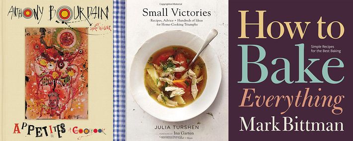
Here's her cover next to yours. You can see the difference; it's night and day. A lot of self-publishers design their own covers and I see hundreds of them on this forum and I am yet to see one (one!) that is even remotely professional looking. I don't say this to disparage the community, only to point out that to get from where you are to an even remotely professional look without the use of a designer is a long, up-hill struggle.

I often get questions posed to me about branding, about how to design a logo for free or where to get cheap work and my answer is always the same: "you get what you pay for" and if you really cared about what you're doing you would make sure you're getting the very best possible.

So, a little late to the game, my question is: do you really care about these books or are they just throwaway projects to end up lost on Amazon like most self-published books, or is it something you're passionate about and really want to create something meaningful? If it's the latter, you may need to change your tactics drastically.

Here is the link to the interview I mentioned.