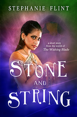
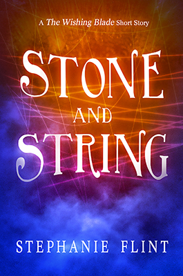
Version 6 is the best out these. The issue I think you're having with image and background is that it becomes too busy. If you look at books in the market, it is rare they will have a vibrant background with a detailed image in the foreground. So, while I think V6 is your best bet, if you have your heart set on having a character on the front I would lose the background - which is a shame because it's not a horrible background. In version 6, you could lose the italic text at the top and make it regular, thus allowing you to italicise the "Wishing Blade" part. Otherwise, it's a pretty good effort, one of the better covers I've seen put together by an author on here.
If you are looking for free stock resources, you could look at makerbook.net - and this applies to anyone, I guess - they have lists of free sites for these things. I've not used their stock photography myself, but I have found them an excellent resource for other things.
If you are looking for free stock resources, you could look at makerbook.net - and this applies to anyone, I guess - they have lists of free sites for these things. I've not used their stock photography myself, but I have found them an excellent resource for other things.
") I did take a look at the ones you linked, and I liked the veiled look, but still wasn’t sure it was quite what I was going for. I did some more searching through Deviant Art, and while I found several stock photos I liked, none quite had the look I was hoping for. The good news, though, is that search gave me ideas of what sort of keywords to try, and I found another potential stock image (would cost me around $15.00, but I think it might be starting to get closer to the right “look” after I did some work on the image, and that’s within my budget).
I did take a look at the ones you linked, and I liked the veiled look, but still wasn’t sure it was quite what I was going for. I did some more searching through Deviant Art, and while I found several stock photos I liked, none quite had the look I was hoping for. The good news, though, is that search gave me ideas of what sort of keywords to try, and I found another potential stock image (would cost me around $15.00, but I think it might be starting to get closer to the right “look” after I did some work on the image, and that’s within my budget).