Guide to Typography

Status
Not open for further replies.

thebloodfiend

Cory
Super Member
Registered
Joined
Apr 2, 2011
Messages
3,771
Reaction score
630
Age
30
Location
New York
Website
www.thebooklantern.com
The uniformity in a monospaced font left untweaked would really bother the dickens out of me.

Me, too.

I, however, can't do shit with comic sans, or the various other hideously ugly fonts primary school teachers love.

My third grade teacher had an affinity for Jokerman.

Jokerman.gif


Ugh.
 
Last edited:

Rachel Udin

Banned
Joined
Nov 19, 2010
Messages
1,514
Reaction score
133
Location
USA... sometimes.
Website
www.racheludin.com
Me, too.

I, however, can't do shit with comic sans, or the various other hideously ugly fonts primary school teachers love.

My third grade teacher had an affinity for Jokerman.
^^; Don't hotlink from other sites than your own. Just a friendly reminder.

Anyway, that would be really hard to typeset correctly. No. No. Please no.
 

Rachel Udin

Banned
Joined
Nov 19, 2010
Messages
1,514
Reaction score
133
Location
USA... sometimes.
Website
www.racheludin.com
If you really, really want to learn typography, I think it is worth your time to learn calligraphy and brush work. You will literally see how the positive space moves the negative space and why negative space matters so much in type, intuitively. And also why Comic Sans is fugly as hell. You can't quite get why Comic Sans is fugly until you do calligraphy--oh,you may think you know now, but wait until you make a b a few thousand times. Try to like up letters.

When you also do that it becomes easier to do the internal book design as well. You will find things like margins have function. The large space before chapter has function and figure out the difference between all those dashes you never cared about as a writer. You will become anal and then be able to shake your fist at type slapped onto the cover big and on a patterned background.

Those things I can never teach you without you actually doing the leg work. Doing calligraphy really does help with understanding the function of type.
 

Rachel Udin

Banned
Joined
Nov 19, 2010
Messages
1,514
Reaction score
133
Location
USA... sometimes.
Website
www.racheludin.com
Calligraphy Tutorials

Why is calligraphy important?

Preaching about negative space is one thing... but seeing *why* and feeling *why* is another. Being able to form good letters really informs you as an artist. It's like talking about writing a book in theory v. writing it. You will be able to feel it for yourself and spot errors when you do your own lettering and know which fonts to choose and steer clear of.

http://www.youtube.com/watch?v=3phzKsXpko8
http://www.youtube.com/watch?v=Q8lJWGnhyP4
http://www.youtube.com/watch?v=SVZLrRFzjlo
has a good primer on calligraphy. You can see why type depends on negative space so much. (plus his calligraphy makes me jealous and makes me die at how fast he is at it...) (Pay attention to the stroke order)

If you want to try it out: http://www.youtube.com/playlist?list=PL9B2B30A6BFE96C70 has a good series of tutorials on how to create letter forms. (felt pens die fast, but are useful for learning) Her letters aren't as pretty as the ones in the first set, but it talks about strokes and stroke types, which is useful. (Most people start learning Italic)

When you do it with the nib you can feel the structure of the letters. You feel how rigid type can be.


http://www.youtube.com/watch?v=CNklHfRSANE

has a show of how brush calligraphy is done and you can see how fast it is and how loose and free it seems, yet preserving negative space.


You can cry over this one: http://www.youtube.com/watch?v=yINOSCCCHdM (He's soooo good).

In Asian writing there are five types of strokes: http://top.at0086.com/Chinese-Cultural-Courses/Top-Five-Types-of-Strokes-in-Chinese-Calligraphy.html

The dot, also known as the "put" The Horizontal, the left slant, the right slant and the hook. The strokes and how they are formed inform you of how the positive space is defined by the negative space so much.


When you do it with a brush, you get a sense of flow and spacing. While you can be terrible at it, you start to get it intuitively.

Both will talk about pressure on the implements. With the first you have to follow the implement's width, the second you form the width purely by pressure and by feel. For an assignment I wore out the brushes I had because I closed my eyes to form the letter in my mind while doing it which helped me visualize the negative space and the control of the width. But with a real brush you have to keep moving.

However, with a calligraphy pen speed isn't the issue, it's the form that's the issue. (also much easier to learn lettering with)

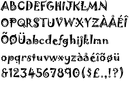
Anyway, if you get into that you'll be intuitive with font selections and also be able to tell terrible fonts right off the bat because of how they use their negative space. This in turn may help you choose better fonts overall. (though this is more for the graphic designers)

Learning type helps with graphic design overall. I mean the real typography stuff.

Rough order for if the Type isn't working (these are in order from memory--I didn't keep the sheet.)

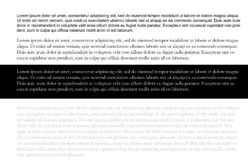
- Check the negative space
Did you break one of the many rules of type not on purpose? Margins, contrast, no patterned backgrounds. Check for readability--that's your first priority. This means fuss with your leading and tracking also.
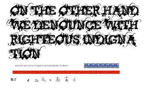
- Change the font.
Sometimes the font is simply not doing it. Sometimes the negative space usage is not right for the application. Are you sure that the font is the correct one? Check the font family concept in comparison to your own.

- Make the font in caps
*only* if your font allows it. No to copperplate, black letter, scripts, illuminated letters and brush fonts. Most other fonts can handle it. This is *not* the best option, under all applications, but it is the least drastic when you do have the option.

- Change the size of the font/check for margins.
Make the font bigger. Keep the margins in mind though.

- Change the color (I think it's size over color might have mixed them.)
Maybe there isn't enough contrast with the background.

... missing a few here... I forgot to keep the sheet and didn't realize online was so pitiful for the list...

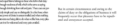
- If the font has a different weight, that's your second to last option.
Artificial bold usually does not pay attention to negative space. It's better to go with W2, W3, etc in which the person did it *for you* paying attention to the negative space.

- Artificial Bold is a *last* resort in typography.

In websites bold is a default setting over caps (mostly because of Jacob Neilsen, sociologist on websites and caps is considered yelling in internet lore), but for print applications, bold goes very, very last. And Italic is *not* an option in typography for visibility. Italics was invented in order to cram in more type. Some fonts were simply not designed to handle bold in the first place...
 
Last edited:

Rachel Udin

Banned
Joined
Nov 19, 2010
Messages
1,514
Reaction score
133
Location
USA... sometimes.
Website
www.racheludin.com
Since I've been seeing misconceptions about how type reads I thought I would make a short tutorial proving this sole point: Type reads on negative and not positive space.

In another words, contrast is more important in type than any other principle. In type, positive space moves negative space lending to readability.

Or from an artistic standpoint, when you write a letter, the positive space moves the negative space which creates the readability. It's NOT negative space is "filled" by positive space. It's positive space moving negative space and the negative space defining what the positive space is. (Or the dot on a large blank canvas principle.)

faceandcontrast_zps60351f5b.jpg

Larger version:
http://i1049.photobucket.com/albums/s381/RachelUdin/tutorial/faceandcontrast_zps17c855d5.jpg
First paragraph is arial (san-serif). Second is Garamond (a serif font). Third paragraph is white type on black in Garamond. This is a bit slower to read. The fourth paragraph you can barely see and thus is very slow to read. This is an example of contrast.

So, that given, that still doesn't prove my point.
e05c3daf-ce4f-451b-8a60-ecd20261fc6f_zps7a0d41b2.jpg


Bigger version: http://i1049.photobucket.com/albums/s381/RachelUdin/tutorial/typemisconceptions_zpsc0867131.jpg

Here are the biggest misconceptions about type on one page.

1. Bigger type will always read better.

No. Can you easily and quickly read those really large letters? What? It's 48 pt in the original. Why can't you? It's because all of those ink splatters are taking up negative space. Size isn't the biggest thing that makes type readable. It's the negative space. You can have very small type read fairly well as in the line that comes after it.

2. Type on a patterned background.
Can you read that quickly as the previous line? What? It's 12pt font. You should be able to read it.

Again, type reads on negative, not positive space. The type itself has no negative space, so discerning the letters is difficult.

3. I want to make the type bright! Complimentary colors are on the color wheel so...

This hurts so much. I have seen a pro author argue that they don't need a publisher and then put up something like that on their cover and I just think that proves the opposite. (Or why you need a someone who is a pro at type.)

100% brightness red does not read well on 100% brightness green. Sorry. I know how much you like Christmas, but trying to read that makes me feel sick. (Color theory also dictates things such as you should pay attention to the value/saturations of your colors in order to create emphasis.)

This rule that negative space is universal across languages, if they are created with a brush or a calligraphy tool. (Maybe with the exception of Ancient Egyptian?) This is why a well formed "a" is more readable than an ill-formed a in both Japanese and English, despite being different languages.

And why the last letter I drew you can't tell if it's a b or a d. It's a legible size, sure, but which letter is it? Or is it supposed to be theta?

So continuing on...

cbc3d471-2af3-4534-8575-371e445dbe97_zpsf1d03b22.jpg

Larger version: http://i1049.photobucket.com/albums/s381/RachelUdin/tutorial/marginsandspacing_zpse632afb9.jpg

The other thing people forget is MARGINS. The words on the left, can you read them as fast as the words on the right? It may look like it's a different font weight. It may even look like the type is smaller, but this is a lie. They are the same font size. They have the same line spacing (mostly). Despite that, the type on the right reads much, much faster. Again, type reads on negative space, not positive space.

Also the one on the left is foolish in general, since printers will crop up to a quarter inch. And if your client or yourself change your mind on going to print, this often means a lot of painful work would be involved in order to fix it. People object it's only going to be online so they can kill the margins. This does not work in terms of thinking long term and also thinking about how type actually reads.

The universal principle is that type reads on negative space, not positive space. Destroy that negative space in all the ways I've shown, and readability (and your marketability) goes down.

You can kind of entertain yourself by staring at the "Disney" logo, which for years I thought read "Disnep." (the "p" was silent and I was young. Only when the Mickey Mouse club came out was when I finally understood that it was spelled with a "y", not a "p". (I learned that elephant was spelled with a ph and there were silent letters in French... which is why I thought it was "Disnep".)
 
Last edited:

Ravioli

Crazy Cat Lady
Super Member
Registered
Joined
Jan 4, 2015
Messages
2,699
Reaction score
423
Location
Germany, native Israeli
Website
annagiladi.wixsite.com
This thread is very useful. I admit I used to think the over-the-top fonts were the best, you know, to make everything you create extra-special. Then, not too long ago, I came to appreciate the beauty of sober text that graces rather than spices up the image.
 

kevinwaynewilliams

Be blunt: I appreciate it
Super Member
Registered
Joined
Aug 18, 2013
Messages
555
Reaction score
53
Location
Phoenix
This thread probably needs to be addressed: my anti-virus software claims that many of the links in the top post are now the home of phishing scams and malware.
 
Status
Not open for further replies.