some thoughts and a cover of my own
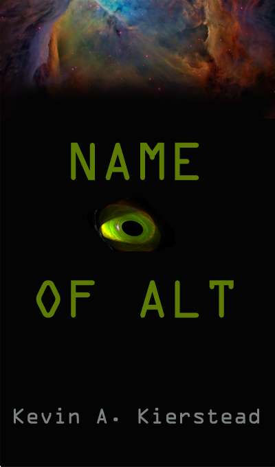
Name of Alt:
Splendad:
This cover hit me only lukewarm; it is visual to me but the four elements don't define the book enough (for me). I also didn't think the vertical/wave of 'Alt' does anything for you. As with another poster, I think I'd rather see one/two fonts at most. I'd also NOT have 'of' dangle as it does; more like--
Name
of
Alt
I could also see the blue moon/planet as a backdrop for your title as I laid it out above, but more centered/symmetric. The eye seems to hang meaningless and the 'bird'?? graphic is not discernable to me.** If I had to rearrange, I think I'd put the alien and bird character at the 7 and 5 o'clock position of the moon while having the title start above the moon and end inside it, probably necessitating a color change for legibility (as necessary).
Pantheon:
this one catches my eye immediately simply for being unique. I think you have a good contrast of color and when I put it in my 'would I notice this book cover on an endcap of a B&M store?', I definitely do.
I don't think I'd have gotten your take on a Greek western though, but it's close.* I get a Native American feel when I see it.
Overall, I like it.
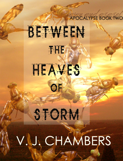
Between the Heaves of Storms:
V, I thought your cover was no doubt unique, but unless your book is about a swarm, it's offsetting. I also wasn't enamored with the 'heaves' part of your title; it's a 'different' word to be sure, but taking from my poetic experience, the word doesn't ring.
You can suggest that storms heave between spells of violence, but somehow I think a better word exists. I'm thinking; 'Between The Arms of Storm', or along the same lines, perhaps this: 'After The Thunder, Before the Rain'. Just ideas to consider.
Re the cover though, I'm not sure I'd pick your book out from others simply because the colors aren't contrasty enough.
Also, 'Apocalypse Two' is too far offset for my tastes. I guess from this last that you're portraying insects as all that survives an apocalypse, and though that's probably accurate, I guess I'd go with a more stereotypical backdrop (unless of course, the bugs are integral to your story). Just some thoughts.
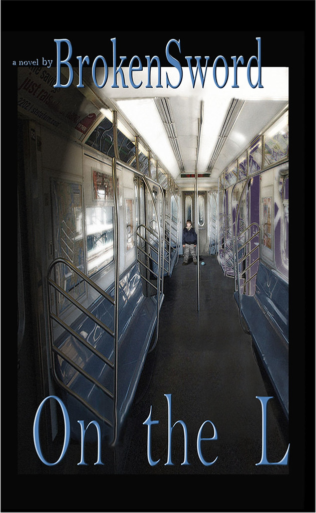
And for review, my current WIP proto cover idea;* For review purposes, I'll post both the front and back blurb, and the cover can be judged solely on it's own presentation and/or knowing the back blurb.* Thank you for any input/feedback.
* Just an aside; I know I don't need 'a novel by' but that's one of my conventions from my previous two books and I'll probably keep it, but feel free to mention if such gets in your way.* Also, I'm not nearly as worried about thumbnail/shrinkage because this cover is designed for print, not electronic publication.
I suppose I could redesign for both but I'm not writing to expose my name as much as my story; tis just my way.
Michael

Back cover copy;
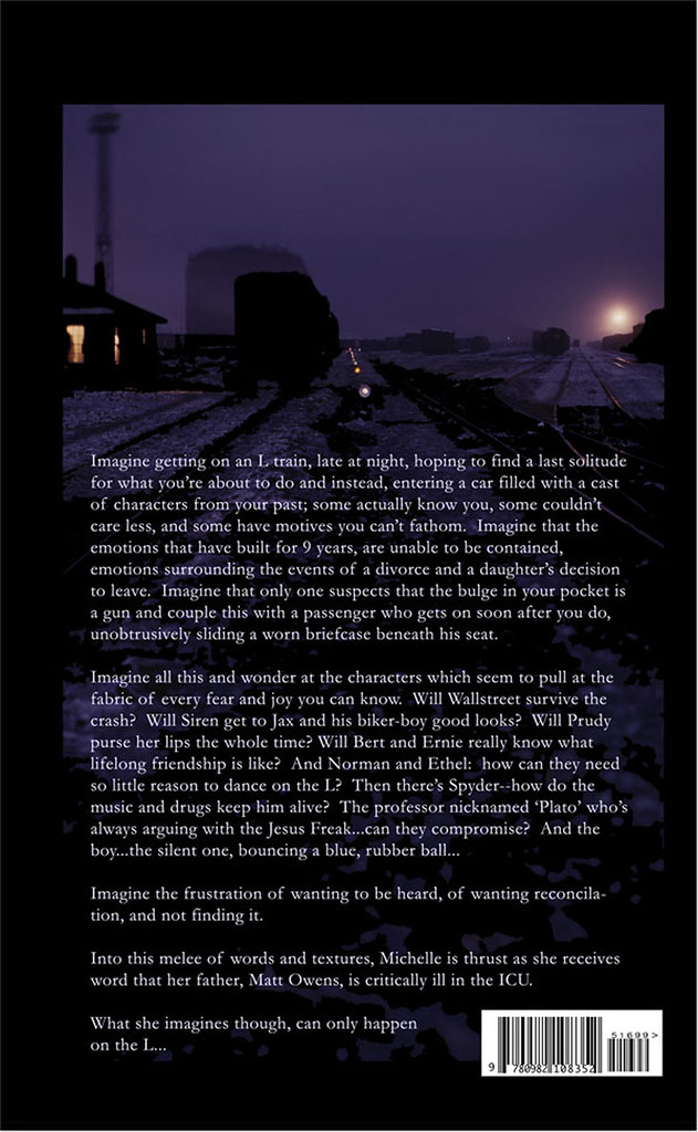
Imagine getting on an L train, late at night, hoping to find a last solitude for what you’re about to do and instead, entering a car filled with a cast of characters from your past; some actually know you, some couldn’t care less, and some have motives you can’t fathom. Imagine that the emotions that have built for 9 years, are unable to be contained, emotions surrounding the events of a divorce and a daughter’s decision to leave. Imagine that only one suspects that the bulge in your pocket is a gun and couple this with a passenger who gets on soon after you do, unobtrusively sliding a worn briefcase beneath his seat.
Imagine all this and wonder at the characters which seem to pull at the fabric of every fear and joy you can know. Will Wallstreet survive the crash? Will Siren get to Jax and his biker-boy good looks? Will Prudy purse her lips the whole time? Will Bert and Ernie really know what lifelong friendship is like? And Norman and Ethel: how can they need so little reason to dance on the L? Then there’s Spyder--how do the music and drugs keep him alive? The professor nicknamed ‘Plato’ who’s always arguing with the Jesus Freak...can they compromise? And the boy...the silent one, bouncing a blue, rubber ball...
Imagine the frustration of wanting to be heard, of wanting reconcilation, and not finding it.
Into this melee of words and textures, Michelle is thrust as she receives word that her father, Matt Owens, is critically ill in the ICU.
What she imagines though, can only happen
on the L...
")