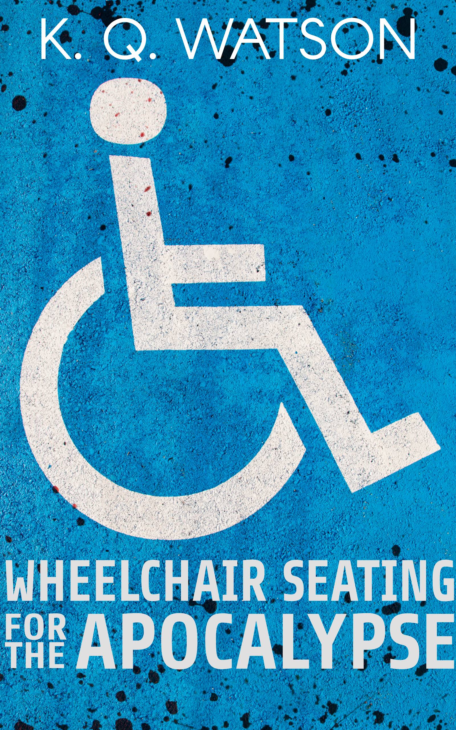
So I'm throwing up a bunch of my old shorts on Amazon and I need feedback on the cover for the first one. It's about a wheelchair bound woman who takes her death into her own hands during the zombie apocalypse.
I like where I am going with it but it feels like it's missing something.
I have limited digital art programs so please keep that in mind. I find GIMP too involved so I use Photopea.
Thanks!
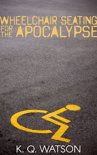
I like where I am going with it but it feels like it's missing something.
I have limited digital art programs so please keep that in mind. I find GIMP too involved so I use Photopea.
Thanks!