Book Cover Fonts

semolinaro

Always lost in thought.
Super Member
Registered
Joined
Mar 24, 2016
Messages
84
Reaction score
8
Location
True north strong and free
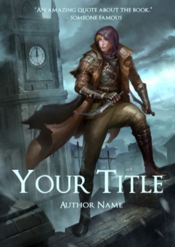
I'm hoping this isn't in the wrong forum, but I was wondering if anyone might be able to help me with a suggestion. I just finished getting a book cover finished and will be lettering it soon. However, I'm having trouble finding fonts and colours that stand out as they get lost in the background. I was hoping to be able to find software that allows for outlined fonts so that it may stand out. Here's what the cover looks like as of now:

[image removed for size]

It's really hard to get any colour or style of text to stand out here. Any kind of online software that might give me some more text editing options would be great, and so would recommendations. Thank you very much!
 
Last edited by a moderator:

Southpaw

The squirrel apocalypse is coming!
Kind Benefactor
Super Member
Registered
Joined
Nov 7, 2009
Messages
3,601
Reaction score
596
Location
the deep recesses of your mind
A better forum is the Art & Design forum. Maybe a mod will move this for you.

**You need to reduce your image size. The guidelines I think are 400 length/height and reduce ppi. This is so it doesn't bog down the site and it also allows members with dial up to see the post.

And it allow us to see an image in its entirety without scrolling. It's hard to answer your question without being able to see the image.

ETA: If all you're interested in is software, I suggest GIMP (free and will do what you want), no need to post your image.
 
Last edited:

alleycat

Still around
Kind Benefactor
Super Member
Registered
Joined
Apr 18, 2005
Messages
72,889
Reaction score
12,238
Location
Tennessee
Southpaw is correct. GIMP will let you outline text however much you want and in whatever color you want. It's an easy procedure.

Hold on while I move this to A&D, Book Covers.
 
Last edited:

Toothpaste

THE RECKLESS RESCUE is out now!
Super Member
Registered
Joined
Jul 18, 2006
Messages
8,745
Reaction score
3,096
Location
Toronto, Canada
Website
www.adriennekress.com
I'm a huge fan of dafont.com. A ton of font options. But make sure you read the licensing agreement for the one you choose. Sometimes they are free, but sometimes they want you to pay a fee. Usually it's no more than $15 though.

I'd caution against outlines etc because it looks more amateurish, like you don't know how to place font over text and are thus "cheating". I'd recommend a light font colour over the bottom part of your book. Maybe one of the blues from your sky. If you don't mind, I think I might play with your image and show you what I mean :) .

As for software . . . that's tough as I use photoshop. I'm sure others here can recommend some free ones though!
 
Last edited:

Toothpaste

THE RECKLESS RESCUE is out now!
Super Member
Registered
Joined
Jul 18, 2006
Messages
8,745
Reaction score
3,096
Location
Toronto, Canada
Website
www.adriennekress.com
See! No need for outlines, just a light colour that already exists within your cover artwork :) . This is obviously just an example using a font that I used for one of my book covers, not saying you need to or indeed should go with this one.

2d040ad8-6448-4c09-b917-e06fab612694_zpspymwcdzs.jpg
 

kevinwaynewilliams

Be blunt: I appreciate it
Super Member
Registered
Joined
Aug 18, 2013
Messages
555
Reaction score
53
Location
Phoenix
Your image has been removed (and I'm not certain if Toothpaste's image is a shrink of it, or just an example), so I'll just repeat the conventional wisdom on fonts: amateurs tend to over-rely on things like outlines and shadows. Professionals rely more on interesting font selections combined with skillful colour selections.

Toothpaste's technique of selecting a colour from the picture is an old standby. Sometimes, you want to do the exact opposite: given the blue/brown colour palette of the image in his example, an orange/black set of font colour choices would contrast and pop well.
 

alleycat

Still around
Kind Benefactor
Super Member
Registered
Joined
Apr 18, 2005
Messages
72,889
Reaction score
12,238
Location
Tennessee
The image posted by Toothpaste is the same as originally posted, but at a smaller size and with the addition of text.
 

RyanPArciero

Registered
Joined
Jun 16, 2016
Messages
6
Reaction score
0
I really like Toothpaste's design and recommendation. Simplicity is sometimes the best way to go. I also like how kevinwaynewilliams added that professionals often have a sharp eye for specific color selections. In my experience with my book, I had my cover designer create both the title text as well as the image for convenience's sake. It turned out rather well. Perhaps you can find someone to accomplish both for you in a pleasing way? Best of luck to you. :)
 

semolinaro

Always lost in thought.
Super Member
Registered
Joined
Mar 24, 2016
Messages
84
Reaction score
8
Location
True north strong and free
Hello everyone! So sorry about the image size, I was out all day and didn't get a chance to remove it. My bad, still learning about the forums.

Thanks so much for the input as well! I had no idea that outlining was an amateurish thing to do, because one of my favourite book trilogies of all time (Brandon Sanderson's 'Mistborn') has outline on the title. I'll have to keep that in mind. Also, thank you Toothpaste for the visual, I will give that a try and play around with some fonts! Thank you :)
 

AW Admin

Administrator
Super Member
Registered
Joined
Apr 19, 2008
Messages
18,772
Reaction score
6,287
I don't know that I'd state flat out that outlining is amateurish. I will state that there more options if you have a budget of the sort that cover artists working for big 5 publishers have, including software and licensed font suites.
 

Toothpaste

THE RECKLESS RESCUE is out now!
Super Member
Registered
Joined
Jul 18, 2006
Messages
8,745
Reaction score
3,096
Location
Toronto, Canada
Website
www.adriennekress.com
You're right, AW, I was being too general which is weird for me . . . ;) . I guess when it comes to people just starting to figure these things out I tend to recommend not doing certain things which unless done really well can easily result in an amateur look. I find outlining falls into that category. But that being said, if the OP is willing to play and do research and compare with other like covers and how they do it, it can absolutely work, yes.
 

Southpaw

The squirrel apocalypse is coming!
Kind Benefactor
Super Member
Registered
Joined
Nov 7, 2009
Messages
3,601
Reaction score
596
Location
the deep recesses of your mind
I've seen beautiful--professional--covers with titles where the text has been outlined. It's all in how you approach it. I have noticed that currently they don't seem to be in fashion at the moment though. What I've seen a lot of are textual titles. Just something to consider.

Personally, for the image you have and the genre, I like pulling the from the colors that are already there. The color suggested is good, but you might also experiment with the bright aqua that's in the cloud by the person's elbow.

Yes, I'm assuming this is a fantasy novel by the cover image. :)