Opinion of Book cover studies

rwhegwood

Super Member
Registered
Joined
Apr 25, 2015
Messages
323
Reaction score
44
Location
MS, USA
I would like to ask for comments/critiques on a set of covers I've been experimenting with to see which works better. The pen names are just placeholders. Muselodeon is a collection of short stories, this particular collection is mainstream with a wee hint of magical realism in a couple.

The others are for a fantasy work, a series about a class of magical folk in the Old South. No Earthly Power opens circa 1850 but the series continues to mid 22ned century and shifts into SF-Fantasy.

I tried posting pictures but couldn't figure out how to do it, so these are links to my google drive.

https://drive.google.com/file/d/0BxDlHRAYVrxMbG9SLWJCSk9EMHM/view?usp=sharing
https://drive.google.com/open?id=0BxDlHRAYVrxMMjduWVV1ay1VcTQ
https://drive.google.com/file/d/0BxDlHRAYVrxMU0tkQlhPZUhmZzg/view?usp=sharing
 
Last edited:

CindyGirl

Super Member
Registered
Joined
Feb 24, 2016
Messages
495
Reaction score
40
Location
Pennsylvania
I don't like the second one at all. Between the first and third, I think I lean toward the third (yellow with dragon thingy).
 

Earthling

I come in peace
Super Member
Registered
Joined
Feb 3, 2016
Messages
1,210
Reaction score
192
I don't like the first and third ones but I don't read fantasy, so I'm not your target audience.

I do buy a LOT of short story collections. I'd like the second cover if the wing and the 'PASCHAL EDITION' were in a different colour - they need to pop.
 

Curlz

cutsie-pie
Super Member
Registered
Joined
Jan 5, 2016
Messages
2,213
Reaction score
382
Location
here
The second one is most stylish, it's classy and gives the expectation of well written, upmarket prose. The only thing that could be improved about it is to make the wing graphic in the red bit more visible. The third one is okay but gives a middle-grade vibe, so it depends what you want from it. Also, it's very reminiscent of a certain Tim Burton movie, which gives it additional cartoonish vibe (I wouldn't expect the contents to be too rough). The first one looks very low-end of the market, yet the graphic (very hypnotising) matches the title (power and stuff), so it's passable.
 

rwhegwood

Super Member
Registered
Joined
Apr 25, 2015
Messages
323
Reaction score
44
Location
MS, USA
So, my take away is that for literary genre folks the 2nd works with a little editing to make certain elements pop more.

For the more SFF orient readers, the 2nd is less interesting and of 1 and 3, 3 evokes the most interest though it has a somewhat cartoonish vibe. General impression is Okay or passable.

Thanks, that's helpful.
 

Marlys

Resist. Love. Go outside.
Super Member
Registered
Joined
Feb 23, 2005
Messages
3,584
Reaction score
979
Location
midwest
I don't care for the first one at all--looks very homemade.

The second looks like a literary or academic journal, so if that's the vibe you were going for, fine. But it is rather generic.

The third is eye-catching and clearly fantasy. I like it.
 

rwhegwood

Super Member
Registered
Joined
Apr 25, 2015
Messages
323
Reaction score
44
Location
MS, USA
Thanks. The second one was for a more literary use. I like the third best myself. Any suggestions for improvement of general design and typography?
 

davidjgalloway

Opus is my guy.
Super Member
Registered
Joined
Jun 28, 2014
Messages
400
Reaction score
41
Location
Upstate NY
The image in #3 is pretty arresting. But it's also, perhaps, almost too whimsical. I get this feeling of the serpent thing shooting out in front, which is dramatic and neat, but then spiraling too much and flopping over with a silly expression on its face. (Might be just me.)

You do have a LOT of space that the image reserves to its right--that's real estate you're wasting, in a sense. I don't think it needs another image, but it pushes your type to the top. Have you tried viewing it in thumbnail size? I'm going to bet everything except the title is unreadable at that scale. (I just tried it by playing with zoom, and yes, all I can see is the title and the serpent. The image is great at that size, still, and very recognizable, but you'll lose every other word.)

The title font has sacrificed force for nuance. At first, I thought it worked, but the more I look at it the less I like it. The title is striking in terms of its words, I could see it being presented more like a thriller, with full cap dimensions taking up the whole top 1/3 of the cover. You could try that for kicks, reducing the image's height. Also, this could let you improve the author name visibility by making it larger and more striking.

This is less design and more overall presentation, but why "Season One?" Strikes me as possibly too precious/self-conscious. I'd pass on a book just based on that. Flout too many conventions and readers will be turned off.
 

rwhegwood

Super Member
Registered
Joined
Apr 25, 2015
Messages
323
Reaction score
44
Location
MS, USA
The title font has sacrificed force for nuance. At first, I thought it worked, but the more I look at it the less I like it. The title is striking in terms of its words, I could see it being presented more like a thriller, with full cap dimensions taking up the whole top 1/3 of the cover. You could try that for kicks, reducing the image's height. Also, this could let you improve the author name visibility by making it larger and more striking.

This is less design and more overall presentation, but why "Season One?" Strikes me as possibly too precious/self-conscious. I'd pass on a book just based on that. Flout too many conventions and readers will be turned off.

Thank you for your thoughtful comments. I'm glad it was visible at thumbnail sizes. I don't know that I buy all the conventional wisdom about that size, but for myself, I like a gripping image and a visible title. If that gets me, I can zoom in to see an author name.

These is ample real estate that could be put to use. I would be loath though to crowd the cover and make it look too busy or cluttered...maybe a really nice pull quote from a review could fit there.

The font displayed may not be the best choice. I will have to experiment with others. Since the story is a fantasy I was trying to find a font that communicated something of that readership's expectations.

We are also dealing here with my limitations using graphics programs. Personally I like flat design..a woodblockish, sillhouetish feel...somewhere between the quilt like work of Grant Wood and the visual harmony of Ray Morimura...if I could get that I would be a happy boy, but sadly my skills aren't there yet, and my budget doesn't permit a professional cover artist. So I have to make best use of what skills I do have:

Ray Morimura examples: Out of something like this, I could see one of the fields rendered as a rectangular hole, with something monstrous just starting to crawl out.image 1
image 2

sorry about the size of this one, I don't know how to make it smaller. It's not like I want to do this precisely, but I like the flatness and the graphicness of it as well as it's mood.

Grant Wood examples: This is a little more full color realistic than I would want for myself, but it's ordering of the world...it's finding of pattern is appealing though I would likely simplify greatly for a flatter effect.

image 3

Something in this artistic universe:

Or this: image 4

The season one thing was from when I was considering releasing the story as serials of 5 to 7 in about 5 season collections. Basically I wanted to treat it a bit like a TV show, with a set of episode for each season of the run. Of late I've backed off that idea because I suspect it could feel like a cheat from a reader's perspective. At 99cents for each episode one could spend 7 dollars for the season, but then see the finished season on sale for 3.99 or 4.99. If that was me, I would not like it. If the story was good enough I would read season 2 but only after the omnibus season package came out and the price went down.

So why irritate readers with price problems. Better I think to write it as a series of 5 to 7 books and forget serialization.
 
Last edited by a moderator:

Reginleif

Dedicated daydreamer
Registered
Joined
Mar 18, 2016
Messages
15
Reaction score
1
Location
Canberra, Australia
I read a lot of fantasy - the first one seems more academic (like a learned journal) and the second one I would definitely have picked up off the shelf and taken a closer look. I like your sense of aesthetics though - I haven't heard of that artist you linked above (Marimura) but I'm going straight to Google to check him out!

Jane
 

rwhegwood

Super Member
Registered
Joined
Apr 25, 2015
Messages
323
Reaction score
44
Location
MS, USA
Here is a revision of the yellow cover based upon forum feedback

https://drive.google.com/file/d/0BxDlHRAYVrxMaUd2M1ZqY2o4Qnc/view?usp=sharing

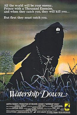
Not quite a book cover, but if I could achieve this, I could ask nothing more of a book cover. This is my favorite of all time:
Movie_poster_watership_down.jpg
 
Last edited:

Roxxsmom

Beastly Fido
Kind Benefactor
Super Member
Registered
Joined
Oct 24, 2011
Messages
23,130
Reaction score
10,902
Location
Where faults collide
Website
doggedlywriting.blogspot.com
The first one is very nicely done and the colors are attractive, but it doesn't in any way say fantasy novel to me. In fact, it kind of reminds me a bit of the old Warner Brother Bugs Bunny cartoon credits. The second is pretty, but there's a lot of empty space in the middle of the cover and to the right. Were you planning on having some kind of image there?

I think the third one looks the most like a fantasy novel, though one of a more modern or literary type than classic fantasy (but from your description that sounds like what it is). I like the colors, and it's attention grabbing and professional looking.
 

rwhegwood

Super Member
Registered
Joined
Apr 25, 2015
Messages
323
Reaction score
44
Location
MS, USA
I've a revision of the yellow one above. Bigger title in relation to image, bigger name.

The first one was experimenting with the idea of an emblem/glyph as a cover graphic (like the mockingjay pin). Not successful it seems.

The second one is for a collection of literary short stories.

Third one (yellow) is fantasy, first of a series...imagine the world of Hogwarts meets Gone with the Wind by way of Brigadoon. The Galenborn are manor living "magic" users who made lives for themselves in the antebellum south. They tend to keep to their own, but they've discovered an unrestrainable monster child in their midst just about the time the world goes crazy down south. No Earthly Power is the story of that monster child as he grows up in the old south and through the war. It runs from about 1850 to the end of the Civil War. The next in the series, The Hound and the Dragon picks up a few years later in the reconstruction. The third, Yonderland is set in the late 1800s to the early 1900s when old folk narratives are breaking down before new ones like Darwinism and Eugenics. Their enemies have triumphed militarily and philosophically, and the few Galenborn who remain must find a new home or lose themselves forever. The final book, no set title, maybe something like The Powers That Be, takes up the story of the Galenborn 200 years later from the perspective of what is left of those who used to be their enemies. It is set mostly on Mars and the story merges into Space/Science fantasy. The last bastion is at risk of discovery, and the only one who can save the Galenborn before it's too late is the monster they once drove from their midst.
 
Last edited:

randi.lee

Certified Non-Genius
Super Member
Registered
Joined
Jan 19, 2012
Messages
1,222
Reaction score
87
Location
New England, USA
Website
www.rlwrites.com
They all feel a bit one-dimensional to me. I tried looking at your updated cover after comments, but it says I need permission to view it?
 

Underdawg47

Super Member
Registered
Joined
Jan 18, 2015
Messages
415
Reaction score
42
Location
Federal Way Washington
I would like to ask for comments/critiques on a set of covers I've been experimenting with to see which works better. The pen names are just placeholders. Muselodeon is a collection of short stories, this particular collection is mainstream with a wee hint of magical realism in a couple.

The others are for a fantasy work, a series about a class of magical folk in the Old South. No Earthly Power opens circa 1850 but the series continues to mid 22ned century and shifts into SF-Fantasy.

I tried posting pictures but couldn't figure out how to do it, so these are links to my google drive.

https://drive.google.com/file/d/0BxDlHRAYVrxMbG9SLWJCSk9EMHM/view?usp=sharing
https://drive.google.com/open?id=0BxDlHRAYVrxMMjduWVV1ay1VcTQ
https://drive.google.com/file/d/0BxDlHRAYVrxMU0tkQlhPZUhmZzg/view?usp=sharing


The first one gives me the impression of being a self help book or New Age book.

The second one looks like some scholarly read, or something political.

The third cover looks interesting. I would pick it up to read further. It looks like a fantasy book.

If I were to see any of these book covers on the shelf, I doubt that I would even pick up the first two covers, but I would pick up the third, open the book and read the the blurbs.
 

BijouBaer

Registered
Joined
Apr 8, 2015
Messages
13
Reaction score
0
I agree the third is the most compelling. I would pick it up in either version. I like the second version the best. I'm not quite sure if you need the layer style on the font but it's a minor nitpick.
 

Pyekett

I need no hot / Words.
Kind Benefactor
Super Member
Registered
Joined
Jan 30, 2011
Messages
1,290
Reaction score
202
Location
Translated.
i like #3. It's the one I would pick up to read the first few lines.

I did a side by side of the two versions: http://imgur.com/MrDy5PC

I like the first. Mind you, I've got a fetish for empty space. Cramming too much into too little is a common self-pub indicator, and it always looks amateur to me. Clean lines, empty space -- that's my sweet spot as a reader.

Also the font on second version reads more old-school sci-fi to me. This may well be idiosyncratic.
 

Underdawg47

Super Member
Registered
Joined
Jan 18, 2015
Messages
415
Reaction score
42
Location
Federal Way Washington
i like #3. It's the one I would pick up to read the first few lines.

I did a side by side of the two versions: http://imgur.com/MrDy5PC

I like the first. Mind you, I've got a fetish for empty space. Cramming too much into too little is a common self-pub indicator, and it always looks amateur to me. Clean lines, empty space -- that's my sweet spot as a reader.

Also the font on second version reads more old-school sci-fi to me. This may well be idiosyncratic.


I like the first version of the 3rd cover best myself. I like the font and it seems simple and uncluttered.
 

davidjgalloway

Opus is my guy.
Super Member
Registered
Joined
Jun 28, 2014
Messages
400
Reaction score
41
Location
Upstate NY
I know we could go on forever with nitpicking at it, but... I like the second one, though I'd try to keep "No" and "Earthly" on the same line. I'd put the pullquote on the back and not squish the serpent (which sounds like some sort of idiom) too much. Just my 2c.
 

rwhegwood

Super Member
Registered
Joined
Apr 25, 2015
Messages
323
Reaction score
44
Location
MS, USA
Thank you all. Looking at the images side by side the second font does have a scifi vibe. Maybe I need to invest in a few new fonts. The first version does have a cleaner less in your face feel, but I think although the present font is serviceable, it could be better.