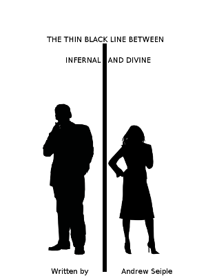
Thoughts on a simple cover?
- Thread starter ASeiple
- Start date
You are using an out of date browser. It may not display this or other websites correctly.
You should upgrade or use an alternative browser.
You should upgrade or use an alternative browser.
- Joined
- Jan 17, 2013
- Messages
- 8,582
- Reaction score
- 8,525
- Location
- The Seattle suburbs
- Website
- www.reneedominick.com
First of all, congrats on your book!
I'm not an artist AT ALL, but, commenting as solely a reader hunting thru thumbnails for something to buy, I'm afraid this isn't working for me. The first kneejerk thing that jumps out for me is the line going too far down the front. I don't like that it cuts the title, or the "Written by" and your name. (Frankly, you don't need "Written by" at all). Second impression is that I have no idea about the basics of what's on offer. A romance? Paranormal? Mystery? Legal procedural? As a reader I do depend on the cover to give me some sort of first, broad impression about what's inside.
If I were making a "this might catch my eye" wishlist, I think at the very least it could use some color. Somewhere. I'd prefer at least a wash of color on the background, just to soften it up some. I assume you're going for stark, but it's just a bit too much so for me. I do feel the line needs to be addressed. It strikes me as invasive. Maybe thinner? And shorter? I like it between the people, not so much the words. Finally, your title is good--very intriguing to me--so I'd like to see it stand out more with a better font and bigger size.
I guess the bottom line is for this reader it's just a little bit too simple. But by all means give my opinion the weight it deserves-- featherweight. There are some terrific cover experts around here who will weigh in with much more valuable suggestions. Best of luck with your story!
dpaterso
Also in our Discord and IRC chat channels
Staff member
Super Moderator
Moderator
Super Member
Registered
- Joined
- Feb 12, 2005
- Messages
- 18,806
- Reaction score
- 4,598
- Location
- Caledonia
- Website
- derekpaterson.net
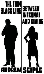
If you hit Ctrl-minus in your browser and zoom out and out until your graphic is a little thumbnail -- which is what readers browsing on Amazon, etc. see -- the text becomes unreadable. Get rid of the useless white space around the focus area, increase the title and author text size, maybe skip the "Written by" and put your first name on the left side and last name on the right side of the line.
-Derek
-Derek
I am an artist, but I can't really give you any constructive feedback without knowing the first thing about your book. Could you give us a few lines on what's it about?
That said, you definitely need to rethink the font size, and most likely the appearance of the line itself (right now there's nothing "thin" about it, even).
That said, you definitely need to rethink the font size, and most likely the appearance of the line itself (right now there's nothing "thin" about it, even).
Fair enough. It's a novella about a pair of agents who work for the Metahuman Resource Bureau. They police heroes, villains, and supernatural creatures. Pretty much men-in-black. The novella follows one of their cases.
One of the agents is infused with demonic essence. The other has a shard of angelic power. They fight crime. I debated putting horns on the guy and a halo over the girl, or having dual red and blue colors enter into the scene somewhere, but figured I'd run it by you all first.
This is good feedback so far, by the way. Exactly what I was looking for! Thanks ElaineA, dpaterso, and Magnificent Bastard!
One of the agents is infused with demonic essence. The other has a shard of angelic power. They fight crime.
This is good feedback so far, by the way. Exactly what I was looking for! Thanks ElaineA, dpaterso, and Magnificent Bastard!
dpaterso
Also in our Discord and IRC chat channels
Staff member
Super Moderator
Moderator
Super Member
Registered
- Joined
- Feb 12, 2005
- Messages
- 18,806
- Reaction score
- 4,598
- Location
- Caledonia
- Website
- derekpaterson.net
- Joined
- Jul 18, 2006
- Messages
- 8,745
- Reaction score
- 3,096
- Location
- Toronto, Canada
- Website
- www.adriennekress.com
There is simply nothing about this cover that suggests any whimsy, and of the superhero/supernatural stuff. It looks like a business how to book. If you like the silhouette idea, what about a Usual Suspects style lineup but you have one person in a cape, one holding a flaming sword, one that's an alien, one that's a ghost that kind of thing.
Also I agree with the others that the font is too small for thumbnail, though I don't like dpaterso's fix because the words are now too big and mushed together and still hard to read. And some colour. You definitely need some colour.
Also I agree with the others that the font is too small for thumbnail, though I don't like dpaterso's fix because the words are now too big and mushed together and still hard to read. And some colour. You definitely need some colour.
- Joined
- Feb 12, 2005
- Messages
- 28,750
- Reaction score
- 2,934
- Location
- right here
- Website
- www.veinglory.com
The image concept is fine but the ratios, colors and especially font need tweeking to be more harmonious and professional looking. Here are some examples of good simple covers:
http://uweb.und.nodak.edu/~leah.schothorst/page3.html
http://www.amazon.com/gp/product/0312180977/?tag=absowrit-20
http://www.peachpit.com/store/simple-and-usable-web-mobile-and-interaction-design-9780321703545
I am not a designer but what they seem to share is a great use of white space, balance, perfect font choice, and a very simple but very evocative graphic. Also they do not always center the design down the middle.
- Joined
- Jul 18, 2006
- Messages
- 8,745
- Reaction score
- 3,096
- Location
- Toronto, Canada
- Website
- www.adriennekress.com
Okay I do way better just mocking something up than explaining with words. These are all images I stole, no idea if they are available to license or for free. And I still think it looks too busy. I also think more colour would be nice. Also you'll notice the top title is a bit blurry, I'm sorry about that, I was trying to make the font thicker and didn't really have the time to do it right. Pretend it's not blurry.
Anyway this is a start off place maybe. Maybe it'll get the creative juices flowing. The tricky bit is you have a very long title.
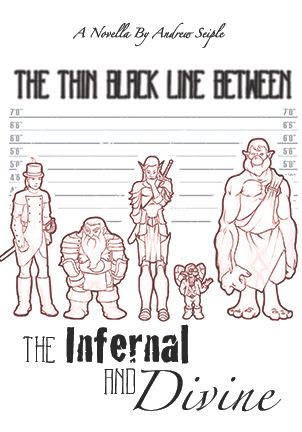
Anyway this is a start off place maybe. Maybe it'll get the creative juices flowing. The tricky bit is you have a very long title.

Oooh, nice mockup Derek! Thanks for taking a stab at it. And thank you veinglory for sharing some good, simple covers.
Thing is... Toothpaste is right. The cover doesn't explain much of the contents. And that visual with the suspect lineup is freaking beautiful. Something like that would rock... But the problem is twofold;
1. I have a budget in the single digits.
2. I have the artistic talent of bread mold.
So it's either dress up the simple cover somehow, or find someone who works cheap.
dpaterso
Also in our Discord and IRC chat channels
Staff member
Super Moderator
Moderator
Super Member
Registered
- Joined
- Feb 12, 2005
- Messages
- 18,806
- Reaction score
- 4,598
- Location
- Caledonia
- Website
- derekpaterson.net
All good points above, you have much to consider. 
I thought you'd maybe go for that horns + halo thing you mentioned, e.g.
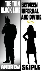
I threw in a subtle gradient to take away the starkness of the all-white background just to see if that did anything, maybe not. Clickable thumbnail. Pardon the toast crumbs <sweeps them away>
-Derek
I thought you'd maybe go for that horns + halo thing you mentioned, e.g.

I threw in a subtle gradient to take away the starkness of the all-white background just to see if that did anything, maybe not. Clickable thumbnail. Pardon the toast crumbs <sweeps them away>
-Derek
- Joined
- Feb 12, 2005
- Messages
- 28,750
- Reaction score
- 2,934
- Location
- right here
- Website
- www.veinglory.com
For a funny superhero story the most memorable cover that comes to mind is "What They Did to Princess Paragon". I bet you could get something like that done on Fiverr if you looked around.
http://www.amazon.com/dp/0452271630/?tag=absowrit-20
http://www.amazon.com/dp/0452271630/?tag=absowrit-20
For me, simple covers only really work if the typography is excellent. I love black and white covers done well. They can be really striking - but the type has to be creative!
- Joined
- Mar 27, 2011
- Messages
- 16,939
- Reaction score
- 5,320
- Location
- Near the gargoyles
- Website
- www.alessandrakelley.com
ASeiple, could you please reduce the size of the cover in the first post? There's a size limit on the forums of 400 by 400 pixels.
Hey, you've gotten some suggestions, and they're pretty good. Both dpatsero and toothpaste's covers were a huge improvement.
Anyway, here's my take.
Go with The Thin Black Line across the top.
Next line: between, and I don't thnk it's capitalized if we aren't in block caps, but somebody please, please correct me if I'm wrong. Slightly smaller font than your first line.
Third line: something like what toothpaste gave you with the different fonts. She's a super-nice person, so I bet if you PMed her, she'd be happy to send you a jpeg of them. I believe she works in photoshop (because she helped me with a cover for my grandmother's bio for her funeral), and if so, photoshop allows you to save as jpegs. Maybe use an ampersand for and so you can center the text better over your split image.
Then your male and female image, beefed up like dpatsero made for you. I'd put the thin black line between the two images only, and I really like the idea of having them standing on your name text.
Then your name across the bottom, not divided by a line.
I was going to suggest you send all that to someone on fiver(r?), but then I looked again and our very own hearosvoice is doing covers for freaking free. I don't care how tight your budget is, anyone can afford that. http://absolutewrite.com/forums/sho...-offer-my-book-cover-design-services-for-free
Last edited:
Yeah, I've actually been talking with hearosvoice on a different cover.  (I'm a busy bee right now...)
I DID just manage to get a friend lined up who's hella good at humorous styles. We might be going with the police lineup idea after all... I have to talk with her tomorrow about it.
I DID just manage to get a friend lined up who's hella good at humorous styles. We might be going with the police lineup idea after all... I have to talk with her tomorrow about it.


