Comments on cover art pls?

Ravioli

Crazy Cat Lady
Super Member
Registered
Joined
Jan 4, 2015
Messages
2,699
Reaction score
423
Location
Germany, native Israeli
Website
annagiladi.wixsite.com
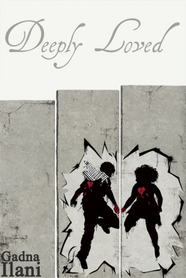
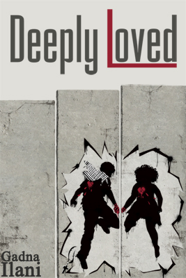
So I just finished another try at a cover. Whatever happens to the manuscript, I like designing covers :D

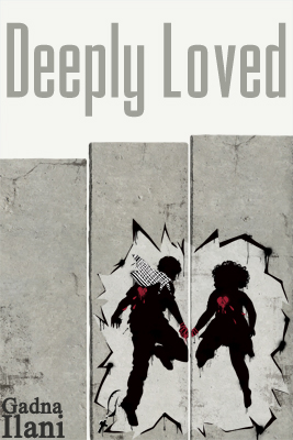
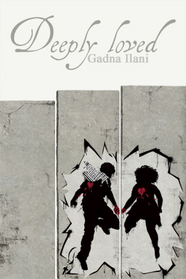
The title refers to the meaning of the MC's name in Arabic, Nadir, and a theme that plays a role in the story. Because he's deeply loved by all the wrong people, or the right people in the wrong way.

The wall is a separation wall around an Arab ghetto in 2019-21's Israel.
cwjycljqeeu97xqnp.jpg


Bigger version here.

Thoughts?
 

StoryofWoe

Sick and pale with grief.
Super Member
Registered
Joined
Oct 4, 2014
Messages
1,045
Reaction score
89
Location
In fair Verona, where we lay our scene.
I can't speak to genre appropriateness or publishing or size or any of that, but I can say that I really like the people and and how they appear to be busting through the wall. Is this an accurate reading? The color scheme is great, too. My only concern is that the title and author text might be too light and therefore less visible when shrunk down to thumbnail size. The slimness of the title font might also play a part in this, but that would probably be fixed by making it darker. I'm also not entirely sold on author name placement. Otherwise, I think it's lovely. :)

TL;DR: Love the visuals, but think the title and author name may need some reworking.
 

Ravioli

Crazy Cat Lady
Super Member
Registered
Joined
Jan 4, 2015
Messages
2,699
Reaction score
423
Location
Germany, native Israeli
Website
annagiladi.wixsite.com
Thanks for your comment :)
The people are supposed to look like a stencil graffiti which, along with the black silhouettes, is a recurring form of art along the Palestinian separation wall. I had different ideas too, but found them either inappropriate for the story, or overdone. It's a lot about broken hearts, captivity, and losing faith - and sex in every other chapter which is the only element missing here.

Where do you think the author text would be good? I thought about putting all text as a graffiti on the wall but decided that would be too cluttered. Maybe just the name?
 

Gale Haut

waxing digital artistic
Super Member
Registered
Joined
Jul 1, 2010
Messages
3,057
Reaction score
574
Location
The Swamplands
Website
www.galehaut.com
I think it's great. Kudos!

The kerning between the p and the l could be tightened. And I don't understand why the L is lowercase but I'm not sure it matters.
 

Kylabelle

unaccounted for
Kind Benefactor
Super Member
Registered
Joined
Jan 3, 2013
Messages
26,200
Reaction score
4,015
I like it very much as well; the image is striking. I think the "L" should be capitalized, and would want a darker color for the title and author name.
 

dpaterso

Also in our Discord and IRC chat channels
Staff member
Super Moderator
Moderator
Super Member
Registered
Joined
Feb 12, 2005
Messages
18,806
Reaction score
4,598
Location
Caledonia
Website
derekpaterson.net
The wall is a separation wall around an Arab ghetto in 2019-21's Israel.
I don't think I would have been able to guess this if you hadn't told me, but that's due to my inexperience with this type of structure.

I wondered if the plot involves their actually blowing a hole in the wall at some point. I tend to take things literally, sorry!

What is that on his shoulder, and why are their hearts in the wrong place?

I thought the fonts could be larger and more contrasting so they're easier to read at postage stamp size.

I'm saying these things in the hope it sparks a thought, not to pull down. I note that I'm completely out of step with everybody else! So meh, what do I know.

-Derek
 

Ravioli

Crazy Cat Lady
Super Member
Registered
Joined
Jan 4, 2015
Messages
2,699
Reaction score
423
Location
Germany, native Israeli
Website
annagiladi.wixsite.com
I think it's great. Kudos!

The kerning between the p and the l could be tightened. And I don't understand why the L is lowercase but I'm not sure it matters.

/grammar-Nazi on
Because "loved" is an adjective!!!!!!!!

But I'll have a look at capitalizing it... thank you!

How's this?
cwklgswd85kacjtit.jpg


I don't think I would have been able to guess this if you hadn't told me, but that's due to my inexperience with this type of structure.
Thought about adding a graffiti hinting at that, but I don't want this to smell of propaganda more than it does already.

I wondered if the plot involves their actually blowing a hole in the wall at some point. I tend to take things literally, sorry!
Actually, MC's cousin tries.

What is that on his shoulder, and why are their hearts in the wrong place?
You're looking at their backs. Also, it's supposed to be just a piece of semi-well done vandalism... But maybe I'll move the hearts a bit?

I appreciate your input!
 
Last edited:

StoryofWoe

Sick and pale with grief.
Super Member
Registered
Joined
Oct 4, 2014
Messages
1,045
Reaction score
89
Location
In fair Verona, where we lay our scene.
/grammar-Nazi on
Because "loved" is an adjective!!!!!!!!

But I'll have a look at capitalizing it... thank you!

How's this?
cwklgswd85kacjtit.jpg
I love the author name placement here. It's present and easy to find without being obtrusive. I still think I would like the title font to be darker and perhaps bigger, since it now has so much negative space around it. You have this cool, gritty image topped off by a muted, elegant title that just sort of floats in space. Just my two cents.

You're close. Very close. ;)
 

Gale Haut

waxing digital artistic
Super Member
Registered
Joined
Jul 1, 2010
Messages
3,057
Reaction score
574
Location
The Swamplands
Website
www.galehaut.com
I like the font change and the capitalization. I don't know what grammar rule would make an adjective lower case in title casing, but maybe there are different rules for that in other English speaking countries.
 

Kylabelle

unaccounted for
Kind Benefactor
Super Member
Registered
Joined
Jan 3, 2013
Messages
26,200
Reaction score
4,015
Gale's the experienced artist here (maybe others too but meaning, as opposed to my own opinion) however, I might even like to see that L even larger than the capital D. (I used to fool around with type a bit years ago) Not sure....

I do like the font change and darker gray. Which I guess is only an appearance due to heavier letterforms. :)
 

Ravioli

Crazy Cat Lady
Super Member
Registered
Joined
Jan 4, 2015
Messages
2,699
Reaction score
423
Location
Germany, native Israeli
Website
annagiladi.wixsite.com
Gale's the experienced artist here (maybe others too but meaning, as opposed to my own opinion) however, I might even like to see that L even larger than the capital D. (I used to fool around with type a bit years ago) Not sure....

I do like the font change and darker gray. Which I guess is only an appearance due to heavier letterforms. :)

Like so?
cwkpxhtpfupjsj9rp.jpg


I like the font change and the capitalization. I don't know what grammar rule would make an adjective lower case in title casing, but maybe there are different rules for that in other English speaking countries.
I've grown up with German, which is very strict with capitalization.. that's probably all there's to it ;)
 

Kylabelle

unaccounted for
Kind Benefactor
Super Member
Registered
Joined
Jan 3, 2013
Messages
26,200
Reaction score
4,015
Yes but it would have to be even bigger so you know at first glance it's intentional. And then, you may not like it. :D
 

Kylabelle

unaccounted for
Kind Benefactor
Super Member
Registered
Joined
Jan 3, 2013
Messages
26,200
Reaction score
4,015
It might not work like I said, but you could try dropping the baseline of the L below the rest of the line.... (Or you could ignore me. Probably the safest thing. I like playing with type.... :D )
 

Kylabelle

unaccounted for
Kind Benefactor
Super Member
Registered
Joined
Jan 3, 2013
Messages
26,200
Reaction score
4,015
Or make the L red to match the hearts....
 

Ravioli

Crazy Cat Lady
Super Member
Registered
Joined
Jan 4, 2015
Messages
2,699
Reaction score
423
Location
Germany, native Israeli
Website
annagiladi.wixsite.com
It might not work like I said, but you could try dropping the baseline of the L below the rest of the line.... (Or you could ignore me. Probably the safest thing. I like playing with type.... :D )
Actually, extending the bas L-ine under the rest of the word, was my thought, too!

Like so? I like.
cwkxqiu2byt8trxo5.jpg
 

cmhbob

Did...did I do that?
Super Member
Registered
Joined
Sep 28, 2011
Messages
5,778
Reaction score
4,982
Location
Green Country
Website
www.bobmuellerwriter.com
Love the concept, and it's been very interesting to follow the discussion and suggestions. My suggestion to the last version is to maybe increase the space between the Y and the L just a skosh to make it a little more clear.

I confess though that I wondered about doing the whole title in a graffiti/tagging type font.
 

girlyswot

Super Member
Registered
Joined
Sep 1, 2007
Messages
2,227
Reaction score
390
Location
Cambridge
Website
myromancereviews.wordpress.com
I'm not sure about having the white background at the top of the cover. On a lot of ebook sites, the default background is white, so the cover will just sort of drift off and in thumbnail it won't read as a rectangle - and therefore, may not even register as a book.

I'd either change that colour or add some kind of edge to it. Maybe a grungy grey something?
 

Ravioli

Crazy Cat Lady
Super Member
Registered
Joined
Jan 4, 2015
Messages
2,699
Reaction score
423
Location
Germany, native Israeli
Website
annagiladi.wixsite.com
I confess though that I wondered about doing the whole title in a graffiti/tagging type font.
I thought about it, too. Like, another graffiti on the wall. But then I decided it'd be too cluttered and possibly hard to read.

I increased the space between the words, you're right it's better this way.

I'm not sure about having the white background at the top of the cover. On a lot of ebook sites, the default background is white, so the cover will just sort of drift off and in thumbnail it won't read as a rectangle - and therefore, may not even register as a book.

I'd either change that colour or add some kind of edge to it. Maybe a grungy grey something?
Thanks for the advice; I've made it darker:
cx6iiaivr8806oab9.jpg
 

K. Q. Watson

Super Member
Registered
Joined
Jan 6, 2009
Messages
718
Reaction score
60
Website
twitter.com
I love it. I like the stark, clean font with the edgy, graphical images. Maybe chose a font with more hard edges? But I don't know.
 

RackinRocky

Super Member
Registered
Joined
Jan 23, 2013
Messages
59
Reaction score
2
Ravioli, almost looks a little like Davy Jones of the Monkees (how many people here are old enough to remember them) sans the beard! In other words, very unique and handsome looking!