Need help with title font for book cover

Status
Not open for further replies.

christwriter

Resistance is Everything
Super Member
Registered
Joined
Apr 25, 2010
Messages
275
Reaction score
63
Location
Texas
Website
creativedoubledipper.blogspot.com
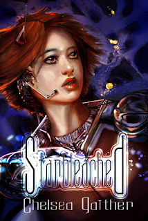
So. All the sci-fi fonts I've found that fit my ideal are utterly freaking illegible. Mostly because whoever designed them apparently thought the only place they'd go is on a bullet train.It's kind of disgusting. Anyhoo, I'm working on putting a print book together.

After lots and lots and lots of fiddling around, trying different fonts and hair pulling, I came up with this:

Starbleachednewcovertiny.jpg


The title is really tiny here, and really big when it prints out at 6 by 9 inches. I've spent three days playing with fonts and this is the first one that fits the story and can still be read. Mostly.

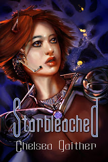
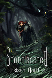
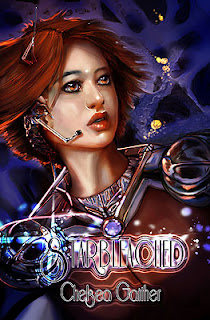
Then I tried the same thing, font and effect settings, on the other two covers in the series, because I'd like them all to match:
Planetbobnewcover2tiny.jpg


overseer%27s+own2tiny.jpg


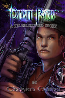
And now I just don't know. How bad is this?
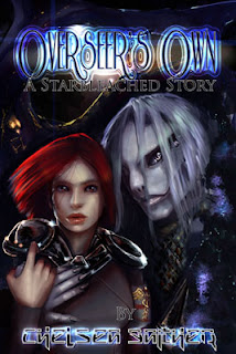
 

Polenth

Mushroom
Super Member
Registered
Joined
Dec 27, 2007
Messages
5,017
Reaction score
735
Location
England
Website
www.polenthblake.com
I can read a few more letters in these than the originals (which are completely unreadable), but it's still not good. I'm still having to guess at the most likely words based on what I can read. You seem caught up in wanting a highly decorative font, but it's like the artistic equivalent of writing purple prose. It draws attention to itself and confuses the meaning.

I'd suggest looking at some professional science fiction covers and finding ones where the typography works with the picture. Then find a font with a similar feel.
 

Toothpaste

THE RECKLESS RESCUE is out now!
Super Member
Registered
Joined
Jul 18, 2006
Messages
8,745
Reaction score
3,096
Location
Toronto, Canada
Website
www.adriennekress.com
Have you gone to dafont.com? I went there and checked out some of their "Sci Fi" fonts for you. I thought many would work for you and would be far more legible (I think Spaceship might work perfectly): http://www.dafont.com/theme.php?cat=303. Alas, the goal must be for the title to be readible as a thumbnail, and while the font you have is pretty, I can barely read it the size it is in this thread.
 

veinglory

volitare nequeo
Self-Ban
Registered
Joined
Feb 12, 2005
Messages
28,750
Reaction score
2,933
Location
right here
Website
www.veinglory.com
I am sorry, but I can't read those titles at all. The previous font was better. Keep in mind that you already know what it says so it seems clearer to you.
 

christwriter

Resistance is Everything
Super Member
Registered
Joined
Apr 25, 2010
Messages
275
Reaction score
63
Location
Texas
Website
creativedoubledipper.blogspot.com
Actually, I've tried that font. I've tried several of those fonts. I've spent the last three days on daFont. And fontsquirrel. The issue I have with every bold-face font I've tried is they will not fit on the image at a readable font size without having to warp the text. And warping the text is what makes it illegible.

And it's going to be a print image too, which is what started the third round of redesigning, because what looked good as a thumbnail looks terrible when printed.

Is this one any better?
Starbleachednewcovertiny.jpg
 

Gale Haut

waxing digital artistic
Super Member
Registered
Joined
Jul 1, 2010
Messages
3,057
Reaction score
574
Location
The Swamplands
Website
www.galehaut.com
Actually, I've tried that font. I've tried several of those fonts. I've spent the last three days on daFont. And fontsquirrel. The issue I have with every bold-face font I've tried is they will not fit on the image at a readable font size without having to warp the text. And warping the text is what makes it illegible.

And it's going to be a print image too, which is what started the third round of redesigning, because what looked good as a thumbnail looks terrible when printed.

Is this one any better?
Starbleachednewcovertiny.jpg

Not significantly.

All the fonts I've seen you post have been embellished with loads of unnecessary effects that make them exhausting to read. I really don't see why a font that hasn't been over embellished like the one I linked to wouldn't fit on your cover.

ETA: Just going to add that I think you might be trying to have your type choice express something that the cover image should already be communicating to the viewer.
 

christwriter

Resistance is Everything
Super Member
Registered
Joined
Apr 25, 2010
Messages
275
Reaction score
63
Location
Texas
Website
creativedoubledipper.blogspot.com
Starbleachednewcovertiny.jpg
I guess you're right. It just...it doesn't look like it fits the story. But then I'm not a pro and I'm not really good at this stuff.

There you go. Unembellished.

The stroke is necessary. Dark fonts won't work without it due to the stuff in the background, and white just looks bad,

Starbleachednewcovertiny.jpg
 

christwriter

Resistance is Everything
Super Member
Registered
Joined
Apr 25, 2010
Messages
275
Reaction score
63
Location
Texas
Website
creativedoubledipper.blogspot.com
Maybe the problem is the image itself? I've got an oldish picture that's been floating around on my harddrive for a little while. It was more perspective and atmosphere practice than anything else, so I haven't used it for anything...

Starbleachednewcovertiny.jpg
 

Gale Haut

waxing digital artistic
Super Member
Registered
Joined
Jul 1, 2010
Messages
3,057
Reaction score
574
Location
The Swamplands
Website
www.galehaut.com
I can tell that you are struggling with placement of the text, which may be why you wanted to do all that stuff to it. Page layout isn't easy, and text needs to be legible against whatever background it's placed on.

For this last image you posted I would create a blending mode or adjustment gradient that lessons the detail behind your text to enhance the contrast and improve legibility. You kind of already had that idea with what you were doing, but just weren't quite there before.

If I find any good tuts I'll link you to them.
 

Bicyclefish

Pedaling Pescado
Super Member
Registered
Joined
Dec 15, 2009
Messages
473
Reaction score
51
Location
PNW
Original font:
I could make out the title with effort in your third book (in your avatar), but couldn't make out your first book title at all—a friend humorously guessed a very inappropriate title after trying to read it for a few minutes—nor your name in any of the books. The titles in your thumbnails meanwhile are a blur.

New fonts:
Better, but you're using too many effects and filters. The title is lost in the picture.

Unembellished font:
The best so far in my opinion. It's clean, has a modern feel, and I can read your title and your name.

It's sort of like a pin up or art piece that's overdone or too cluttered such that your eye doesn't know where to go. Consider browsing the scifi and fantasy titles at a bookstore/ebookstore. Legibility is important. Avoid clutter. More is not always better.
 
Last edited:
Status
Not open for further replies.