Book cover for contemporary fantasy

Colleen Cowley

Super Member
Registered
Joined
Apr 4, 2013
Messages
97
Reaction score
11
Location
In my head, mostly.
Website
www.colleencowley.com
Hi, all -- I've found the cover threads helpful and fascinating. I'm hoping to get feedback on mine and perhaps help others learn from my mistakes. (I didn't execute the design, but the mistakes would be mine regardless.)

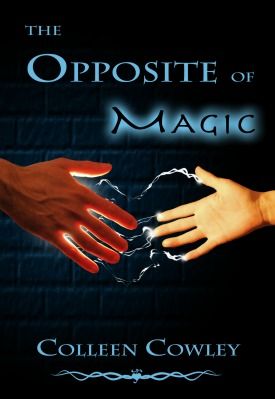
Below is my cover for a contemporary fantasy. Does the genre come across? Do the image and typography work? What ought to be changed?

cover275x399_zpse9c411c6.jpg.html
cover275x399_zpse9c411c6.jpg


Many thanks!

Colleen
cover275x399_zpse9c411c6.jpg.html
 

alleycat

Still around
Kind Benefactor
Super Member
Registered
Joined
Apr 18, 2005
Messages
72,891
Reaction score
12,242
Location
Tennessee
I think it conveys the genre.

I'm not saying that what you have is bad, but I would have probably at least looked at doing a couple of things differently.

I understand why someone would have chosen a different font for the word Magic, but it's perhaps a little too different since one is such a formal font and the other is such a contemporary one (and one is blue on black and the other is black on blue). I might have look at using a less traditional font for the words The Opposite of. The fonts could have still been different, but have them somewhat related. Or perhaps had them both be the same tone; black on a blurred blue background. It's just a little jarring as it is. I'm not sure, it would just be something to consider.

I think the hands would be better if they weren't at the same level; for example, if the hand on the right was just a little lower, or perhaps reaching up just a little. And, since you have the light source as being the magic in the palm of the hand, I might have darkened the backside of the hand on the left. Maybe. Again, just a consideration.

These are all just minor comments not major criticisms of the design.
 

Gale Haut

waxing digital artistic
Super Member
Registered
Joined
Jul 1, 2010
Messages
3,057
Reaction score
574
Location
The Swamplands
Website
www.galehaut.com
The lighting is pretty good. The graphic for the bricks I don't love.

The type for your name looks okay to me. I don't like the title. And I really, really don't like the outer glow effect around magic. Why does the font suddenly change and why the word "the" on a separate line? It looks sloppy.

ETA: The whole thing doesn't look sloppy--just the type choices I mentioned.
 
Last edited:

Colleen Cowley

Super Member
Registered
Joined
Apr 4, 2013
Messages
97
Reaction score
11
Location
In my head, mostly.
Website
www.colleencowley.com
The graphic for the bricks I don't love.

You don't think bricks should be there at all, or you don't like the look of these particular ones? (We tried a version sans brick -- just black -- but it seemed blank in a bad way.)

The "The" on a separate line is an easy fix. Are you recommending the same font for the entire title, or like alleycat do you think slightly less, um, opposite fonts are the way to go?

Thanks for the feedback!
 

Cyia

Rewriting My Destiny
Super Member
Registered
Joined
Nov 15, 2008
Messages
18,651
Reaction score
4,103
Location
Brillig in the slithy toves...
The edges of the hands look ultra sharp because of the bricks, so the cover comes off looking like separate layers. If you're married to the bricks, I'd suggest blending the edges of the hands enough to take the "crisp" effect off of them.

At least that's how it looks to me.
 

Rachel Udin

Banned
Joined
Nov 19, 2010
Messages
1,514
Reaction score
133
Location
USA... sometimes.
Website
www.racheludin.com
Not in love with the bricks and it doesn't read "contemporary" fantasy to me either. Not sure without the synopsis.

The lighting on the bricks doesn't seem to match the lightning... but that may be just me.

The typography on the title needs work the line spacing (leading) needs work. (Bring is closer together) I also triple on what was said about the type. It seems like you're trying to get the type to say too many things. This means you're putting burden on the type, which means the image itself isn't strong enough to communicate what you want.

(This is why a blurb will help with building the concept.)

Get the type to say *one* thing.

Then get each element of the design to also say one thing, or one unified thing. (Color, etc). If you do that and get it to unify, then you'll be able to communicate the concept of your book more clearly and get a unified message in the art.

And you'll get a cleaner design.

I think from what you have up, you need to do some font hunting. Doesn't seem like you're striking what you want out of it.

Right now reads like Fantasy, probably YA. Very structured. I don't get contemporary. (If you had hands with a watch or some such, maybe you could slide it).

And I'm not sure what the book is about from the cover in tone or theme...

Technically executed, it's pretty good save for the type. Concept wise--it's not quite speaking to me. I'm not sure what it's trying to communicate about itself that's special, which doesn't compel me to pick it up.
 

slhuang

Inappropriately math-oriented.
Super Member
Registered
Joined
Dec 11, 2012
Messages
2,906
Reaction score
1,140
Website
www.slhuang.com
Adding to the chorus saying the change in font in the title isn't working. (I can't say whether it's the change, period, or that the font for "Magic" is TOO different, but it definitely bothers me.)

The bricks don't bother me, but the hands do, and it's possible that what other people have said about the bricks are contributing (it's hard to tell sometimes what affects my perception of graphic design!). The hands bug me because they feel too different -- they feel to me like they've been photoshopped from different sources and don't match in size/lighting/etc.. I also can't tell if what's happening between them is supposed to be electricity or something liquid, though that might be the thumbnail size.

Hope this helps!
 

Gale Haut

waxing digital artistic
Super Member
Registered
Joined
Jul 1, 2010
Messages
3,057
Reaction score
574
Location
The Swamplands
Website
www.galehaut.com
You don't think bricks should be there at all, or you don't like the look of these particular ones? (We tried a version sans brick -- just black -- but it seemed blank in a bad way.)

The "The" on a separate line is an easy fix. Are you recommending the same font for the entire title, or like alleycat do you think slightly less, um, opposite fonts are the way to go?

Thanks for the feedback!

Per the bricks, the execution isn't really there and they appear to be put in place as an afterthought without considering the relationship to the other graphic elements. Take a look at Cyia's beautiful covers in her siggy. The textures are beautifully added in both, and they are also relevant to the covers central message/messages. On the other hand, these bricks look like what you described them as, a quick fix to make the image less blank by using some easy stock that was at hand. Of course, I'm not necessarily saying a texture isn't the answer or that bricks can't work--I just don't think you're quite there yet with this draft.

I agree with many of Rachel's points about the type. She generally gives good critique and has an extraordinary eye for type. What I was personally saying wasn't that you should do a particular thing with the type. I was just pointing out that what you are doing isn't working. You could certainly try using the same typeface for the whole thing (I personally don't like the serifs for this typeface when it's in small caps) and you could totally remove the outer glow or make it more subtle. Those are just suggestions. But if you can tweak the title so that it's in harmony with itself and with the other elements then you've created something successful.
 

WriterTrek

Boldy Writing
Super Member
Registered
Joined
Mar 17, 2013
Messages
730
Reaction score
97
Location
Mississippi, USA
I didn't even notice the bricks until everyone else started to comment on them. They registered as "properly vague background item" to me, something there to give a little setting concept and to keep it from being blank, and that much was alright (at least on my screen).

I think the fonts are alright though if Magic was slightly larger it might look better (in my opinion). Given the change of font it looks smaller than the word opposite to me, and I think they are meant to be the same size.

I love the colors in general, the blue/black theme. Also love the title for that matter, makes me want to legit read this book.

The primary concern I have is that the hands seem to "pop" a little to much. Not sure how else to put that, but it's like they are standing out a little bit more than they should, or something.

Cheers -- love the cover all around, nicely done.
 

Ginger Writer

Writing like a madwoman
Super Member
Registered
Joined
Mar 4, 2012
Messages
234
Reaction score
11
Location
Arkansas
Website
www.youtube.com
I'm actually alright with the bricks, and I think the color choices are well made. The problem that I have with the font change and the glowing "magic" is this: it makes it look like a MG cover. And that's not a bad thing. If this is a MG or lower YA book, then you might even be able to leave it. But if it's an adult book or a middle-higher YA, then I could definitely see how it might be unappealing to someone in these groups picking it up. I really like the design under your name, though.

Just one final point--I wasn't sure what the white lines between the hands are supposed to be. Are they just wisps of magic? Are they lightning? (If this is the case, then they definitely don't seem crisp enough to me.) This ambiguity isn't necessarily a bad thing, just something to consider. To be perfectly honest, I thought it might be sci-fi at first.
 

Tezzirax

Super Member
Registered
Joined
Jul 31, 2012
Messages
375
Reaction score
61
Location
Southern California
I would like to see some character to the hands. Perhaps something that shows the conflict...As an example: if the opposite of magic is technology for instance, having one of the hands decorated in mystic jewelry and they other with a cuff and wristwatch would sell a conflict between the two forces for me.
 

Colleen Cowley

Super Member
Registered
Joined
Apr 4, 2013
Messages
97
Reaction score
11
Location
In my head, mostly.
Website
www.colleencowley.com
Thanks, all, for taking the time to give feedback! For those of you wondering what the story is about and if it's MG, YA or adult -- it's adult. Here's the quick summary:

Emily Daggett's childhood dream of finding a wizard, becoming extraordinarily powerful and battling evil is belatedly coming true. In the most screwed-up way possible.

First off, the wizard's all wrong. Alexander Hartgrave is a thirty-year-old IT director instead of a silver-haired mage, and he's dead-set against playing the proper role of helpful mentor.

Worse, he thinks Emily's extraordinary, all right — because she's uniquely incapable of doing magic.

When adventure overtakes her despite (or rather because of) her oddity, she has to start seeing fantasy like a cold-eyed realist, and fast. Otherwise, her bookish expectations about good and evil will get her, Hartgrave and a lot of other people killed.

---

Side note: Emily is actually anti-magic -- she destroys spellwork and the raw material of magic by touching it, like anti-matter meeting matter. So she's the opposite of magic. What's on the cover is the reaction between her hand and Hartgrave's.

Both hands were photographed for the cover in the same place, so it's interesting/odd that they're coming off as completely different. I wonder if it's partially that the female hand is so much smaller.

Will put up a revised version soon. Thanks!
 

Colleen Cowley

Super Member
Registered
Joined
Apr 4, 2013
Messages
97
Reaction score
11
Location
In my head, mostly.
Website
www.colleencowley.com
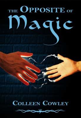
Here's a revised version with different type, different type placement and slight blur around the hands:

cover-redo-bricks_zps6961da1e.jpg


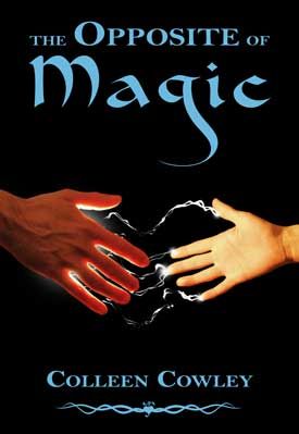
Here's that same version sans brick:

cover-redo-none_zps00af3fae.jpg


The bricks aren't random: The characters spend a lot of time in an unusual basement. But I realize that "accurate to the story" and "good cover idea" aren't necessarily the same thing.

Oh, and magic isn't the only light source here -- that's why the back of the man's hand isn't completely in shadow.

Thanks!
 

veinglory

volitare nequeo
Self-Ban
Registered
Joined
Feb 12, 2005
Messages
28,750
Reaction score
2,934
Location
right here
Website
www.veinglory.com
What I get is a man and a child (boy?) and magic. That is all really. The swirly things almost make a heart which makes me vaguely uncomfortable.
 

Colleen Cowley

Super Member
Registered
Joined
Apr 4, 2013
Messages
97
Reaction score
11
Location
In my head, mostly.
Website
www.colleencowley.com
What I get is a man and a child (boy?) and magic. That is all really. The swirly things almost make a heart which makes me vaguely uncomfortable.

Yikes, that's frustrating. It's a man and a woman's hand, and the heart is there on purpose. (Supposed to be subtle, so I wouldn't expect that everyone would see the heart. But gah, I wish we'd used a woman with larger hands.)
 

Cyia

Rewriting My Destiny
Super Member
Registered
Joined
Nov 15, 2008
Messages
18,651
Reaction score
4,103
Location
Brillig in the slithy toves...
I definitely thought it was a child's hand, too. This came off as a master-apprentice representation, with either electricity or water-based magic transferring between them. Given the title, I expected something along the lines of a magic-hating scientist, maybe even a Frankenstein tale.

The proportions are definitely off if that's supposed to be an adult woman. The wrist is too narrow in proportion to the base of the hand, and the fingers appear stunted. There are no discernible fingernails, which is odd for the graphic of a female hand.

Do you have no pictures of the hands in the reverse, where the man's palm is showing, rather than the woman's? It might help ease the confusion.
 

Gale Haut

waxing digital artistic
Super Member
Registered
Joined
Jul 1, 2010
Messages
3,057
Reaction score
574
Location
The Swamplands
Website
www.galehaut.com
I see major improvements on the overall composition. There's a kerning issue that I immediately see between the W/L in Cowley. The kerning of the O/L in Collen is definitely more relaxed than the rest of the letters.

The gender or age ambiguity problem people are seeing... Her ring finger should be shorter than her index finger. The over exposure on her index hides the fact that it's bent and makes it appear short proportionally like a masculine hand. You could also slim the hand slightly and add a touch of polish to the exposed nail on her thumb. I would personally reduce the contrasts or shading levels on her wrist.
 

Colleen Cowley

Super Member
Registered
Joined
Apr 4, 2013
Messages
97
Reaction score
11
Location
In my head, mostly.
Website
www.colleencowley.com
I see major improvements on the overall composition.

Hooray! Thanks for the additional suggestions -- I really appreciate it. They're underway.

Given the brick/no-brick options above, do you think I should look for another brick background or leave it plain black?

Cyia, I don't have photos of the hands in reverse, but my designer -- my poor, put-upon husband -- is fiddling with the woman's hand as Gale recommended. Hopefully that will help.
 

Colleen Cowley

Super Member
Registered
Joined
Apr 4, 2013
Messages
97
Reaction score
11
Location
In my head, mostly.
Website
www.colleencowley.com
I guess I just don't personally like that texture.

Right -- I'm just wondering whether it makes sense to look for a better texture or go with black. (Maybe you meant the latter.)

Sorry to keep asking follow-up questions! I appreciate how generous you have been with your time and don't expect more of it.
 

Rachel Udin

Banned
Joined
Nov 19, 2010
Messages
1,514
Reaction score
133
Location
USA... sometimes.
Website
www.racheludin.com
Without the bricks, it looks more like Adult contemporary.

I still don't like the font--while the sizing looks much better, I still tend to hate font changes of that sort. It makes it seem like you're hitting the viewer too hard.

This is in league with what is typically called, "the Chinese menu problem"

http://thankyouenjoy.files.wordpress.com/2008/04/chinese-menu.jpg

"Look, it's a CHINESE menu."

We already know that. What else can you say about the restaurant without making it scream CHINESE?

With graphics repetition is often not a good idea.

If you have magic in the title, magic in the graphic, you don't need to also scream "This is magic" with the font either.

Ideally the font should say something different and should be the same font throughout. Font changes are seen as last resort in typography. (I mean within the text) and seen as lazy.

What other thing can you communicate with the font selection about your book besides screaming it has magic. Alright--we got that? What else does it have?

Things you can try:

Make it say "contemporary" rather than magic. I.e. make it say a time period. For example, Art Deco would say 1920-30's.

Make it say a specific art movement that relates to the story. For example, recently we had someone who said her story contained "Swing" so I suggested she get the font to say, "Swing"

You can also get it to speak to a certain theme. For example, "Scary" "technological" "structured" "Unstructured" "Whimsical" that fits the feel of your story. You can see this done fairly well in the type choice in Fifty Shades of Grey. One of the characters is a journalist, so the person who designed the cover chose a typewriter font. (Which is echoed, but not resaid by the tie)

Despite that, choose it to lean towards that direction, but don't let it scream it at the viewer.

Anyway, the font you do have now for magic is reading "Aladdin" since it's a brush font, probably made to imitate Arabic a bit. (Which is trad. written with a brush with the sharp ends like that.)

I'd lean towards choosing a unified font that says everything you want it to say and only one font for the entire cover. ('cause you have no idea how I was told NO, limit your fonts.)

BTW, blue in color psychology in the US is supposed to be "rational", though I have a loose theory that this is kind of sex-based psychology. In which after the 1950's, where pink and blue got swapped and Genesis puts forward that men are "rational" and blue got associated with men.

I'll agree with the hands, though women are sometimes said to have more tapered fingers too.

Adding some bling might not be a bad idea either to help the tip off. (Again subtle)
 

JournoWriter

Just the facts, please
Super Member
Registered
Joined
Dec 2, 2012
Messages
591
Reaction score
38
My first thought looking at the original was that it was a NF book about Wicca for teens. The later versions are better, but I'm still stuck with that impression. Not sure if that's just in my head, though. I spent a lot of time at a bookstore job in college reshelving the religion section.

The small-cap font for "opposite" may need to be all caps, and I'd suggest looking at making "the" and "of" that same size as well.
 

Colleen Cowley

Super Member
Registered
Joined
Apr 4, 2013
Messages
97
Reaction score
11
Location
In my head, mostly.
Website
www.colleencowley.com
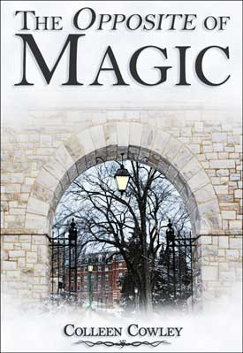
Thank you, everyone, for the continued feedback. I might work on fixing the current cover -- dealing with the small-hand issue and changing the type per Rachel's suggestions -- but since some (all?) of you think the design itself might be off for a contemporary fantasy, I wanted to try one alternative:

cover-arch-small_zps2e5c3e31.jpg


Upsides -- as far as I can tell: More clearly communicates "adult." Shows the setting of the novel. Has a slightly Narnia-ish feeling.

Downsides: The dark-gray on white doesn't look like a novel, though I can't put my finger on why (or how to better integrate the image and the text). And the image might suggest historical, since it's a college built in the nineteenth century.

If you all don't think this is better (or could be better with the right fixes), I'll work on the hands version.

Thank you all for your time. And Rachel, I really appreciated the typography information -- it's fascinating how much the right font can add to (and how much the wrong font can detract from) a cover.
 
Last edited: