My new Cover

MoonStone

in touch
Super Member
Registered
Joined
Apr 30, 2010
Messages
112
Reaction score
4
Location
Ontario
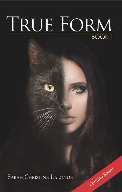
I wanted to share my cover- Or at least the poster of it.
The full cover can be viewed on my facebook
User Name: Author Sarah Christine Lalonde
Feel free to add me, I always enjoy new friends.


kmlk_zpsb13b0be5.jpg
 
Last edited:

MoonStone

in touch
Super Member
Registered
Joined
Apr 30, 2010
Messages
112
Reaction score
4
Location
Ontario
My sister Lisa Hayes did this cover for me after i showed her the idea I had wanted. I am very happy with the outcome. She did a great job, in my opinion. I am glad others like it as well! :)
 

Rachel Udin

Banned
Joined
Nov 19, 2010
Messages
1,514
Reaction score
133
Location
USA... sometimes.
Website
www.racheludin.com
I'm going to be really nitpicky... so feel free to ignore.

The space between the "R" in "form" and the "M" is none existent, which makes it look inconsistent for no good reason.

And I'd move the author name maybe 5-10 pixels down to clear the hair so the end of the name doesn't get lost in the curve.

Other than that, well done. Subtle bichromatic. Not sure if it fits the concept of the book without the blurb...
 

Alessandra Kelley

Sophipygian
Staff member
Moderator
Super Member
Registered
Joined
Mar 27, 2011
Messages
16,936
Reaction score
5,315
Location
Near the gargoyles
Website
www.alessandrakelley.com
O luminescent, glorious gloaming light
That catch th'image divine in elfin rings,
And bring miraculous the gift of sight
Th'eye-blessing colours, frames, and imagings,

Atlas-like our servers bear the load
Of heavenly wafted words on shoulders proud,
Yet vaster still are images in code.
Four hundred pixels be the size allowed.

Four hundred by four hundred be the span
Permitted for Apollo's blessed crown,
Else Phaeton-like the horses whelm the man
And loosened bonds of light cast servers down.

If thou wouldst not this humble mod to holler,
Take pity, gird thy bounds and make it smaller.
 

MartinD

Thought I'd stop by
Super Member
Registered
Joined
Mar 16, 2010
Messages
383
Reaction score
12
Location
Northern California
I like the cover (good job!) but I dislike the "Book 1" addition. It tells me that I will probably need to read Book 2 or 3 or 4 for the complete tale. If sales are bad, will we ever see Book 2 or 3?

Once the series is complete, I'll give it a look.
 

Colleen Cowley

Super Member
Registered
Joined
Apr 4, 2013
Messages
97
Reaction score
11
Location
In my head, mostly.
Website
www.colleencowley.com
Hi -- neat concept! My husband is a Photoshop adept, and he suggests moving the cat half down a little bit, which should make the eye and nose line up better. (It didn't immediately jump out at me, but when he mentioned it, I could see what he meant.)

I think you could also get more mileage out of a better font for the title and your name. That's often the big difference between an indie cover and a traditionally published cover.

Here's an example of font-as-art: http://www.amazon.com/dp/0373210701/?tag=absowrit-20

And another: http://www.amazon.com/dp/014241557X/?tag=absowrit-20

Of course, a beautiful font that's not legible except at full size is counterproductive, so take that suggestion with a grain of salt.

Best of luck!