- Joined
- Apr 2, 2011
- Messages
- 3,771
- Reaction score
- 630
- Age
- 30
- Location
- New York
- Website
- www.thebooklantern.com
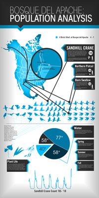
I don't know if this is appropriate (I'm not going to ask you guys to do my homework, btw), but I just finished up a site analysis infographic for class. It's too cluttered, IMO, but we had to fit in ten pieces of quantitative data and one qualitative. How does it look to you guys?
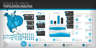
Here's a thumb, full size is below if you want to click. Be warned, it's huge.
Full size click here.
I'm printing it later on today. It's going to be 44X22. The dpi is crappy because I was too lazy to fix it after I made the initial draft. Here's what it used to look like before my professor made me switch it to landscape and tweak a few things: