My Try at a Cover for Moody Fantasy Epic

Omnigon

The Book of All
Super Member
Registered
Joined
Jul 4, 2011
Messages
200
Reaction score
13
Location
I live in my head.
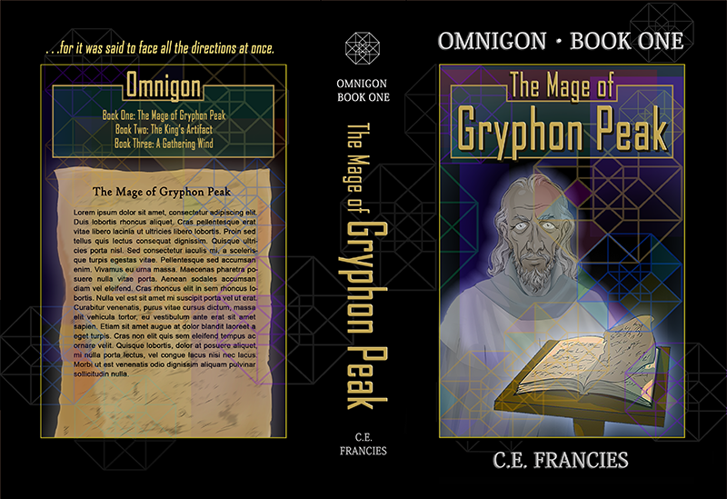
Here's what I came up with, limited resources that I have, for the first volume of the epic fantasy I'm working on. It's somewhat of a dark story. Does it work to convey a moody, fantasy feel? Even vaguely? I know, I know; I need an oil painting of a solemn group of adventurers against towering mountains and stuff, but I don't have the time and resources for that unfortunately. ;)

I'm posting the full image and a thumbnail. Is the smaller readable? Is the larger interesting enough or that it might catch the right audience's attention? Does the composition work?

It sure is tough doing this all on your own, I'm finding.
cover-full.png


cover-thumb.png
 

Gale Haut

waxing digital artistic
Super Member
Registered
Joined
Jul 1, 2010
Messages
3,057
Reaction score
574
Location
The Swamplands
Website
www.galehaut.com
You've already incorporated your work into the publication and book trailer, so I'm a little apprehensive to crit it.

But since you've posted it, I have to tell you that I don't get a dark moody sense from this cover. The line art looks cartoony and demotes the genre to middle grade in appearance, and the technicolor gradients mixed with the vector art communicates cyberpunk rather than fantasy. I think if it's not too late, and you're book is truly as good as the reviews suggest, you should invest in a professional cover artist to reflect the quality of your content.

Good luck with your publications.
 

Williebee

Capeless, wingless, & yet I fly.
Super Member
Registered
Joined
May 11, 2007
Messages
20,569
Reaction score
4,814
Location
youtu.be/QRruBVFXjnY
Website
www.ifoundaknife.com
It is outstanding artwork. The fantasy feel is there, for me.

Moody? Not so much. And yeah, it does seem to play younger, or at least upbeat, off-center SF. It looks like it would lead into a graphic novel with some mystery and action, and a valiant young hero.
 

merrihiatt

Writing! Writing! Writing!
Absolute Sage
Requiescat In Pace
Registered
Joined
Nov 5, 2008
Messages
4,001
Reaction score
477
Location
Pacific Northwest, Washington
Website
merrihiatt.com
I didn't get moody, instead it had more of a religious feel with the wise man in white and the book (reminds me of the Bible, even though I realize it's not). Just my two cents. I noticed that my eye never landed on any one area, it just kept moving around to look at everything. A focal point would be good.
 

Omnigon

The Book of All
Super Member
Registered
Joined
Jul 4, 2011
Messages
200
Reaction score
13
Location
I live in my head.
Thanks everyone for your input! I really appreciate it.

I can see what you are saying to some degree Gale. Unfortunately, I don't have the means to invest in a professional. It would be great if I could. But I'm hoping, at the least, the vector/ angular art conveys something about the mathematical/ geometrical (hence, "Omnigon") nature of magic in my world. I've had some good criticism and suggestions since publishing, unexpected admittedly, and I'm revising my files based on it. I figure it's a late last chance to improve, so no worries about what it's been incorporated into.

Thank you W.S. and Williebee for your comments. I'm glad some things about the cover might be working. The book does have some science fiction-like qualities to it, interestingly. No young, upbeat heroes though--just an old, angry, disturbed wizard. Hmm, something else for me to think about here.

merrihiatt, thanks for offering a comment. The book actually does have a kind of religion-themed conflict, and I was definitely hoping to suggest a biblical quality to the image. Hopefully I didn't go overboard, but I'm glad to see it's apparent.

Good observation about the focal point, though.

Again, thanks, everyone for the input so far.
 

Gale Haut

waxing digital artistic
Super Member
Registered
Joined
Jul 1, 2010
Messages
3,057
Reaction score
574
Location
The Swamplands
Website
www.galehaut.com
I apologize for such a harsh critique. My mind is focused on art right now as I work on a new piece. This cover actually isn't as bad as I made it out to be, though I still think it would be wise to re-think the line art.
 

Searching

Super Member
Registered
Joined
Aug 5, 2008
Messages
551
Reaction score
74
Location
Oz
The whole feels professional, but I wouldn't say modern. By that I mean, it looks like a book cover designed in the 90s. I would advise you to change the font for the author's name.
 

SBibb

Super Member
Registered
Joined
Feb 2, 2011
Messages
1,573
Reaction score
116
Website
sbibb.wordpress.com
It does look professional, although I do think Searching has a point in that it looks like an older cover (not that I mind older covers). I'm actually fine with the fonts.
 

oaktree

Super Member
Registered
Joined
Jan 25, 2012
Messages
65
Reaction score
1
Forgive the stupid question, but is the back cover copy going to remain in Latin?
 

oaktree

Super Member
Registered
Joined
Jan 25, 2012
Messages
65
Reaction score
1
Thanks, parametric ;). I think my brain is on vacation this afternoon.
 

fadeaccompli

here and there again
Super Member
Registered
Joined
Dec 26, 2009
Messages
899
Reaction score
227
Location
Austin, TX
Based on that cover image, I would think that the book was going to be a modern fantasy aimed at the middle grade market. It's cartoony, the man is smiling... It says "happy fantasy for kids", with a somewhat peculiar coloration choice to go with it. The book alone might not convey that vibe quite so much, but the cartoony old man really does. I associate people in a cutesy style with children more than I associate clip-art style books with them.
 

mirandashell

Banned
Joined
Feb 7, 2010
Messages
16,197
Reaction score
1,889
Location
England
I reminds me of the front page of a computer game. The kind of thing that Big Fish do.