Feedback on My Cover Welcome

Angkor

practical experience, FTW
Super Member
Registered
Joined
Nov 4, 2008
Messages
186
Reaction score
17
Location
Enroute to Jalalabad
Website
www.amazon.com
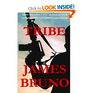
Sales of my latest thriller have been anemic (in contrast with its two steady bestselling predecessors). It's a political thriller about Afghanistan, where I've served. It's gotten great reviews from NYT bestselling authors, respected book review sites and Amazon Top Reviewers. Anyway, I'm wondering if its striking cover may be the problem. Would be grateful for honest feedback. Thanks.

41aYCirgIcL._BO2,204,203,200_PIsitb-sticker-arrow-click,TopRight,35,-76_AA300_SH20_OU01_.jpg
 

Nazurelle

Sometimes it hurts instead
Registered
Joined
Mar 22, 2011
Messages
25
Reaction score
0
Location
Avristar
It's the red, it blends into the background too much and therefore takes the reader away from the title and author and focuses it on that silhouette.

I don't think you need to change the silhouette though it's just that in both of your other book covers the title and author name rise above the background and therefore it makes the background just a background.

You want to try to keep the red, but emboss the lettering, you can do this by putting an outline on it (maybe a white outline) and maybe adding a shadow behind the words to bring it out. Make the title and your author name pop and you'll get a better response to it.

Otherwise, the rest of it is really striking and will attract the right people to the subject. It just needs that final edge to really drive the message home that this is a gruesome book. Right now it's like you're trying to say it's gruesome without really committing to it. You're afraid the cover is too taboo when it's not taboo enough.

I hope this helps.

Namaste,
Rhi
 

Gale Haut

waxing digital artistic
Super Member
Registered
Joined
Jul 1, 2010
Messages
3,057
Reaction score
574
Location
The Swamplands
Website
www.galehaut.com
I feel kind of dumb for having gleaned the meaning of your post....

I looked at the amazon listing online. IMHO, you have two surface problems.

1. The image is still in CMYK mode, which is for print. The blacks and colors appear as a grayer shade than they should be. It needs to be converted to RGB and made more vibrant to increase the color and shade contrasts.
2. As a reader the ebook seems expensive considering the number of sales. You might want to lower the price and see if it helps sales. I'm really not a pricing expert though.
 

Angkor

practical experience, FTW
Super Member
Registered
Joined
Nov 4, 2008
Messages
186
Reaction score
17
Location
Enroute to Jalalabad
Website
www.amazon.com
Gale, Namaste: thanks for the technical input. I'm wholly ignorant of that aspect. I'll pass your recommendations on to my cover designer. I really want to do what I can to improve the cover.

Note on price: Last week I dropped the ebook price to 99 cents from $4.99 for the time being.
 

Gale Haut

waxing digital artistic
Super Member
Registered
Joined
Jul 1, 2010
Messages
3,057
Reaction score
574
Location
The Swamplands
Website
www.galehaut.com
No worries. I must have gotten the paperback price mixed up with the ebook. For some reason I thought it was $13.99 when I looked at the listing.
 

veinglory

volitare nequeo
Self-Ban
Registered
Joined
Feb 12, 2005
Messages
28,750
Reaction score
2,933
Location
right here
Website
www.veinglory.com
The basics are there but something about the font and color doesn't seem professionally put together. Not being a designer, I can't nail down just what.
 

Gale Haut

waxing digital artistic
Super Member
Registered
Joined
Jul 1, 2010
Messages
3,057
Reaction score
574
Location
The Swamplands
Website
www.galehaut.com
I'll just show you what I was talking about. The one to the right has been corrected.
41aYCirgIcL._BO2,204,203,200_PIsitb-sticker-arrow-click,TopRight,35,-76_AA300_SH20_OU01_.jpg
tribe.jpg


Your designer needs to prepare the image to appear less gray on the screen.