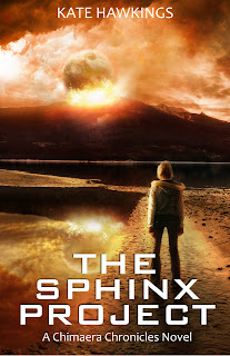
My brand new cover
- Thread starter KateHawkings
- Start date
You are using an out of date browser. It may not display this or other websites correctly.
You should upgrade or use an alternative browser.
You should upgrade or use an alternative browser.
Nathaniel Bell
Registered
Eyecatching and evocative, but make your name and the title bigger. Remember it's only a thumbnail on somebody's smart phone.
Subconsciously, big name = BIG AUTHOR. People are funny that way.
Subconsciously, big name = BIG AUTHOR. People are funny that way.
Thanks guys ")
I purchased the artwork exclusively for this book, but I typeset it myself. I had been planning on making the cover bigger, but I'm just waiting until I can get onto the graphics program again to sort it out
I purchased the artwork exclusively for this book, but I typeset it myself. I had been planning on making the cover bigger, but I'm just waiting until I can get onto the graphics program again to sort it out
- Joined
- Nov 5, 2008
- Messages
- 4,001
- Reaction score
- 477
- Location
- Pacific Northwest, Washington
- Website
- merrihiatt.com
- Joined
- Jul 29, 2005
- Messages
- 762
- Reaction score
- 46
- Location
- The lovely mountains of Arizona
- Website
- www.marsneedswriters.com
- Joined
- Jul 1, 2010
- Messages
- 3,057
- Reaction score
- 574
- Location
- The Swamplands
- Website
- www.galehaut.com
- Joined
- Aug 18, 2010
- Messages
- 4,526
- Reaction score
- 1,804
- Location
- Southern California
- Website
- www.storyrhyme.com
- Joined
- Nov 19, 2011
- Messages
- 4,910
- Reaction score
- 279
It's very nice: but how well does it work as a thumbnail?
I've been trying to figure out how to readjust the size, but it keeps enlarging itself every time I previewed it... As far as I can tell, as others have said, my name needs to be a bit bigger because in the thumbnail it's invisible. But I think it looks okay. The title is easily distinguishable, to me anyway.
- Joined
- Jul 1, 2010
- Messages
- 3,057
- Reaction score
- 574
- Location
- The Swamplands
- Website
- www.galehaut.com
My two cents... it should look good as a thumbnail. The title is easy enough to read and the image is distinct.
I like it, definitly looks professional.
My thoughts would be not only make your name bigger, but also push the name down a little more from the top. When the books pages are being cut, you don't want it to accidently get chopped off.
Overall I like the title section, though, so if it's within safety borders, I'd leave that as is.
Good luck! :-D
- Joined
- Feb 8, 2011
- Messages
- 154
- Reaction score
- 6
- Location
- North Dakota
- Website
- themusingwriter.blogspot.com
- Joined
- Apr 12, 2005
- Messages
- 18,984
- Reaction score
- 6,937
- Location
- At some altitude
- Website
- www.jamie-mason.com
Stephen Zimmer
Registered
- Joined
- Jan 19, 2012
- Messages
- 12
- Reaction score
- 3
Nice work!
Kate, really superb artwork, easily readable font. The artist has a nice eye for layout as well. I like the way the title text forms a kind of pyramid shape, in the context of containing the word "sphinx" in the title itself. Nice subtle touch!
Keep up the good work!
Kate, really superb artwork, easily readable font. The artist has a nice eye for layout as well. I like the way the title text forms a kind of pyramid shape, in the context of containing the word "sphinx" in the title itself. Nice subtle touch!
Keep up the good work!

Awesome cover. Out of curiousity, will the artist's name be left on the cover like that? (I'm working on book cover design, so different people's practices interest me).
In the meantime, I think the cover and blurb does it's job. When will the book be available? It sounds interesting.
In the meantime, I think the cover and blurb does it's job. When will the book be available? It sounds interesting.
Kate, I think you've got a tense-slip in your back cover copy; and does the world really threaten to "literally" fall apart? (That phrase is a cliche, and I'm sure you could do better; but the "literally" bit might be a big mistake, so I'm flagging that first.)