In my misspent youth, I had to do a thesis paper on book covers in the SF&F field, from 1965 to 1987 (the year I did the paper).
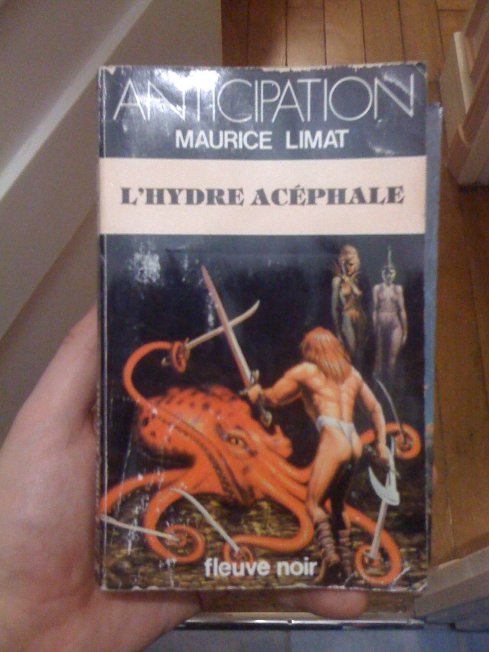
Without droning on, marketing was still finding its way. In the pre-Star Wars era, SF was still mostly identified by pulp images (bug monsters and scantily-clad babes) or pompous abstract paintings meant to evoke a futuristic vibe. Fantasy got a huge boost with the Tolkien revival of the early-seventies (when Frazetta duked it out with the Brothers Hildebrandt for cover styles.)
It's not so different today. We have some stunning artwork, but there are still tropes that help identify genres and writers. Sometimes, with very little representation of the actual characters, setting, or plot.
 Although normally "Agnes and the Hitman" has a much nicer cover and I can't find that version anywhere but on that blog.