Need cover feedback for set of historical novels

Libbie

Worst song played on ugliest guitar
Super Member
Registered
Joined
Apr 23, 2007
Messages
5,309
Reaction score
1,094
Location
umber and black Humberland
Hello, folks. In case you missed it my post about this elsewhere, after much thought I have decided to self-publish my small collection of historical novels as a bit of an experiment in promotion/marketing. Here is an extremely long post on my blog about how I came to this decision. Read when you have plenty of time to kill.

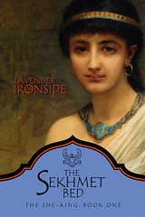
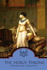
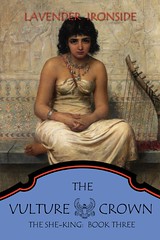
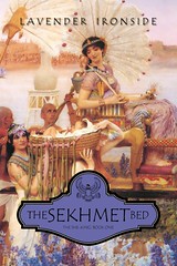
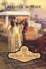
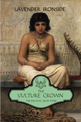
Anyway, I'd like to start the ball rolling by September, so I laid out two different sets of covers for these books.

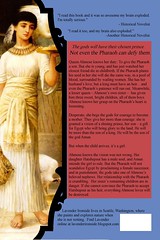
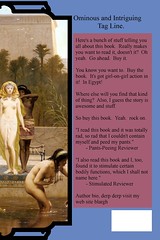
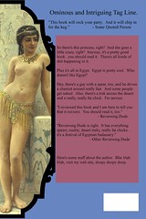
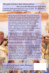
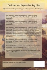
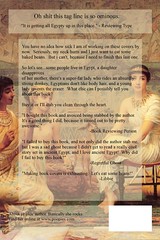
The first book in the trilogy is completed, fully revised, well polished, and ready to go ASAP. The second is written but not yet polished/revised, and the third is outlined/has a detailed synopsis. I will only write the third book and revise/publish the second if I am able to meet my sales goal with the first. The first book has the actual back-cover blurb on it and the other have all space-holder stuff for design purposes only...you can track the course of my exhaustion in the copy as you move from first book to third book. ;)

So please take a look at the two sets of covers below and let me know which set appeals to you more. Do you find them cohesive? Attractive or unattractive, and why? In your honest opinion, do they look professional? Would you feel inspired to pick the book up if you saw these covers?

Danke schoen for any feedback you can provide!
 
Last edited:

atombaby

nice & cynical
Super Member
Registered
Joined
May 31, 2011
Messages
1,645
Reaction score
93
Location
NJ
Website
elldimensional.wordpress.com
First off, these are gorgeous! I find myself more attracted to the second set, but this is just my opinion. It looks more traditional and professional. The first set is nice as well, but the blue empty space in the back feels too, well, empty and bland. Same with the blue space on the covers of the first set.

I love the cover of the first book in the first set, but I also love second set's book #1 cover piece, too. I suppose whichever you find that better suits your story, as I can't really offer a solid opinion on that! But I do prefer the cover of #2 in set #2.

The themes and colors of both sets are really pleasant, but like I said before, the second set's theme feels more soft and uniform. The first, with its darker hues exudes a stronger tone. I admit I don't know the content inside, but I would definitely pick it up to see what it's about! Good luck and congratulations on getting such nice covers.
 

Libbie

Worst song played on ugliest guitar
Super Member
Registered
Joined
Apr 23, 2007
Messages
5,309
Reaction score
1,094
Location
umber and black Humberland
Thank you! I made them myself, so I can make any needed adjustments according to feedback.

I didn't do the paintings, of course. ;) They're all public domain works from the Orientalist art movement of the late 1800s.
 

veinglory

volitare nequeo
Self-Ban
Registered
Joined
Feb 12, 2005
Messages
28,750
Reaction score
2,934
Location
right here
Website
www.veinglory.com
The design is very good but for set one I feel the blue is a bit strong and doesn't set off the colors on the art. For set two the gold and green colors are a better match.
 

bowiefan1970

Super Member
Registered
Joined
Mar 10, 2011
Messages
82
Reaction score
3
Set two for the aforementioned reasons. They look very nice. Good Luck!
 

eward

Super Member
Registered
Joined
Jan 7, 2010
Messages
262
Reaction score
22
Location
Salem, Oregon
Website
openpresencenow.com
I really like set two! I agree with the others who said the extra blue space is kind of odd. I also like the painting for #1 more in the second set. I really like the back covers more with the opaque squares over the paintings. I'd pick them up because they're beautiful!

The only thing I'd suggest with the second set is maybe making the titles a little bigger. And. . .I don't know, I'm looking at the cover picture of the third book and I can't decide if I like it or not. the girl in the painting kind of looks bored and/or pissed off lol Beautiful painting, but different subject matter than the other two, so I'm not sure.
 

kaitie

With great power comes
Super Member
Registered
Joined
Sep 10, 2009
Messages
11,059
Reaction score
2,659
I love the second set. Beautiful covers!
 

leahzero

The colors! THE COLORS!
Super Member
Registered
Joined
May 1, 2009
Messages
2,190
Reaction score
377
Location
Chicago
Website
words.leahraeder.com
These look great. I'd suggest using the butter yellow for the background of each title nameplate--it's a color that seems to be common to all the paintings. The blue, lavender, and green don't harmonize with the paintings and create a bit of visual dissonance.

I also like the type treatment best in the "THE VULTURE CROWN" with the green background. Easily readable, stately, almost portentous--totally evokes the mystery and grandeur of Ancient Egypt for me. Would suggest a uniform size for all words in the titles except for prepositions.

Well done. :)
 

Libbie

Worst song played on ugliest guitar
Super Member
Registered
Joined
Apr 23, 2007
Messages
5,309
Reaction score
1,094
Location
umber and black Humberland
Awesome! Thanks for all the useful feedback, folks!

As for the painting for the third book...I was glad to find a pissed/pouty looking girl for that one. It's exactly what I wanted for that book. :)
 

Alessandra Kelley

Sophipygian
Staff member
Moderator
Super Member
Registered
Joined
Mar 27, 2011
Messages
16,936
Reaction score
5,316
Location
Near the gargoyles
Website
www.alessandrakelley.com
Wow! Beautiful use of Victorian Orientalist paintings. I love when people use public domain art to good effect, and I think the effect here is fantastic.

I think the second set looks better, although I like the form of the backs of the first set. I would suggest making your name a uniform size across the books, and that the smallest one used (on the first book, looks like). Aside from that, I'm impressed by your covers overall.
 

sheilas_world

digging in my word garden
Super Member
Registered
Joined
Mar 29, 2011
Messages
138
Reaction score
9
Location
North Carolina
Website
newsfromsheilasworld.blogspot.com
Here is SET TWO:

First Book:


TSBfrontv6 by sweetlight, on Flickr

TSBbackv6 by sweetlight, on Flickr

Second Book:


THTfrontv1 by sweetlight, on Flickr

THTbackv1 by sweetlight, on Flickr

Third Book:


TVCfrontv1 by sweetlight, on Flickr

tvcbackv2 by sweetlight, on Flickr

Such lovely paintings! I love the style of these works.

I've got to say I like this version the best, especially the color scheme of The Horus Throne v1 for the title plate--I'd use this in all three, if it were my series.

And your "blurbs" and "quotes" are so funny!

By the way, the miniature horse tack is awesome. :D
 

AlishaS

Is swimming with creativity frogs
Super Member
Registered
Joined
Oct 20, 2009
Messages
1,617
Reaction score
119
Location
Canada
Website
www.averyolive.blogspot.com
Just re-posting... My post was lost when we had that little disruption.

So, I said, I prefer the second set, the colours and pictures feel way more appealing to the eyes, they're slightly brighter, and prettier :)

Good luck buy the way!
 

shaldna

The cake is a lie. But still cake.
Super Member
Registered
Joined
May 12, 2009
Messages
7,485
Reaction score
897
Location
Belfast
I had't seen this when it was posted, but I'm going to weigh in with the second set too. I love the images. Please keep us update Libbie, these sound awesome.