Is there a place to post book covers so I can get a critique? I didn't see one but I haven't finished drinking my coffee.
Book Cover Critique
- Thread starter elisadasilva
- Start date
You are using an out of date browser. It may not display this or other websites correctly.
You should upgrade or use an alternative browser.
You should upgrade or use an alternative browser.
http://www.flickr.com/photos/15473833@N05/5872882599/in/photostream
I can't get it to post the photo, sorry have to click link
I can't get it to post the photo, sorry have to click link
- Joined
- Jul 29, 2005
- Messages
- 762
- Reaction score
- 46
- Location
- The lovely mountains of Arizona
- Website
- www.marsneedswriters.com
- Joined
- Feb 12, 2005
- Messages
- 28,750
- Reaction score
- 2,934
- Location
- right here
- Website
- www.veinglory.com
I think you have a nice look overall. I would suggest the following fine tuning:
Put author name on cover
Lower contrast, the photos look a little over modified to me
Bolder, clearer title font so it really pops and can be read on a thumbnail or across the room
I would also suggest having the child (which I like, as well as her contrast to the background) looking into the center of the cover rather than off the edge.
Last edited:
I really like it except I think it's a little too dark (or maybe just too contrasty?). The little girl shows up rather starkly (which is good, imho) but the rest is difficult to actually see what it is (a cemetery, correct?), so it loses a little of the impact. Also, those 'double lights' above the girl are confusing (maybe just because it's onscreen versus 'real life') - I can't tell if they're supposed to be eyes, lit windows, or grave markers. So basically if there's a way to 'strengthen' the background without losing that 'creepy' feel... and it's definitely creepy, so I hope that's what you were going for! ")
I would continue the ropes of the swing beyond the title. Or get the rope to wrap around the tree branch. Right now it's really obviously pasted in and it's not working. And correct me if I'm wrong but the rope also looks like it was "made" in Photoshop and the actual rope doesn't go much past the girl's hands.
And for a full crit- put the author name on it somewhere. That will affect the whole cover.
AND I'm really not this mean, I'm an artist and I notice things...
And for a full crit- put the author name on it somewhere. That will affect the whole cover.
AND I'm really not this mean, I'm an artist and I notice things...
- Joined
- Oct 20, 2009
- Messages
- 1,617
- Reaction score
- 119
- Location
- Canada
- Website
- www.averyolive.blogspot.com
I agree with what's been said already. It's really too dark, however I like the girl on a swing in a cemetery. It really adds an interesting element to the book. It's intruiging, I find I want to know more.
I'm not sold on the Title font, it might stand out more if it was bolded? And of course, most definitley put the Author name on.
I'm not sold on the Title font, it might stand out more if it was bolded? And of course, most definitley put the Author name on.
http://www.flickr.com/photos/15473833@N05/5872882599/in/photostream
I can't get it to post the photo, sorry have to click link
I can't see it because it's in flickr and I can't acccess that at work.
To post a photo :
Right click on the image and select 'copy image url' then in the post hit the 'inset image button' - it's the yellow square one that has the little mountain on it. A box with open, past the whole url into the box and it will insert the image for you.
I forgot my name. LOL.
Ask a friend...they'll be able to tell you what it is. (-;
I agree with Vein's summation. I do like the cover art. Very attractive.
I can't see it because it's in flickr and I can't acccess that at work.
To post a photo :
Right click on the image and select 'copy image url' then in the post hit the 'inset image button' - it's the yellow square one that has the little mountain on it. A box with open, past the whole url into the box and it will insert the image for you.
Flickr won't actually let you copy the image url due to copyright control. It's a bit more convoluted. You have to click the little arrow above the photo to find sharing info.
Hope that helps, Elisa!
To me, the cover seems somewhat squat and shorter than the standard ebook cover size. Not sure.

That's odd. It shows up fine for me below. Are you sure you're copy-pasting the BBC Code and not the HTML? Though it looks like you've found an alternative host that works.
And for what it's worth, I actually like the composition of the cover better with the girl to the side instead of perfectly centered.
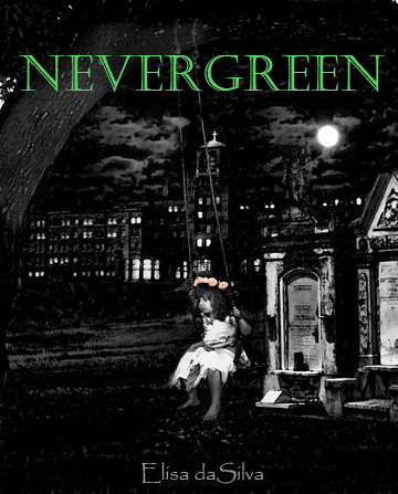
cover372 by boonseamus, on Flickr
And for what it's worth, I actually like the composition of the cover better with the girl to the side instead of perfectly centered.
cover372 by boonseamus, on Flickr
Last edited:
- Joined
- Apr 16, 2011
- Messages
- 147
- Reaction score
- 3
- Location
- Somewhere in the past
- Website
- www.laurenwaters.net
I also like the first version you created best as well. I think it's a fantastic, eerie cover and looks very professional. My only recommendation would be to make your name bolder so that it can be seen as a thumbnail version. Great job though!
I'm confused. My name isn't on the first version. The one in the thumbnail is the second version I made after all the suggestions of the first one being too dark and not being able to tell a building was behind her.
I'd prefer the second version if the girl and the moon were positioned as they were in the first version. I'd want more of the grave marker on the right to show, and now the moon looks more like a street light.
For me, the cover's too dark. The title doesn't tell me anything and I don't have any idea of your target audience. I mean, I could be your target audience, for all I know, but what's the book about?
Okay, here we go again with a readjustment. The book is a paranormal romance (vampire) so I am going for a gothic kind of feel. Just wanting to know opi.nions about whether it creates interest or not

Last edited:
- Joined
- Feb 11, 2005
- Messages
- 25,582
- Reaction score
- 3,785
- Location
- New Hampshire
- Website
- madhousemanor.wordpress.com
Take a look at how it appears at 100 pixels high (the size of the thumbnails on a whole lot of bookseller sites):

dgaughran
Banned
- Joined
- Oct 1, 2009
- Messages
- 1,256
- Reaction score
- 100
- Location
- Stuck in Sweden
- Website
- davidgaughran.wordpress.com
I think your latest image is the best so far. However, Jim is right, it really really needs to look good small.
This is what I suggest:
1. Brighten up the whole thing a shade - and especially the central image, it's kind of swallowed up there as a thumbnail.
2. Make the title pop more - it's pretty unreadable - thicker letters and/or a change of color.
3. Massively increase the author name. Consider caps (and maybe a font which matches the book title better).
4. Maybe zoom in on the girl a little more.
5. Brighten the color of those flowers - I'm guessing you want them to jump out, but in thumbnail they are barely visible.
It's a really nice image, but most people won't get to see the bigger version if they don't find the thumbnail enticing enough.

