- Joined
- Oct 6, 2006
- Messages
- 1,191
- Reaction score
- 117
- Location
- In my head.
- Website
- www.requirecookie.com

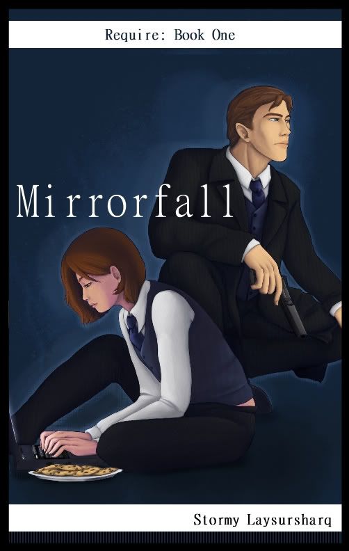
The white banner at the top, I'll be doing something more with this, some sort of light texture or maybe just making it slightly less white - something just to take the edge off it a little.
I'm looking for opinions on whether it should be flush against the top, or just slightly below (keep in mind, it'll wrap around the back at whatever level it ends up being at).
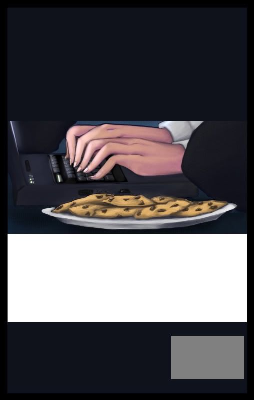
This is what I started with for the back cover - I like having the art in the middle, as it allows me to zoom in on a certain section of detail (for these two, it ended up being the girls and their favourite toys
 ).
). The little white rectangle is the spot for the barcode.
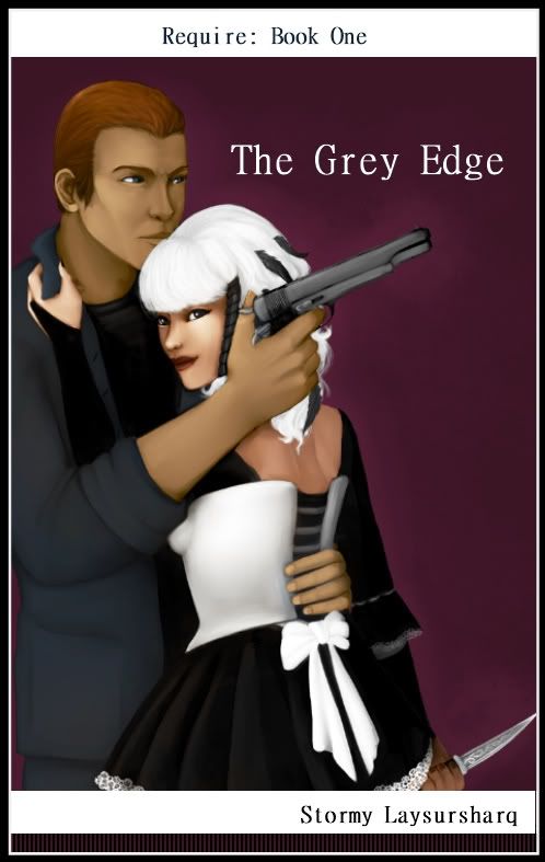
Not much difference to the first cover here (other than the position of the top white bar, and that it should read "Book Four" not book one, that's a copypasta mistake).
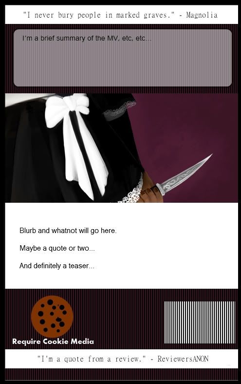
Here's where I let myself get a little busier with the back cover. The white banners - was thinking of using one for a in-book quote, and one for a review quote, though I can switch the positions, or have two of one and none of the other - again, whatever looks good.
(Obviously, that cookie logo was made in less than ten seconds and isn't the final
). The summary box up the to will be a short overview of the 'verse the series takes place in, or maybe a series-so-far snapshot, haven't decided yet.
Thoughts, comments, crits?
[Borders are just for reference, these will be full-bleed].
Last edited: