- Joined
- Jan 7, 2010
- Messages
- 262
- Reaction score
- 22
- Location
- Salem, Oregon
- Website
- openpresencenow.com
Hello folks! This is a young adult short story collection cover for Kindle and Smashwords. I'd like a cover critique but also help with thumbnails.
I made this on wordle.net and my husband and I played around with it in Photoshop (made the title stand out and added the "seven short stories" bit). I like it, but I'd love any feedback.
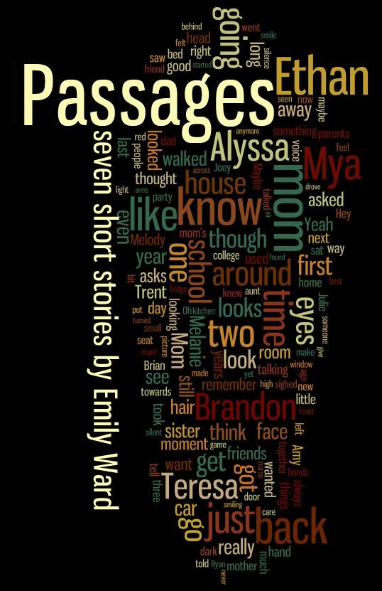
As for the thumbnails, I think they end up looking kind of cluttered on Amazon and Smashwords, and it seems like it loses some of the color.
Link to screen cap of Amazon (it's not live right now).
Link to Smashwords.
I'm not sure what happens when it goes to thumbnail, maybe they compress it? Because the thumbnail looks fine on my photobucket. What do you think? Does it lose its prettiness when downsized? Or is it still eye catching? Am I totally over thinking this? The thumbnail is the first thing they'll see, though, since it's an ebook.
Thanks!")
I made this on wordle.net and my husband and I played around with it in Photoshop (made the title stand out and added the "seven short stories" bit). I like it, but I'd love any feedback.
As for the thumbnails, I think they end up looking kind of cluttered on Amazon and Smashwords, and it seems like it loses some of the color.
Link to screen cap of Amazon (it's not live right now).
Link to Smashwords.
I'm not sure what happens when it goes to thumbnail, maybe they compress it? Because the thumbnail looks fine on my photobucket. What do you think? Does it lose its prettiness when downsized? Or is it still eye catching? Am I totally over thinking this? The thumbnail is the first thing they'll see, though, since it's an ebook.
Thanks!