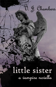
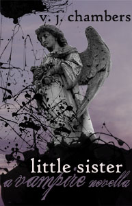
#4
Valerie:
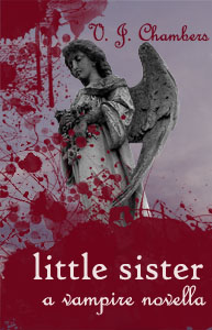
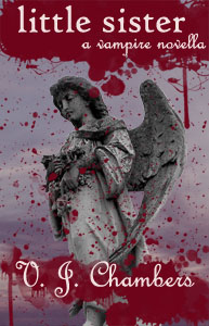
I like the 4th (bottom right) cover best. I think your name is better/clearer not using the script text and I like the black blob pattern relative to your angel statue better in that one. I didn't like the 'a vampire novella' as you have it and think it would look better in the size/script font of #2 (upper left) but!!! do it in red? (and I'd have some separation between the title and the text in question). I mean, come on, this is about vampires, right? I would have gone for the red as the spalsh pattern but each of yours is a bit too busy for my tastes.
Just a thought.
Michael
(just had another thought; when I look at your covers, I get the sense I'm looking down and into a lake, like this is a reflection. Now, not sure if that's what you were aiming for, but if you did, why not add some ripple and accentuate this pov?)
")