I'm not a graphic designer, and I don't play one on TV

, so take this FWIW...
>>>heh, I think we'd all like to play that role! Part of why I like self-pubbing!
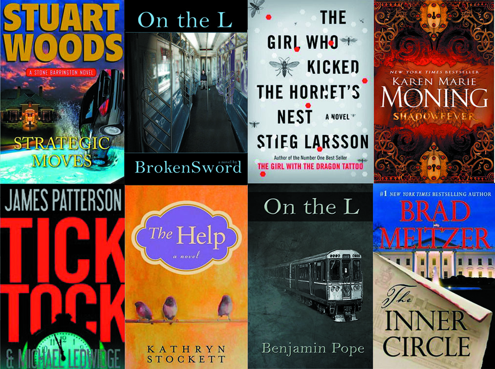
#1 - I kind of like this one, but I think the train should be headed straight ahead instead of to the side (like it's headed straight at me). I like the background color but feel it should be a darker color (think: sinister). These two changes would make me think thriller/suspense, and that's what this is, right? I really like the font on this one, and altho the color on your name is a bit hard to read, if you decide to darken the background color like I suggested, this probably wouldn't be a problem.
>>>The only problem I see with that is if you have the train straight on, it might look parked, no? I could cobble up a train which has it's tail curving, to show the movement aspect heading outward and straight on, but I'd have to cut the fade effect. Something to work on, though.
I'll admit that I don't really care for the pic; the person is too far away. If there's some kind of significance, it's lost on me. (But then again, maybe it's just me, lol.)
>>>no, it's not just you! There is a HUGE significance but I if I told you, I'd have to kill you, and well, can't do that when you're being so nice and reviewing my proto covers! (Actually, this cover shot is a direct scene in the book and is symbolic of what I was trying to accomplish.) Now, the reason the kid is far back is to create a tunnel effect, to draw the eye of the viewer in. As long as you can tell it's a kid and his blue, rubber ball, I think that part works.
With that being said, if you decide to go with the pic anyway, I don't think you should go with the skinny ones, #4 & #6; maybe because it makes the person look even more miniscule than the full-on shot. I do dig the dark marble effect on those covers, though.
>>>my son will love hearing that as the dark marble effect is actually darkened, scratched-up steel and that was his idea. He generally isn't liking the pic at all and the train cover + the two 'slice of pic' covers are his doing. That's partly why I'm asking for other opinions; so I don't get narrow-minded!
If I were go with one of the pic covers, I'd go with either #3 or #5, with my preference being #5, despite the smallish font of your name (altho I do like that font). Hard to say why I don't prefer #3, but I don't care for those banner thingies (don't you love my technical terms?
) on the top and bottom.
>>>Number 5 is more or less the original with a font+font location change. A number of people thought the full-length pic worked better than having a dark border (which was done to pull out the text as I wanted the font color to be symmetrical and the light color of the pic at the top doesn't allow for this. Hence, the darkened marble/steel slice-pic covers. I wasn't sure I'd like the 'banner thingies' either (I think you coined a new term; we should adopt this when critiquing all covers on the forum, hey? ") ) but thought I'd add them and see what others thought.
) but thought I'd add them and see what others thought.
Hope I've been of some (limited) help.
>>>you've been of tremendous help, Nancy; I really appreciate your comments about each. Helps me zero in on effectiveness and bookshelf curb appeal. Thank you! Nancy