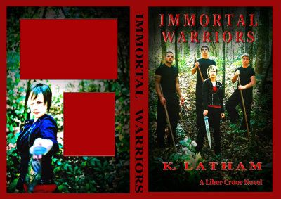
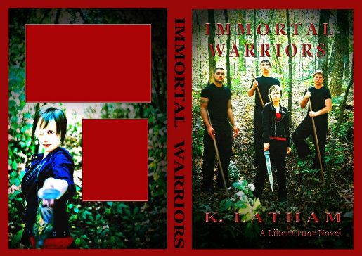
I really hope I do this right... Please note the blank red boxes are for the book desc and author info.
The size is just fine. Are you the author or the illustrator?
 (and the photographer...)
There are some good decisions with this. I'm having difficulty reading the text because of the color, fx, shape, and placement of it.
Niy, do you have access to photoshop? There's a lot of neat formatting stuff you can do with the text to make it easier to read.
Or, if you don't, you can shoot it my way and I'd be more than glad to tinker with it for ya.
Any thoughts on how to fix them???... I toyed with the idea of a banner behind them...but it looks very cheesy.
Hey, not a problem. The amount of info needed to pull off a good cover can be overwhelming, and I do my best not to come off like a complete arse, but...
?). I don't see a group who battle together (I kind of assume that's what I'm looking at). I see people posing for a photo with props. Also the forest is overwhelming. It's too much to look at. See the tree/bush in the foreground, it's just as in focus as everything else. Our eye isn't being directed anywhere. . .You are welcome! Glad they were helpful. One further thought with the new information, your models don't look particularly YA. They look mid twenties at the youngest. I assumed this was adult fantasy looking at the cover, and that is a problem. You want your readers to instantly know what genre and market your story is. That is one of the main duties of a cover. I would recommend you google some YA paranormal covers and take your cues from that
Good luck!
. I wish you well with the book!