- Joined
- Nov 11, 2011
- Messages
- 5,147
- Reaction score
- 2,040
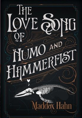
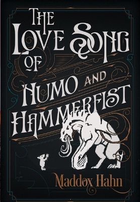
Howdy-do...
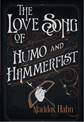
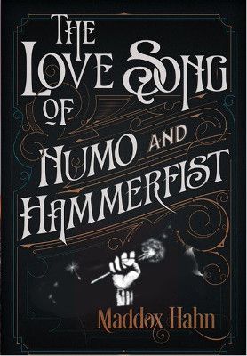
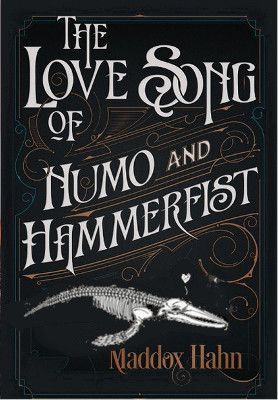
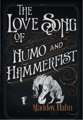
So here's a question.
I hired a stellar typography guy to make a cover for me. I'm very happy with all of the text and surrounding swirliness (though I may ask him to tweak color slightly, but basically---AAAAAA).
But--he asked me for an image to put in the empty space, and I was kinda...buh? I dunno. I tried. And tried some more. Then it occurred to me I should probably hire someone to draw something. But since I'd already stuck my foot in it, I tried a little bit more.
So...I don't know. I did a thing. I'm basically asking if I should give up and hire someone or if this looks good. If the image does the beautiful typography stuff any justice. It probably doesn't? But I've been staring at it too long now...
Anyway. I've done a quick cut-and-paste of my image onto his cover mockup to give an idea of what it would look like as a whole. But there is some wonkiness surrounding the image himself--ignore that, if you would") (He will incorporate it into the cover better than this.) I'm mostly looking at feedback on a) whether the image itself looks amateurish and b) whether it fits in compositionally and stylistically. Like, if I should hire someone with a better eye than me, basically.
(He will incorporate it into the cover better than this.) I'm mostly looking at feedback on a) whether the image itself looks amateurish and b) whether it fits in compositionally and stylistically. Like, if I should hire someone with a better eye than me, basically.
Doop. Anyway.
Here be the thing.
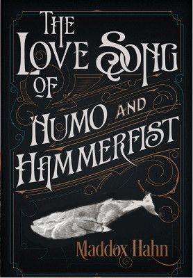
"My image" being the whale.
So. What do you guys think...?
Thank you for reading/looking
So here's a question.
I hired a stellar typography guy to make a cover for me. I'm very happy with all of the text and surrounding swirliness (though I may ask him to tweak color slightly, but basically---AAAAAA).
But--he asked me for an image to put in the empty space, and I was kinda...buh? I dunno. I tried. And tried some more. Then it occurred to me I should probably hire someone to draw something. But since I'd already stuck my foot in it, I tried a little bit more.
So...I don't know. I did a thing. I'm basically asking if I should give up and hire someone or if this looks good. If the image does the beautiful typography stuff any justice. It probably doesn't? But I've been staring at it too long now...
Anyway. I've done a quick cut-and-paste of my image onto his cover mockup to give an idea of what it would look like as a whole. But there is some wonkiness surrounding the image himself--ignore that, if you would
(He will incorporate it into the cover better than this.) I'm mostly looking at feedback on a) whether the image itself looks amateurish and b) whether it fits in compositionally and stylistically. Like, if I should hire someone with a better eye than me, basically. Doop. Anyway.
Here be the thing.
"My image" being the whale.
So. What do you guys think...?
Thank you for reading/looking