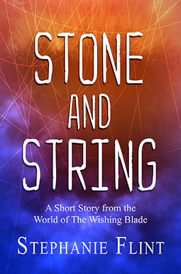
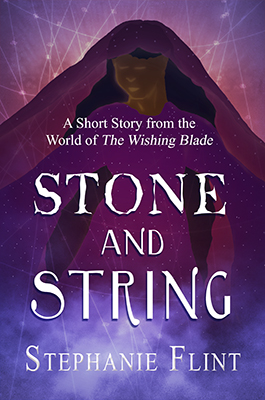
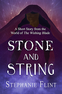
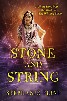
EDIT 4: Cover has been finalized. Thanks for the help! :-D
EDIT 3: Final Choices at Post #45. :-D
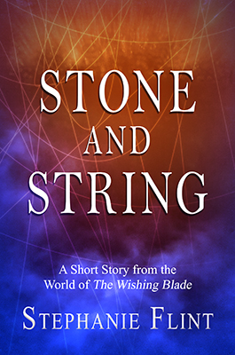
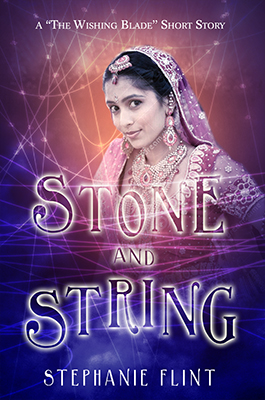
EDIT 2: Updated Proof (V6) at Post #36
EDIT: New Variations at Post #28
Ooo, boy. There's a lot to go through here. O_O
All right. I've read through everything (though I'm sure I've missed something), and responded below under the new proofs (The +1 character mentions are notes for myself). I tried to pick out what to start with, and the result is several different cover variations. I took a few of these to my local writing group, got more feedback, and created one other variation.
Note: In the case where I used stock images, I used the comp images from Dreamstime. A licence will be purchased if I decide to use a particular image in the final cover.
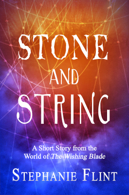
V5
V6
V7
V8
V9
V10
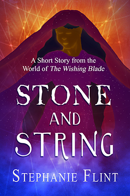
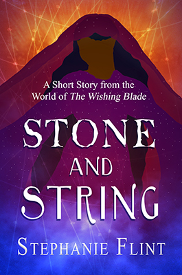
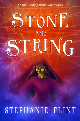
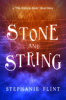
Personally, I like it much better without the character. But then again, I almost always think characters on the cover look cheesy, so take my opinion with a grain of salt. (If I had to pick one of the ones with the character, I'd pick C, but with the eyes, mouth and nose removed with the rest of the shading intact.) The font change between Stone and String looks awkward to me, though. I think you did it to give a stone-like effect to the word stone, but personally, I think it looks unappealing.
+1 for no character. Also, I changed the font so it's all one way or all the other.
Another vote for D. In the first one in the OP, I don't like the lettering because my eye reads 'siring' instead of string, the t and the i look too similar. So the lettering in your last batch is definitely better.
I prefer the character. A face would be fine but maybe not the one in versions A-C. Otherwise faceless is good. The character adds to the picture without being specific enough to imprint on the reader's mind, another argument for faceless. I agree with Alary that you have to be careful with characters. But for me, it's not cheesy so much as it gives me an impression sometimes as strong as the synopsis and it can be a turn-on or a turn-off.
+1 for character, but better face, or faceless.
I like version 4 the best. It has a nice contrast and I like the starburst effect on the web. If I was to choose the one with the character, it would be D . However, I would like it if the face was a bit more defined.
I've redefined the face. Probably still needs work, but maybe it looks better? I tried merging some of the best of V-4 with V-D.
I really like version D the best, though I feel the "A short story" font text should either be a different font and/or be moved just a bit. Something feels a bit amateur about that part of the font.
...
Also, totally random and if you don't mind my asking, I'm wondering why is the goddess on the front and not the protag? (Maybe it's just me, but I usually see protagonists or love interests on the front of the covers that do have characters.) Is it a YA story?
ETA: Another vote for keeping it faceless, if you want to keep the cartoony character. The other versions with the faces don't look as professional.
+1 Faceless character, if keeping drawn character.
Moved "A short story font" in all cases. Also tried shortening it.
I think I chose the goddess initially because I could picture her looking more "fantasy" than the protagonist, and thus got the idea for her, first.
Magic's Stealing is lower YA/Upper MG, but I
think the style of the writing in this story is leaning toward adult. I could be wrong, though, as I'm not the best judge of age category.
I don't like any of these, sorry. It definitely looks like Fantasy now, but it looks like it got thrown together on Paint. Sorry. But if I had to pick one, I'd pick A. The font is very strange though, how the font changed on the second and third row of the title. I know many titles use different fonts, but there's no reason for the change (no emphasis of a specific word, etc.), except maybe just because to have differing fonts. Try changing the ALIGNMENT of the fonts, so they're more overlapping, or changing font sizes of the words (like the first letter). I liked the Stone font, but the String font is not very flattering.
Changed the fonts so they don't change mid-title. Also played with the alignment and such. Did this for both the stone font and string font, though I focused on string.
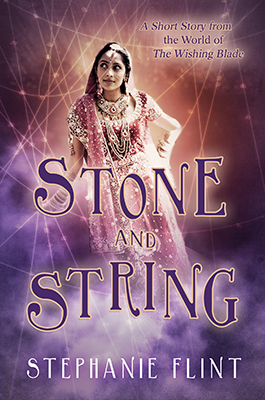
Have you considered using a stock photo of a brown-skinned woman in a similar outfit? The art isn't quite working for me (and obscuring a PoC character's face is a cover trend I have a strong dislike for) but the font treatment is strong, and I feel like it would go very nicely with a colourful stock photo. Ostill has a
very nice stock photography of Arabic models in belly dancing gear,
this is a nice collection of an Arab lady in a purple headscarf,
this has a nice protagonist-y feeling, and you can find many more using keywords like
"Muslim headscarf purple".
I do worry that, overall, focusing on the woman in your cover is going to send off the wrong signal about your book. Most readers will assume the figure on the cover is the protag -- is your main character a PoC, at least? If not, readers looking for PoC main characters might be negatively surprised.
I considered using stock, but initially avoided it because I was trying to avoid putting much money into the story (since I'm not sure how much of a market there will be). However, I think I can find stock for under $15.00, so it is an option. I've started the search, and put together a couple covers, but I'm worried they lost the fantasy look and look more like they're specific to India. Also, I'm worried that the current model poses don't fit the tone of the book. I may continue the search, however.
Pretty much all the characters in Stone and String are POC, so I'm hoping that won't be a negative surprise.
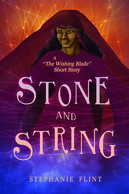
So, I like the direction of D, but I don't care for the image. It's doesn't match the style of the background, which makes it look pieced together.
I attempted to smooth out the two images so that they mesh together better. Not sure it's quite the right effect, and I may abandon that image, but I also did more work on the image itself.
Lose the image. The background texture is fine, though it could stand to be darkened some. Don't mix typefaces in the same series, i.e. two or three different ones within the title. I would stick with standard serif fonts, as you had in a previous iteration. It may not look like a fantasy book, but most fantasy books look pretty rotten. I would drop the size of the byline "short story from, etc" and place it at the top in one line. And have the same typeface across the board. Be careful of drop shadows, they rarely look anything but horrid. If you're losing definition in your text, consider making the shadow or using a glow that is the same colour as the background but slightly darker. I don't know whether you have the technical capability to do that, i.e. InDesign, but it's the option I would choose. Though darkening the background somewhat as I suggested might also relieve the need to a drop shadow on the text.
Changed the title font to one single font. Tried a couple different image, but not particularly happy with either. May search for more stock options. I'm fairly certain I want it to look fantasy, though, so I'll probably continue playing with the different typefaces that have more of a fantasy look. I've tried a few covers without the drop shadows, and one with.
The first one more vivid.
I've tried playing with different color options, including a few more vivid, like the first.
I also agree with Emaree about using stock photo imagery, since that is what many YA (and many adult SFF) tend to have when it comes to having a character in front, but I wasn't sure if the OP wanted that or had any stock photo images.
Thinking on it, Sibbib, isn't the Version D concept similar your avatar book cover? That avatar cover looks better than the cartoon image cover, and, it looks like it may have a photo image.
Like Emaree said, it would look better with stock image (or maybe an excellent realistic character painting).
...
I've attempted to make the character in D more realistic, and played with making it more similar to the style of the book in my avatar (which does use a photo image).
Also, while we're at it. Lose the caps in the author name, have it all small caps (small caps always look better than their bigger counterparts for some reason).
Tried this, but one of the typefaces uses pretty much the same image for small and large. I did play with this idea on a couple of the covers, though.
*Flop.* Thanks for the help, everyone! If I don't respond for a few days, it's probably because I'm trying to wrestle with stubborn cover design.
")