- Joined
- Apr 15, 2012
- Messages
- 120
- Reaction score
- 9
- Location
- Suncheon, South Korea
- Website
- alwaystypingfaster.blogspot.com
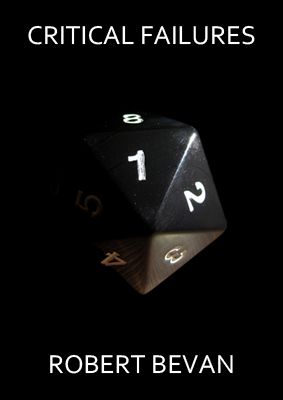
Die lodged in a half-melted popsicle on a table with peeling formica.
")
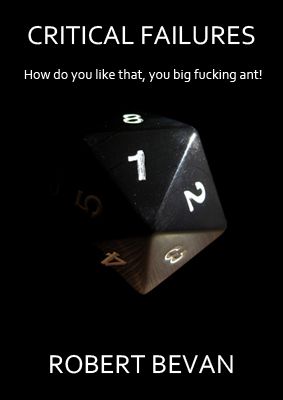 ), but not the tag line entirely. I think a tagline should hook someone in, and the line just doesn't do it for me. Though, I can't help but wonder if the die refers to Heroscape, D&D, or other games of that ilk.
 Are you planning on changing the handling of the words on the cover at some point? I still think the image looks good--if perhaps not entirely in line with expectations for the book--but the title, tagline, and so forth are all so clearly amateur that they're detracting from the rest of the cover.
here's a more serious effort. what do you think?
, though I wouldn't rule out experimentation, seeing what really works and what doesn't. I know there are days when I'll look and something and think it's the best thing out there, and then the following day, I'll hate it. At least for me, I'd like to see a tag line that plays off the 20 sided die, while relating to the topic of the book. Even if you didn't go with it in the end, it would still be cool to see what contrast (or on the other hand, lack thereof) could come of it.well, the source of the problem could be that i am an amateur. any suggestions? is there a specific problem that you can pinpoint?
I've just realised what it is that I don't like about the image.
The die isn't sitting flat on the ground, it's balancing on one edge. It looks wrong like that. I want it to be flat, for goodness' sake! (And yes, I am obsessive about having things straight and lined up and all that, so perhaps I'm not the best person to listen to here.)
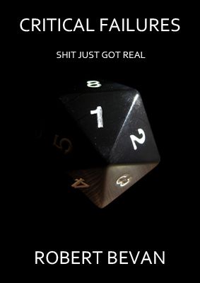
I think it's a better tag line
I'd also italicize the tagline to differentiate it from the rest of the text. A gray background would be interesting to see, too.
Please don't get me wrong: I like the tag line a lot. All I'm saying is that through experimentation you often find something even better.
Good luck, my friend.
ETA- When working with a tagline, (just a general rule of thumb) make sure the language matches the intended audience. If it's for adults, add the curse words; if it's a YA/crossover, add the swears, but know that the book may be near books younger (corruptible) kids could come across, so would want to keep the swear words tame. Just my 2 cents...
I've just realised what it is that I don't like about the image.
The die isn't sitting flat on the ground, it's balancing on one edge. It looks wrong like that. I want it to be flat, for goodness' sake! (And yes, I am obsessive about having things straight and lined up and all that, so perhaps I'm not the best person to listen to here.)
I think this cover's getting better, though I might suggest playing with the font and finding something that matches the tone of your book.
Sadly, I'm an amateur as well. This is definitely one of those situations where I can see there is a problem, but not usefully explain how to fix it. I just know that when I look at that cover, the image is saying "Professional photography" and the text is saying "Amateur with basic image-editing software."
Some of it is that you appear to be using a single font, all in a solid color, that looks to be a bog standard font packaged with any word processing program. If I could make a cover in Powerpoint, then it's probably not a professional-looking cover. And some of it is that you're using a very simple font on a very simple background, which makes it all look very...flat. A simple font on a complex background can work well (take a look at the cover for Range of Ghosts; now there's a super-simple, barely-serifed, all-white font that looks perfect on a very complex, dark background), but a simple font on a simple background ends up coming across as dull unless there's something else going on with it.
At our D&D (Pathfinder) game last Sunday, somebody rolled and their die in fact ended up balanced on a point. It wasn't leaned against anything; it just stopped that way.
I'm not sure about the tagline, though using a "game quote" tagline could be a great deal of fun. Sometimes some of the best stuff gets said at the table!
Take the shot of the die (laying flat on it's side as if it's just landed with the one showing) on a grainy wooden top or some kind of map. Camera should be at about 45 degrees from the table so you have a horizon. Fade the table/map background into dark grey until you can just discern it. This could give your image more dimension.
Try offsetting the Title and taglines, and your name so they're not all centered, or some are, one isn't, whatev.
I do love "Shit just got real." Out of all the elements on that page, that would have had me going, WTF? and picking it up.
Oh, were you going to include "Book One" somewhere or...?
well, the source of the problem could be that i am an amateur. any suggestions?
Just a thought: hire a professional?
If you want professional results -- in any field of endeavor -- would you expect an amateur to produce them? If you hired an amateur mechanic to work on your car, would you expect professional results? If you hired an amateur joiner to replace a bannister in your house, would you expect professional results? If you hired an amateur garden landscaper, would you expect professional results? Sure, it's possible you might get them; there are amateurs in most any field who are as good as professionals. But you can't just assume that an amateur will produce professional-level work, that it's just a matter of getting some advice. Training and experience are what turn amateurs into professionals.
You've decided to hire an amateur (yourself) to produce the cover of your book. It shouldn't come as a surprise that the results look amateur in comparison to professional covers. (This isn't an insult; it's just a statement of fact.)
This is the thing about self-publishing. If you want professional results, and if you don't own the skills needed to produce those results, you have to hire someone with the expertise. If you aren't willing to make the investment, it's going to show.