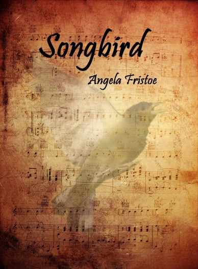
Possible covers for YA romance

Penang

Registered
Joined
Dec 6, 2009
Messages
33
Reaction score
2
I've recently decided to self-publish, and have already ordered my proof copy of my first book. I used the Create Space cover maker and was pretty happy with the results, until I read a thread on the self-pub forum here about the generic look the create space cover maker has and also that the photos they provide are over used. So, I went ahead and tried to create one on my own. Now I can't decide which to use! The first one, I can't really change anything (they only offer 6 different fonts). The second one, I can play with a bit more.

Any suggestions? I'd love to hear the thoughts of people who aren't my family!!

songbird-front-cover-preview-1-copy.jpg
new-music-songbird-cover-31-e1302658971498.jpg
 
Last edited:

Smish

Reads more than she writes.
Kind Benefactor
Super Member
Registered
Joined
Jan 21, 2009
Messages
8,636
Reaction score
3,087
Location
in the Bouncy Castle
I like the first one. It looks like a YA cover. The second one does not, in my opinion.
 

brainstorm77

practical experience, FTW
Super Member
Registered
Joined
Jul 16, 2006
Messages
14,627
Reaction score
2,057
The second isn't showing for me, all I get is a red x. But I like the first one.
 

Penang

Registered
Joined
Dec 6, 2009
Messages
33
Reaction score
2
hmmm, don't know what happened to the second one. It was there. I'll check the code.
 

BrokenSword

keeper of the Flame
Super Member
Registered
Joined
Aug 11, 2007
Messages
153
Reaction score
11
Location
Michigan
Website
www.SwordOfShakespeare.com
first

I'll weigh in and also vote for #1, though artistically, I like the second better. But since your aim is YA, the first scores better. Maybe have the couple of #1 be an overlay (like you have the bird on #2), with less translucence for the couple? If you have the software and the graphics, doesn't hurt to mock up alternates.
 

Penang

Registered
Joined
Dec 6, 2009
Messages
33
Reaction score
2
Thanks for the feedback! It really helps me solidify my decision. At this point I'll probably go with the first one. I wish I could use the picture of the couple and some how mesh it into the music paper, but the photo isn't high enough resolution since its from the create space thumbnail and the pic actually belongs to Create space. I found an almost identifcal one, but it's a premium pic and is pricey.

Unless the way my proof copy turns out is horrible, I'll use the first.

:) Ang
 

shaldna

The cake is a lie. But still cake.
Super Member
Registered
Joined
May 12, 2009
Messages
7,485
Reaction score
897
Location
Belfast
I quite like the first one, it's clean, light and fresh and looks like a YA. The second cover looks like a religious or spiritual book.
 

Penang

Registered
Joined
Dec 6, 2009
Messages
33
Reaction score
2
Thanks! I got my proof copy the other day with the first cover and really liked how it looked, although I wish I'd gone slightly smaller than 6X9.

Now it's on to major editing again!